 Log in
Thanks to the AI-driven chip shortage, prices for phones, computers, and consoles are sky-high—and still climbing.

|
Sr. Content Developer at Microsoft, working remotely in PA, TechBash conference organizer, former Microsoft MVP, Husband, Dad and Geek.
|

Pennsylvania, USA

Ryan welcomes Benny Chen, co-founder of Fireworks AI, to the show to explore what actually makes an AI application good or not, how to balance qualitative signals with quantitative metrics when evaluating AI, and how open-source eval protocols and community efforts are setting the standard for AI evaluation.
Pennsylvania, USA
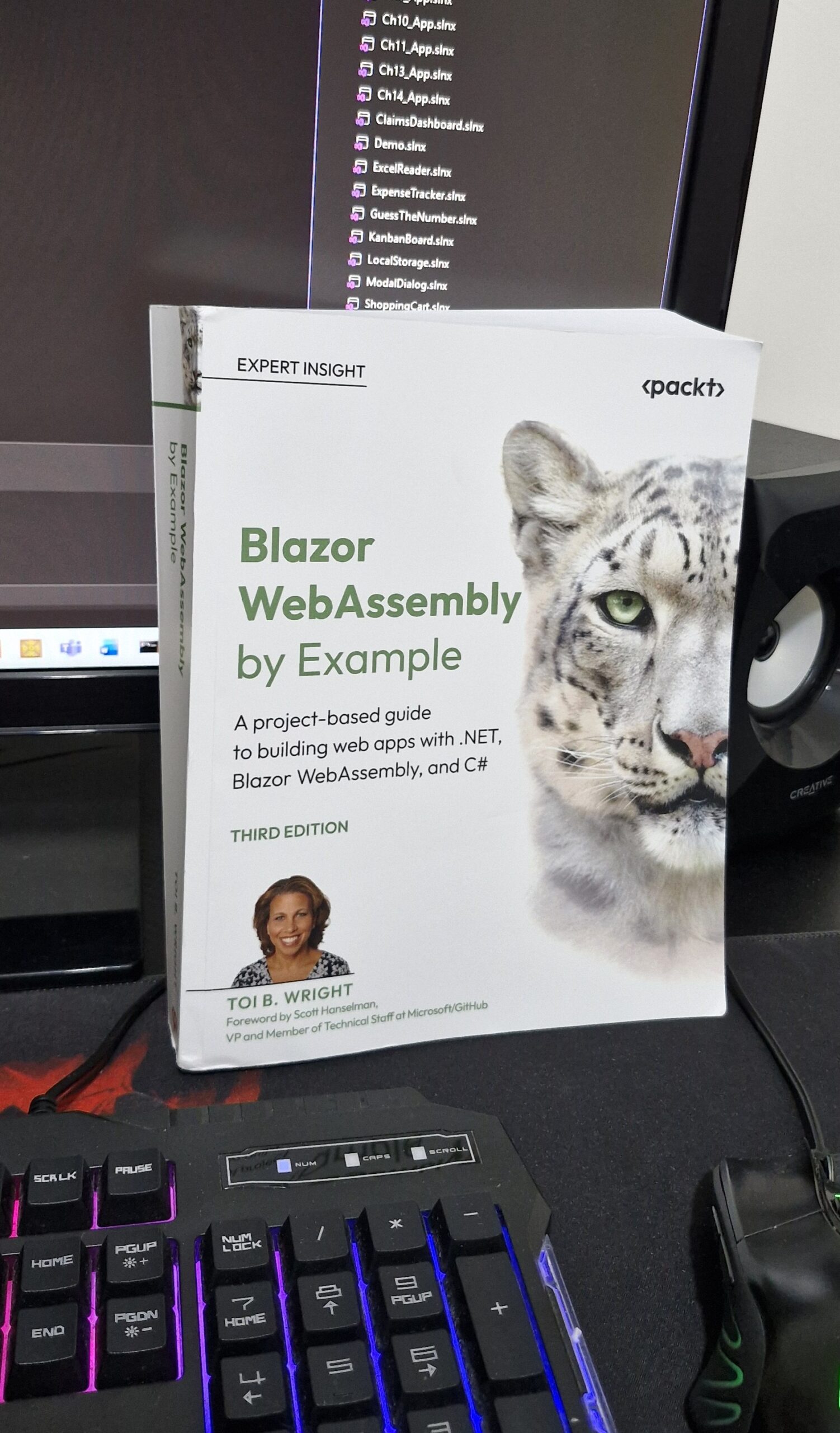
This article reviews "Blazor WebAssembly by Example (Third Edition)," a practical book that guides developers through building real-world Blazor WebAssembly applications. It covers key topics like components, routing, state management, API integration, authentication, deployment, and AI integration, demonstrating how Blazor fits into the modern .NET ecosystem. The author emphasizes learning by building complete projects and highlights Blazor's versatility for full-stack development within the Microsoft stack.
Pennsylvania, USA
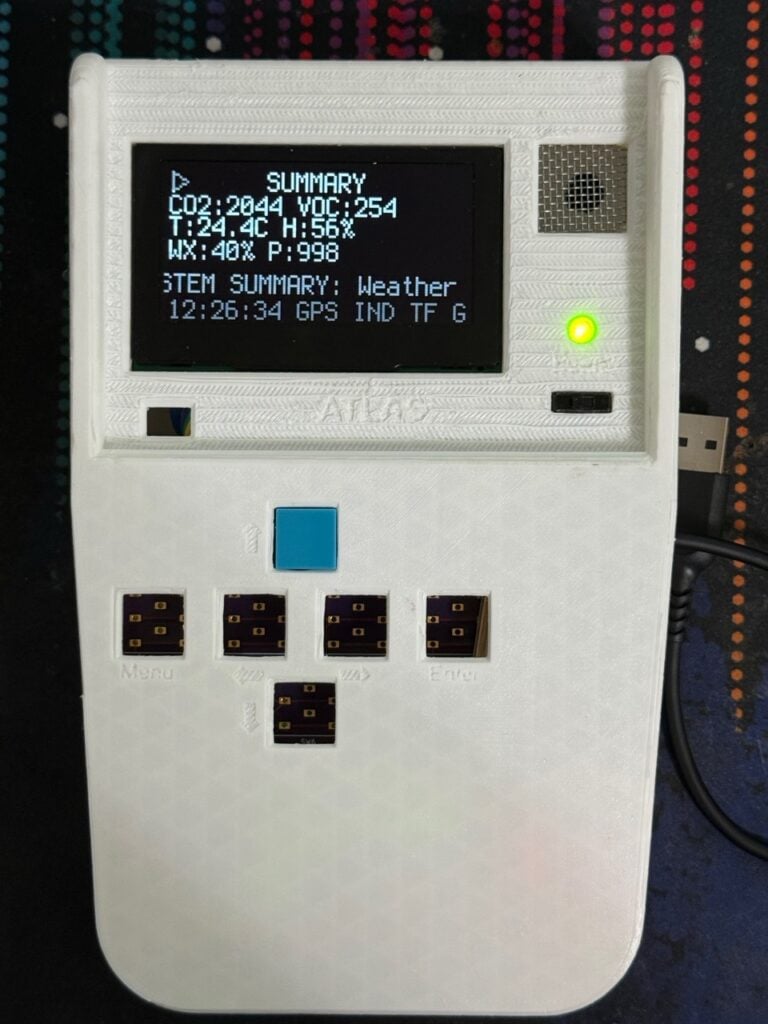
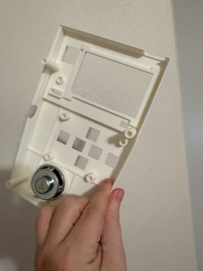
This is pretty much a real-life Tricorder, like the one used by the Starfleet crew in Star Trek. But take a look under the hood, and you’ll see that it’s actually a powerful tool designed to help the user survive unforgiving terrain. And it’s all running on RP2350, our secure, high-performance microcontroller.
ATLAS (Advanced Tactical Laboratory and Analysis System) is a rugged handheld field tool designed for explorers, engineers, and anyone who needs real, actionable intelligence, not just sensor readings. With pro-grade sensors measuring radiation, CO₂, VOCs, temperature, humidity, light, sound, and magnetic fields, ATLAS gives you direct, plain-English warnings like “Safe background radiation levels”, “Leave area now”, or “Storm incoming in 2 hours. 68% chance”.
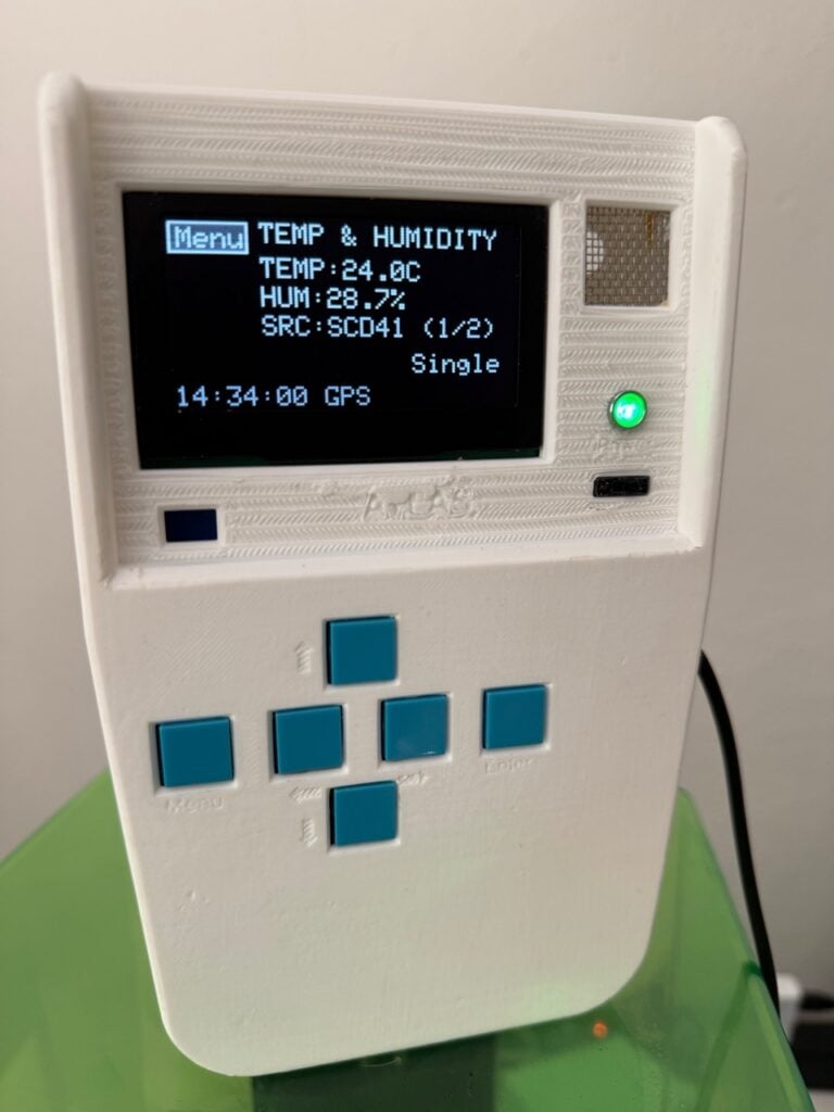
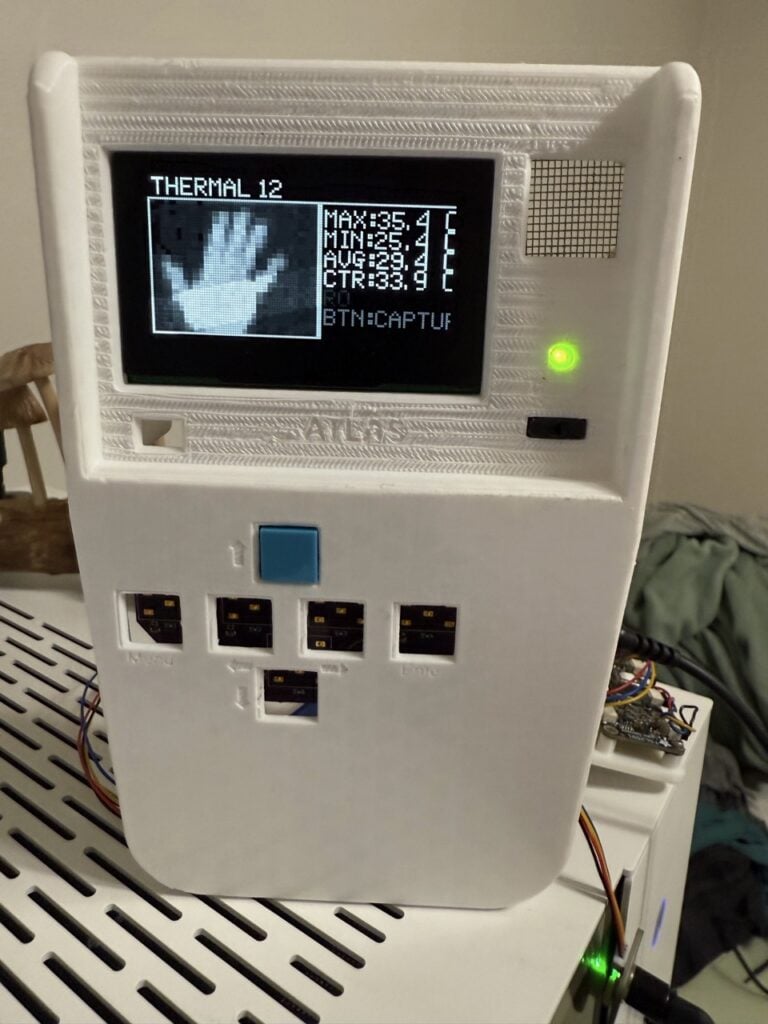
Integrated GPS means every reading, warning, and anomaly is geo-tagged and timestamped for complete field awareness. The on-board 5MP camera and Google Coral Mini AI enable instant identification of rocks, bugs, and plants without the need for Wi-Fi or Bluetooth.
ATLAS also delivers real-time, on-device weather forecasts and storm alerts, using its sensors to warn you about dangerous conditions as they happen. The data is even logged for later review.
RP2350’s power-lifting capabilities
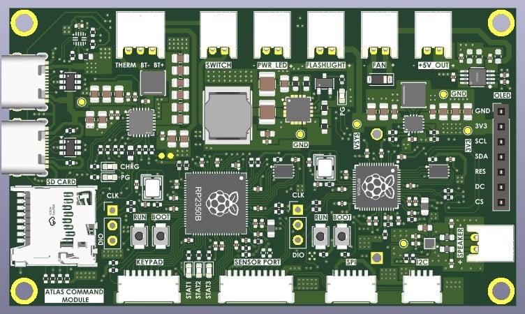
Maker Apollo Timbers is an engineer who set out to build an environmental, biological, and threat detection system in a single device. It took about a year to develop and runs on our RP2350 microcontrollers: one RP2350A and one RP2350B, with their roles deliberately split.
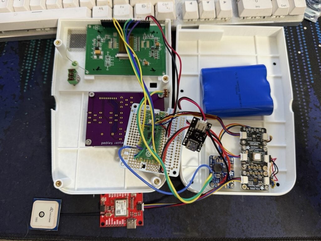
RP2350B is the main brain, running the sensor stack responsible for environmental and weather monitoring, threat detection, and overall device coordination. Its higher pin count and memory capacity made it the right choice for the heavy I/O load this build demands.
Elsewhere, an RP2350A runs a TMS5100-class linear predictive coding (LPC) speech synthesiser, providing the voice ATLAS speaks with. Apollo tuned the vocabulary so that ATLAS’s spoken words — numbers, status updates, alerts, and so on — sound the way they would coming from a Tricorder. As the maker explains: “A 1978-lineage voice on your 2024 silicon, in a real device in 2026. It felt right.”
Massive sensor stack
We’re a British company, so we’re largely averse to tooting our own horn. T’would be crass. So instead, we’ll subtly share this quote from the maker — the grandfather of the modern Tricorder, if you will — about how endlessly powerful our silicon is:
“…the sensor stack is massive — IMU (Inertial Measurement Unit), pressure, CO, CO₂, radiation, light, microphone, and more. ATLAS doesn’t just collect data, it runs sensor fusion across the stack to understand where it is and what’s happening around it, and warns the operator when something is going to hurt them. The two RP2350s powering the ATLAS Command Module make all of that run… And frankly, the datasheet is readable, which is rarer than it should be.”
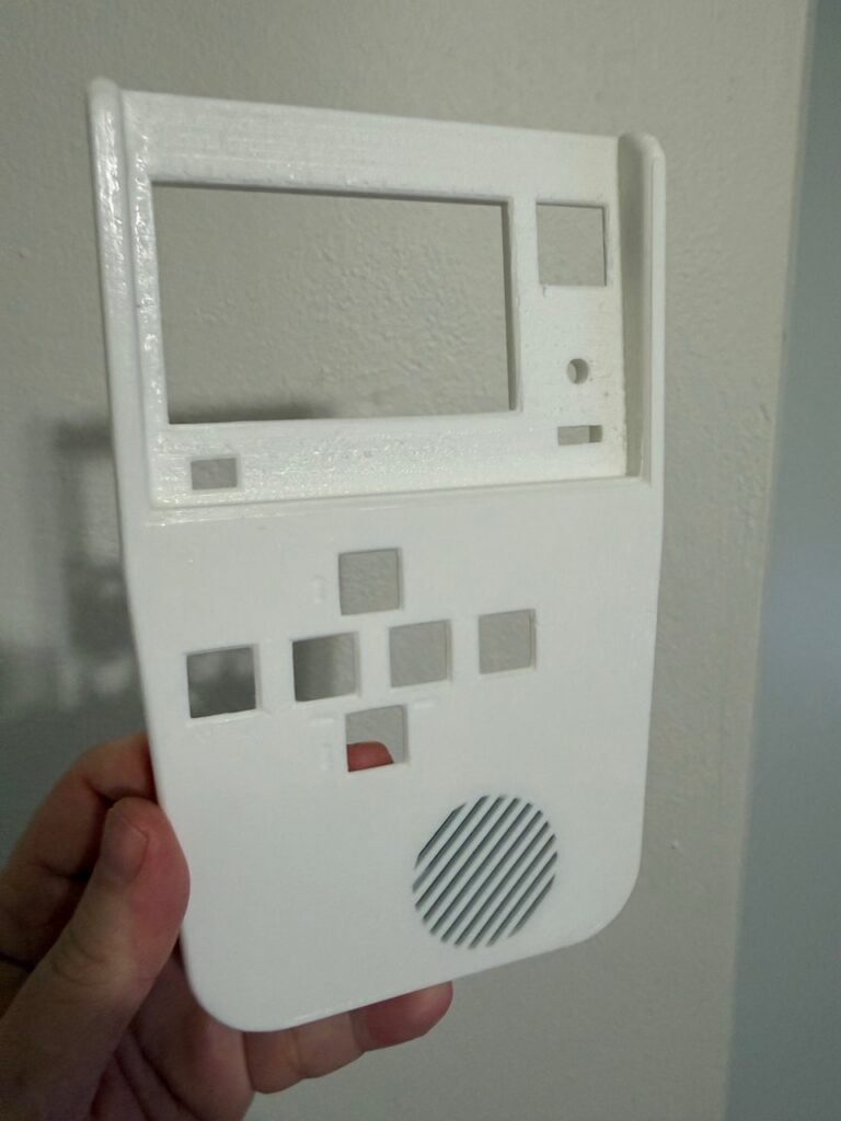
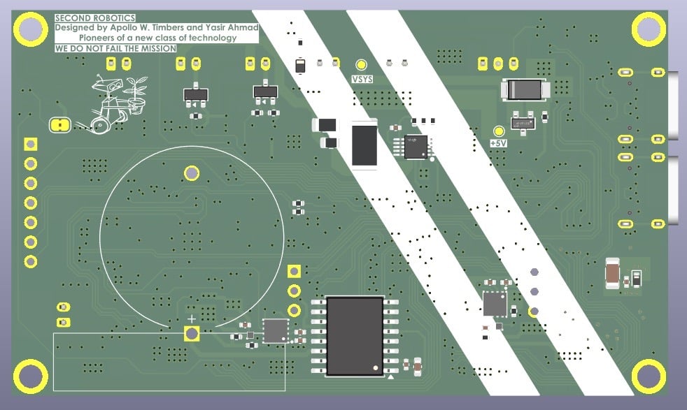
This compact handheld device has a number of possible applications, and its potential for monitoring human safety is immeasurable. Take a look at more designs from Apollo Timbers’ company, Second Robotics.
The post ATLAS: a modern Tricorder designed to survive unforgiving terrain appeared first on Raspberry Pi.
Pennsylvania, USA
Pennsylvania, USA
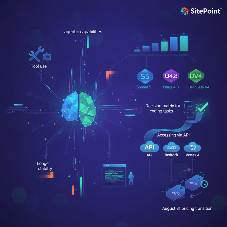
Claude Sonnet 5 developer decision guide. Sections: What changed from Sonnet 4.6 (agentic capabilities, tool use, longer output stability), Sonnet 5 vs Opus 4.8 vs DeepSeek V4 for coding tasks (decision matrix, not benchmark table), accessing Sonnet 5 via API (model ID: claude-sonnet-5, available on Claude API, Bedrock, Vertex AI), Claude Code integration (how Sonnet 5 performs as default CLI model), the August 31 pricing transition ($2/$10 intro → $3/$15 standard), and what ‘agentic’ means for your daily coding (real examples of Sonnet 5 autonomous workflow capabilities).
Continue reading Claude Sonnet 5: The Developer’s Guide to Anthropic’s New Default Model on SitePoint.
Pennsylvania, USA
Next Page of Stories