Despite hundreds of billions of dollars in investment, nearly half of planned U.S. data center projects are being delayed or canceled. "One major reason behind these setbacks is the availability of key electrical components -- such as transformers, switchgear, and batteries -- that are used both at data center sites and outside of them," reports Tom's Hardware. "Meanwhile, grid infrastructure is also stressed by electric vehicles and electrified heating systems." Tom's Hardware reports: Approximately 12 gigawatts (12 GW) of data center capacity is expected to come online in the U.S. in 2026, according to data by market intelligence firm Sightline Climate cited by Bloomberg. Yet only about one-third of that capacity is currently under active construction because of various constraints.
Electrical infrastructure represents less than 10% of total data center cost, but it is as vital as compute hardware. A delay in any single element of the power chain can halt the entire project, which makes transformers, switchgear, and similar devices critical items despite their relatively small share of CapEx. Due to high demand, lead times for high-power transformers have expanded dramatically in the U.S.: delivery typically took 24 to 30 months before 2020, but waiting periods can stretch to as long as five years today, according to Sightline Climate cited by Bloomberg. For AI data centers, this is a catastrophe as their deployment cycles are under 18 months.
To address shortages, companies are turning to global markets. As a result, Canada, Mexico, and South Korea became the biggest suppliers of high-power transformers for AI data centers to AI data centers. At the same time, imports of high-power transformers from China surged from fewer than 1,500 units in 2022 to more than 8,000 units in 2025 through October, according to Wood Mackenzie data cited by Bloomberg. The volatility of exports from China does not end with transformers, as the PRC accounts for over 40% of U.S. battery imports, while its share in certain transformer and switchgear categories remains near 30%, according to Bloomberg.
For people who entered the world of desktop computing at a certain time, Microsoft Publisher was a revolution. Combining the power of high-end desktop publishing software with the ease of use of a word processor, the application opened up new creative possibilities for a generation. But the party had to come to an end – or at least this is what Microsoft believes. Last year the company announced that the much-loved Publisher would be retired. Now this is getting a step closer. While many users may have been hoping that Microsoft Publisher would be given a stay of execution, it… [Continue Reading]
In this release, we are focusing even more on improving the everyday developer experience by refining the core workflows and adding native cargo-nextest support directly in the IDE. Running tests in large Rust workspaces can be slow with the default test runner. Many teams rely on Nextest for faster, more scalable execution, but until now, that meant leaving the IDE and switching to the terminal. You can now run and monitor Nextest sessions with full progress reporting and structured results in the Test tool window, without leaving your usual workflow.
Rust provides a robust, built-in framework for writing and running tests, as described in The Rust Programming Language. This ecosystem centers around the #[test] attribute, which identifies functions as test cases. Developers typically execute these tests using the cargo test command.
This standard setup handles unit tests (next to the code they test), integration tests (in a separate tests/ directory), and even documentation tests within comments. When cargo-test runs, it compiles a test binary for the crate and executes all functions marked with the #[test] attribute, then reports whether they passed or failed.
Testing in RustRover
RustRover’s testing integration is designed to mirror this experience within a visual environment. It parses your code for test functions and modules, adding gutter icons next to them for quick execution.
When you run a test, RustRover uses the standard Test Runner UI. It translates the output from cargo-test into a structured tree view in the Run or Debug tool window, so that you can inspect results more easily. Filter results, jump to failed tests, view output logs per test case, and restart failed tests with a single click, all within the IDE context. You can read more in our documentation.
The benefits of cargo-nextest
While the standard cargo-test works well for many projects, it can start to show scalability issues in large, complex workspaces. Nextest is an alternative test runner for Cargo, built specifically to address these bottlenecks and provide a faster, more robust testing experience.
“When I started building cargo-nextest, the goal was to make testing in large Rust workspaces faster and more reliable. Seeing it integrated natively into RustRover means a lot to me; I’m thrilled developers can now benefit from nextest’s feature set without leaving their IDE. Thanks to the JetBrains team for the thoughtful integration and for supporting the project!”
Software Engineer at Oxide Computer, author of cargo-nextest – a fast Rust test runner
The key benefits of switching to cargo-nextest include:
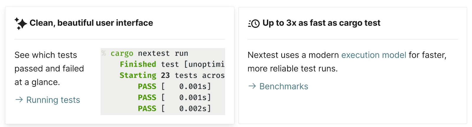
Significantly faster execution. Nextest uses a different model: it executes tests in parallel using a process-based model and schedules them across all available CPU cores. This can make tests up to 3x faster than cargo test, especially in massive workspaces where the standard runner’s overhead becomes significant.
Identify flaky tests. Nextest includes powerful, built-in support for retrying failed tests. This helps to identify and mitigate flaky tests (tests that fail intermittently) without halting the entire suite.
Pre-compiled test binaries. It separates the process into distinct build and run phases. This allows test binaries to be pre-compiled, for example, in CI, and then executed across multiple machines or environments.
Actionable output. Nextest provides structured, color-coded output designed to highlight the critical information. It simplifies failure analysis by grouping retries and providing summary statistics.
How cargo-nextest is implemented in RustRover
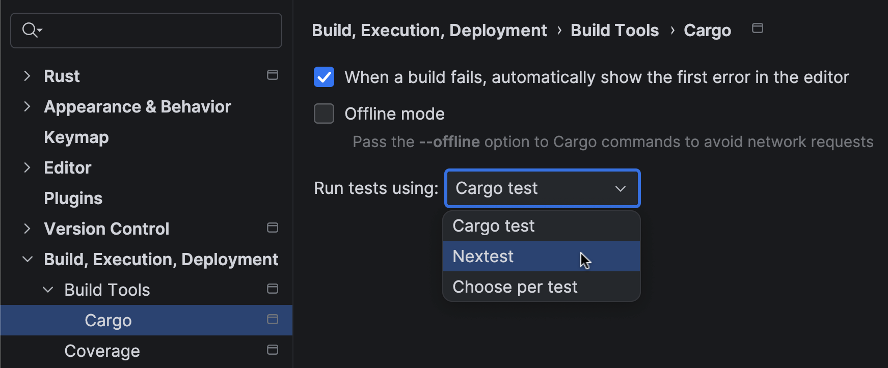
With the 2026.1 release, we have integrated cargo-nextest directly into RustRover’s existing testing infrastructure. The goal was to bring the speed and flexibility of Nextest without changing the workflow users already know.
Seamless integration
The integration works by adapting RustRover’s test runner to communicate with the cargo-nextest CLI instead of cargo-test. Here is how it works in RustRover:
You can now select Nextest as the preferred runner in your Run/Debug Configuration. RustRover automatically detects if cargo-nextest is installed in your environment and offers it as an option.
The same gutter icons and context menu actions (Run 'test::name') that work for standard tests will now invoke cargo-nextest, as long as it is configured as your runner.
We have also mapped Nextest’s specialized output onto RustRover’s standard Test Runner UI. This means you get the performance benefits of Nextest while keeping the hierarchical tree view, failure filtering, and integrated output logs that make debugging efficient.
Progress reporting
We’ve also focused on making full use of Nextest’s detailed progress reporting. As your test suite runs, the Test tool window updates in real time, showing the status of each test (queued, running, passed, failed, or retried). The visual feedback is smooth and immediate, so you can always see the state of your test run without switching context.
By bringing native cargo-nextest support into RustRover, we want to provide a development environment that scales with your projects. Large Rust workspaces demand performance, and this integration ensures you use the best-in-class tools without compromising the productivity of your IDE workflow.
A special note of gratitude
Finally, we want to thank Rain, the author of cargo-nextest. Their work has significantly improved the developer experience in the Rust ecosystem by making the testing process faster and more reliable. If cargo-nextest has become an essential part of your workflow, we encourage you to support the project. You can contribute to its continued development by sponsoring the project.
OpenClaw's Node for VS Code extension proved it can support a real local file-based workflow, but on Windows the experience still feels more like early infrastructure than finished tooling.
ESLint v10.2.0 adds support for language-aware rules through the new meta.languages property. Rule authors can now explicitly declare which languages a rule supports, and ESLint will throw a runtime error if that rule is enabled for an unsupported language, as specified by the language configuration option.
Here is an example of a rule that only supports the JavaScript language:
With the Temporal proposal now at TC39 stage 4, ESLint v10.2.0 recognizes Temporal as a built-in global. As a result, the no-undef rule no longer flags Temporal under the default configuration:
/* eslint no-undef: "error" */const now = Temporal.Now.instant();// OK
1 2 3
In addition, the no-obj-calls rule now reports direct calls to the global Temporal object:
/* eslint no-obj-calls: "error" */Temporal();// Error: 'Temporal' is not a function.
1 2 3
Features
586ec2f feat: Add meta.languages support to rules (#20571) (Copilot)
This month, our Windows team shared a candid update on how we're thinking about Windows quality, what's changing behind the scenes, and how your real-world feedback is shaping the platform. It's all in a post entitled Our commitment to Windows quality. Windows + Devices EVP Pavan Davuluri walks through how we identify issues, prioritize fixes, and how the Windows Insider community helps make Windows more reliable before updates reach production environments. It's a helpful read if you're interested in learning more about how we build, measure, and strengthen Windows quality.
Now on to more highlights from March in this month's edition of Windows news you can use.
New in Windows update and device management
[AUTOPATCH] – Windows Autopatch update readiness is now generally available. It includes new capabilities to help you proactively detect and remediate device update issues. Reduce downtime, improve update success, and lower the security risk that comes from devices that aren't up to date.
[HOTPATCH] – Windows Autopatch is enabling hotpatch updates by default starting with the May 2026 security update. This change in default behavior will come to all eligible devices in Microsoft Intune and those accessing the service via Microsoft Graph API. New controls are available for those organizations that aren't ready to have hotpatch updates enabled by default.
[RSAT] – Remote Server Administration Tools (RSAT) are now officially supported on Arm-based Windows 11 PCs. You can now remotely manage Windows server roles and features using Windows devices built on Arm processors, just as you would with traditional x64-based PCs.
[SECURE BOOT] – The March 2026 security update introduces two new PowerShell features to help you manage the ongoing Secure Boot certificate rollout. The Get-SecureBootUEFI cmdlet now supports the -Decoded option, which displays Secure Boot certificates in a readable format. The Get-SecureBootSVN cmdlet lets you check the Secure Boot Security Version Number (SVN) of your device's UEFI firmware and bootloader. Use it to report whether the device follows the latest Secure Boot policy.
[PRINT] – Instead of requiring device-specific drivers, Windows is now released with a single, universal, inbox-class driver based on the industry standard IPP protocol and Mopria certification. If you're using a traditional x64 PC, including the latest Copilot+ PC running on Arm-based silicon, the print experience is the same: plug in (or connect over the network) and print.
[W365] – Windows 365 Frontline in shared mode is now available in Brazil South, Italy North, West Europe, New Zealand North, Mexico Central, Europe, Norway East, France Central, Spain Central, Germany West Central, and Switzerland North. Windows 365 is now available for Government Community Cloud (GCC & GCC-High) organizations in the US Gov Texas region. In addition, multi-region selection is now available for Windows 365 GCC & GCC-High.
[DRIVERS] – Starting with the April 2026 security update, Microsoft is removing trust for all kernel drivers signed by the deprecated cross-signed root program. This update will help ensure that by default, you can only load kernel drivers the Windows Hardware Compatibility Program (WHCP) passes and signs. This new kernel trust policy applies to devices running Windows 11 and Windows Server 2025.
[SECURE BOOT] – Catch up on the latest FAQs by watching the March edition of Secure Boot: Ask Microsoft Anything (AMA) on demand. The next AMA will be April 23, 2026. Save the date and post your questions in advance or during the live event. New guidance and resources are now available, including:
Guide: Secure Boot certificate update status in the Windows Security app[SYSMON] – System Monitor (Sysmon) functionality is now natively available in Windows. Capture system events for threat detection and use custom configuration files to filter the events you want to monitor. Windows writes captured events to Windows Event Log, which allows security tools and other applications to use them.
[WDS] As announced in January 2026, the Unattend.xml file used in hands‑free deployment with Windows Deployment Services (WDS) poses a vulnerability when transmitted over an unauthenticated RPC channel. Beginning with the April 2026 security update, the second phase of hardening changes for CVE-2026-0386 begins. These changes will make hands‑free deployment disabled by default to enforce secure behavior. For detailed guidance, see Windows Deployment Services (WDS) Hands‑Free Deployment Hardening.
New in AI
[W365] [AGENTS] – Curious about the difference between Windows 365 for Agents and Microsoft Agent 365? Explore the distinct role of each product and learn how to use them together to run agentic workloads securely, at scale, and under enterprise governance.
To learn about latest capabilities for Copilot+ PCs, visit the Windows Roadmap and filter Platform by "Copilot+ PC Exclusives."
[EVENT] – Save the date for the Windows Server Summit, May 11-13. RSVP for three days of practical, engineering-led guidance on real-world operations, security, and hybrid scenarios supported by live Q&A.
[NVMe] – A basic NVMe-over-Fabrics (NVMe-oF) initiator is available in the latest Windows Server Insiders build. This release introduces an in-box Windows initiator for NVMe/TCP and NVMe/RDMA, enabling early evaluation of networked NVMe storage using native Windows Server components.
New in productivity and collaboration
Install the March 2026 security update for Windows 11, versions 25H2 and 24H2 to get these and other capabilities, which will be rolling out gradually:
[RECOVERY] – Quick Machine Recovery now turns on automatically for Windows Professional devices that are not domain‑joined and not enrolled in enterprise endpoint management. These devices receive the same recovery features available to Windows Home users. For domain‑joined or enterprise managed devices, Quick Machine Recovery stays off unless you enable it for your organization.
[NETWORK] – A built‑in network speed test is now available from the taskbar. The speed test opens in the default browser and measures Ethernet, Wi‑Fi, and cellular connections.
[CAMERA] – Control pan and tilt for supported cameras in the Settings app.
[SEARCH] – Using search on the taskbar? Preview search results by hovering and quickly seeing when more results are available with group headers.
New features and improvements are coming in the April 2026 security update. You can preview them by installing the March 2026 optional non-security update for Windows 11, versions 25H2 and 24H2. This update includes the gradual rollout of:
[SECURITY] –You can turn Smart App Control on or off without needing a clean install.
[SETTINGS] – The Settings > About page now provides a more structured and intuitive experience. Get clearer device specifications and easier navigation to related device components, including quick access to Storage settings.
Lifecycle reminders
Windows 10 Enterprise 2016 LTSB and Windows 10 IoT Enterprise 2016 LTSB will reach end of support on October 13, 2026. Windows Server 2016 will reach end of support on January 12, 2027. If your organization cannot migrate to newer, supported releases in time, explore the options available to help you keep your devices protected with monthly security updates. Extended Security Updates (ESU) are now available for purchase for Windows 10 Enterprise 2016 LTSB.
Looking for the latest news and previews for Windows, Copilot, Copilot+ PCs, the Windows and Windows Server Insider Programs, and more? Check out these resources:
Windows Roadmap for new Copilot+ PCs and Windows features – filter by platform, version, status, and channel or search by feature name
If you're an IT admin with questions about managing and updating Windows, add our monthly Windows Office Hours to your calendar. We assemble a crew of Windows, Windows 365, security, and Intune experts to help answer your questions and provide tips on tools, best practices, and troubleshooting.
Finally, we're always looking to improve this monthly summary. Drop us a note in the Comments and let us know what we can do to make this more useful for you!
 Log in


