Amir Salihefendic has been building Todoist for 20 years, but he also started his career as a developer who gradually discovered his entrepreneurial ambitions. That experience shaped his talk at the Shift conference, where he focused on developers who are considering starting their own companies.
As someone who has spent nearly 20 years following developers, founders, and tech entrepreneurship, I spoke with Amir after his talk about what developers need to know to become founders. We discussed how AI is changing software development, junior hiring, product building, and what one person can achieve.
Developers are not doomed
What happens to developers now that AI can write code? It has probably become one of the most common questions at tech conferences over the past few years, ever since the AI revolution began. Naturally, I opened my conversation with Amir by asking exactly that.
Amir has programmed since childhood and spent over 20 years developing his own Vim configuration, which he says became one of the world’s most popular. Today, he barely uses the editor the same way and rarely reviews code in detail (except when security, models, or other areas need his attention).
Still, he doesn’t think developers are becoming irrelevant. Quite the opposite:
My contrarian view on this is: developers are still super critical, because I don’t think code was ever the objective. What is objective? Solving problems for customers, building systems.
In other words, writing code was never the whole point. Code serves as a tool, while solving customer problems and building systems remain the real goals.
What changes now is the level at which developers work. Managing agents, configuring them, coordinating multiple systems, and working with what Amir calls agent swarms all matter more and more.
That shift also dramatically changes the leverage a single developer can have:
I think the difference between a good developer and an amazing developer is not a 10x anymore. It’s 1000x.
Juniors may have an advantage that seniors do not
That raises another question: how can someone who enters the industry today learn what good engineering actually looks like?
Amir sees a potential advantage for junior developers here. Unlike seniors, they do not carry 20 years of habits that they first need to unlearn – they can start from first principles and treat agents, agent swarms, or systems that build other systems as a natural part of development, instead of trying to retrofit them into a workflow they have followed in the same way for years.
But that advantage has its limits: AI models still cannot replace the kind of experience that helps developers recognize whether a solution is actually good:
This said, I do still think the models are not good enough for a lot. Especially architecture.
Customers are still P1 for founders
AI may let one person build more, but a founder’s main job is still the same.
I asked Amir what developers should focus on when they also have to think about design, marketing, sales, hiring, and fundraising. Once again, he came back to the basics: customers:
Again, I’m actually not sure how much has changed, because I think in the end what you’re building for is customers, it’s other people, it’s empowering them. And you need to find out: how can you get customers? How can you build something useful? And that is maybe the P1. Everything else, attending conferences, getting investment, should not be a P1.
He says new founders often reverse that order. They start with incubators, try to raise money, or look for a co-founder, and only then ask whether anyone actually needs what they are building.
None of those things lack value. They simply do not belong at P1:
But P1 is finding customers, finding something useful, building something useful, trying it out, learning from that, getting kicked in your face. And then you go back and you rebuild and you learn. And also this loop is very critical.
In other words, build something, put it in front of users, make mistakes, learn from them, and build again. Amir sees that loop as one of the key parts of building a company.
Do not blindly copy Silicon Valley
From the very beginning, Todoist followed a different organizational model from the classic Silicon Valley playbook, but Amir did not choose that path because he had a grand theory about the future of work.
The company went remote because he lived in Chile and simply could not find enough people to hire locally.
At one point, he actually planned to move to Silicon Valley and start the company there, but then he met his wife and changed his plans.
That experience shaped another piece of advice he gives developers who want to become founders: instead of copying someone else’s formula, start with your own circumstances, abilities, and strengths:
I do think you need to work in what kind of environment you have, what kind of skills you have, what kind of strengths you have, and then work from that.
For that reason, founders should not treat his remote model as a template that automatically works for every company.
The same goes for following other founders too closely:
You follow what I have done, or you see something on X or some other founder, and then you just blindly follow them. That’s probably not going to lead to a very good outcome.
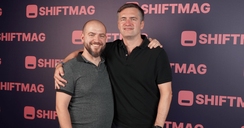
After his talk at Shift, Amir and I sat down for an inspiring conversation. Photo by Marko Mudrinić.
If you start an AI startup today, you may already be too late
AI has become impossible to ignore, swallowing the tech industry’s attention. Almost every startup wants to become AI-native, conversations turn to agents, and everyone looks to Silicon Valley again.
So I asked Amir whether developers outside this wave should feel they’re missing out. He gave one of the most direct answers of our conversation:
In a lot of cases, if you actually start an AI startup right now, you’re probably too late.
For him, understanding technological S-curves matters much more: founders need to recognize which stage a particular technology has reached.
Ideally, he says, you enter a trend before exponential growth begins. AI may already be deep into that curve, while space could still be near the start.
The reverse is true too: in mature markets, making a significant impact is much harder:
For instance, if you do SaaS right now, that is freaking mature. You have very, very entrenched companies. Of course, maybe by some miracle you can do something that’s 10x, but it’s highly unlikely.
Rather than chase the hottest field, founders should understand where the market and their company sit on the S-curve and where they want to compete. The same applies to fundraising: know what game you’re choosing to play.
Before taking VC money, you need to know which game you are playing
Todoist has remained bootstrapped, and when I asked how he thinks about company financing today, Amir returned to the same starting point: founders who lack traction, customers, proof that the product works, or a personal track record will struggle to raise money.
His preferred order therefore remains the same. First, build, learn, and find customers. Only then decide whether fundraising makes sense at all.
But another part of that decision matters even more. VC money comes with very specific expectations about what company success should look like:
VCs want to see billion-dollar outcomes. If you don’t have a realistic way to achieve that, even if you lie, say, okay, this is our path, but you don’t really believe it, at some point they are going to push you to their direction, and then they’re going to mess up your company, because that is what you’re signed up for.
The problem, then, does not lie in the VC model itself. The problem appears when a founder accepts that kind of capital without actually wanting to build the kind of company that the VC game requires.
That is one of the reasons Amir has never raised money for Todoist:
Why I have never raised money for Todoist is because I don’t want to build a billion-dollar ARR business.
Bootstrapping is like climbing Everest without oxygen
That does not mean Amir sees bootstrapping as an easier or more relaxed alternative to the VC path.
I also wanted to know whether people have romanticized bootstrapping in recent years. Founder stories often present it as a way to avoid investor pressure, keep control, and build a company at your own pace.
Amir dismantles that image:
But I think bootstrapping is incredibly hard. It’s not the easy path. What I actually tell my team is: we are climbing Mount Everest without oxygen, and with oxygen is the capital. That is what you’re signing up for.
So the real question is not whether bootstrapping beats VC funding. Founders need to ask what they actually want from their company and from their own lives.
Not every company fits the VC path. At the same time, bootstrapping comes with serious constraints of its own.
Todoist removed “balance” from its core value
Building a company for 20 years doesn’t mean 20 years of growth. Amir recalled that Todoist and Buffer followed a similar path: years of growth, then a plateau and slight decline.
As he puts it, growth can make you think you’re “the freaking smartest.” When it stops, you realize how much needs rethinking. At Todoist, that meant major culture changes, including dropping one word from a core value:
We actually had this core value called ambition and balance. And then we just removed balance.
Amir says that at one point he became deeply unhappy with how things worked inside his own company. He did not think the company showed enough ambition, he did not like the level of output, and he felt that the team no longer pushed boundaries.
The cultural shift went beyond words. During that process, the company let some people go, while others chose to leave:
And I think right now we have a lot more calibrated company because of that.
He sees an important lesson in that experience for new founders. The culture you create at the beginning, the first people you hire, and the first core values you define can have a huge impact on the company you eventually build.
Once the company grows, changing those foundations becomes much harder.
Todoist now wants to become a suite of apps
At the end of our conversation, I wanted to know what comes next, and Amir described two very different possible futures for Todoist.
In one, he could cut 50 percent of the team, generate much more profit and, as he joked, perhaps buy himself a small yacht, while in the other, the company would take on a much bigger problem, which is ultimately the path they chose:
Or we can just say, okay, let’s freaking solve a much, much bigger problem. So for us, we are going to create a suite of apps.
The first product in that expansion will focus on automations:
Honestly, I think what we have done technologically, but also on product side, will be really, really cool for people to see, because everything is natural language. And you tell what you want to build, and then the system builds it for you. And it’s quite affordable. So automations will be the first leak. The other one is team communication.
When Amir mentioned team communication, I asked whether that meant a return for Twist, Doist’s asynchronous team communication app, which the company developed as an alternative to real-time workplace chat.
Amir replied:
It’s coming back in a very strong form.
That fits with the broader direction Amir described for Todoist, as the company now plans to expand beyond its core product and build a wider suite of apps.
Spend a week with almost any infrastructure team in 2026 and you’ll see one AI subscription producing five very different results. One engineer opens 40 pull requests before lunch across repositories they haven’t touched in a year. Another ships a Terraform change they couldn’t explain in a code review. A third hasn’t opened the tool since the pilot and says they’ll come back “when it’s ready.”
A fourth uses it for two narrow jobs, decoding a SAML trace and writing a regex they never want to write by hand again, and may be the most productive person on the team. The fifth tried it in March and again in June, and will try it again after the next keynote.
The usual way to describe this is Everett Rogers’s diffusion curve: innovators, early adopters, early majority, late majority, laggards. Rogers’s framework measures when people adopt. It says nothing about how they use a tool once they have it, and with AI that’s where the outcomes split. The engineer with 40 PRs and the one with two use cases are both early adopters, but they achieve different results and create different types of risk for the team.
None of the five types Rogers described is new. Previous technology shifts, from the PC and the web to Stack Overflow and the cloud, produced similar behavior. AI just changes where the bottleneck sits.
The bottleneck moved
For most of software’s history, writing code was slow, so development methods focused on managing that work. Waterfall put the planning up front because changing course late was expensive. However, even in the 1970 paper that’s usually cited as the origin of waterfall, Winston Royce warned that the strictly sequential version was “risky and invites failure.” The industry skipped the warning and adopted the diagram.
Agile was the correction. The 2001 Agile Manifesto prioritized “responding to change over following a plan,” and short iterations replaced yearlong specifications. The manifesto still valued the plan, but that part got skipped too. Facebook took the idea to its limit with “move fast and break things.” At its F8 conference in 2014, it retired the slogan in favor of “move fast with stable infra,” because fixing what broke had started to cost more time than the speed saved.
AI has now sped up what was left. Models draft the code, and since GitHub made Copilot code review generally available in April 2025, a model often reviews it too. The tempting response is to push Agile further, with shorter loops, more agents, and less ceremony. In other words, break things faster. But when one engineer can open 40 PRs a day, the cumulative changes can leave the team with a system nobody can reason about.
The better position is somewhere between the two. It isn’t waterfall’s fixed specification, but it isn’t the absence of one either. It means a roadmap that says where the team is going and why, issues that state the problem before anyone generates a solution, and design reviews where people argue about trade-offs. That structure looks like it would slow things down, but it’s what makes speed safe. Jazz musicians can improvise freely because everyone on the bandstand knows the chord changes and the form of the tune. Without that framing, they’d just be making noise. A roadmap does the same job for a team of people and their agents. It sets the boundaries, and inside them everyone can move as fast as the tools allow.
With AI accelerating implementation, planning is now the only part that decides whether the fast parts are worth doing. On my blog Synthetic Auth, I’ve called this the difference between conducting and auditing. A Conductor holds the “why” (the requirements, the history, the users) and directs agents toward a “how” that fits it. An Auditor hands over a ticket, checks that the code runs and the tests pass, and ships it. Both can end up with the same diff, but only the Conductor knows whether it solves the actual problem. An AI reviewer can’t tell the two apart because it only sees the diff, not the intent behind it. Structure is what gives the Conductor something to conduct from.
The Soloist
The Soloist is often one of the strongest players on the team, with a backlog of ideas that never got planned or written up. With a fleet of agents, the Soloist can chase every one of them at once, and the result is a wall of pull requests across repositories nobody planned to change this quarter. Each solo may be well played, but the rest of the orchestra is playing something else.
The problem is that all those changes may pull the team in different directions. A team moves only when its members pull roughly the same way. What used to keep individuals aligned was cost. Weeks of effort forced someone to ask whether a project was worth starting before they started it. Agents remove that cost, so it’s worth asking three questions of any Soloist PR: How does this fit into the bigger picture? Who are the stakeholders, and did anyone talk to them? Apart from the unit tests the agent wrote alongside the code, has the change been tested against the rest of the system it touches? Too often the answer to all three is no, and the PR exists because it seemed like a good idea.
The closest historical match is end-user computing in the 1990s. Access, Visual Basic, and macro-heavy Excel let anyone with a PC build an application, and departments built thousands of them. Many were useful individually but couldn’t integrate with each other or existing IT systems, so two departments could end up with separate customer databases that disagreed about who the customers were. IT spent the next decade finding, reconciling, and retiring these systems, and the industry eventually named the problem shadow IT.
The lesson from that era is that making things cheaper to build doesn’t make them cheap. The cost moves downstream, to whoever has to integrate and maintain the result. AI review can keep up with the volume, but it judges each diff on its own terms. It can’t tell you that 40 correct PRs are pulling in 40 directions, or that the agent’s tests only prove the code does what the agent assumed it should. The productivity may also be smaller than it feels. In METR’s 2025 randomized study, 16 experienced open source developers took 19% longer on real tasks when they were allowed to use AI. Afterward, they estimated it had made them 20% faster.
One thing is new. Access never told anyone their idea was brilliant. Today, the Soloist drafts an RFC with a model, asks the same model whether the RFC is sound, and gets an enthusiastic yes. This model sycophancy is a widely known problem: In April 2025, OpenAI even rolled back a GPT-4o update after users found it praising nearly any idea they gave it. Weak proposals used to die early, stopped by a skeptical colleague or a blank page. Now that friction is gone.
The answer isn’t to take the tool away. The Soloist is often your most capable engineer, and the agents make them more capable still. Bring them back into the orchestra instead. Tie every PR to an issue on the shared roadmap, and name the stakeholders before the work starts, not after it ships. Require integration or end-to-end testing for any change that crosses a service boundary rather than relying on agent-written unit tests. Have a person review every RFC, not the model that helped write it. The goal is to keep that talent working toward shared priorities.
The Copy-Paster
AI helps the Copy-Paster faster than anyone else. A task that used to stall for a day, like a Helm chart, an IAM policy, or a regex for parsing logs, now gets done in minutes. The trouble is that the work gets finished before it gets understood. Like a junior engineer, the Copy-Paster can’t tell an answer that works from one that’s correct, and AI output nearly always looks like it works. The Copy-Paster is an Auditor by default, and one without the knowledge to audit.
Earlier programming tools created similar problems. Programmers took the phrase “cargo cult” from Richard Feynman’s 1974 Caltech commencement address to describe code that copies the form of a working solution without the understanding behind it. Stack Overflow then made copying that form effortless. Researchers at Fraunhofer AISEC and TU Munich measured the result in “Stack Overflow Considered Harmful?” (IEEE Symposium on Security and Privacy 2017). Of 1.3 million Android apps, 15.4% contained security-related code copied from Stack Overflow, and 97.9% of those included at least one insecure snippet.
The industry responded to Stack Overflow’s risks with guardrails: linters, static analysis in CI, mandatory code review and frameworks with safe defaults. The same approach works for AI, because guardrails check the output, whoever or whatever produced it.
Autonomous agents raise the stakes. Code pasted from Stack Overflow still had to get through a build and a review before it could do damage. An agent running with the Copy-Paster’s credentials can apply the change itself, in production, with every permission that person holds. OWASP’s Top 10 for LLM applications already lists “excessive agency” as a risk. The Copy-Paster is the user most likely to grant it, because they’re the least able to judge what the agent is about to do.
Manage them like a junior engineer, even when their title says senior. Give agents their own scoped, short-lived credentials rather than the user’s. Require plan-then-apply workflows, so a person approves the diff before anything runs. In review, ask the Copy-Paster to explain each change in their own words. That’s how they learn, and it’s how you find out whether they understood the change.
The Godot Waiter
The Godot Waiter isn’t against AI. They’re waiting for it to be ready: more accurate, better governed, cleared by security, or just further along. Like Beckett’s two tramps, they have a reasonable explanation for why today isn’t the day, and they’ve been giving it for a while.
Every platform shift has had its waiters. Mainframe shops held out through the move to client/server, and “nobody ever got fired for buying IBM” was a real strategy, not a punchline. Two decades later, plenty of enterprises said they would never put sensitive data in a public cloud. That position got much harder to defend once the CIA signed a $600 million contract with Amazon Web Services in 2013.
Waiting can be rational. Letting others pay the early-adopter tax is a legitimate strategy, and the Godot Waiter often catches problems the enthusiasts miss. The danger is that a finished, trustworthy version never arrives as a single event. Meanwhile, the people who used the tools along the way have built judgment that the Godot Waiter can’t acquire all at once.
The irony is that the Godot Waiter often has a good Conductor’s instincts, including skepticism, attention to context, and a demand to know why. They just haven’t picked up the baton. Treat their objections as requirements. Ask what would have to be true, write it down, and check it again in six months. Start them on low-risk read-only work, like summarizing an incident timeline or explaining an unfamiliar codebase. Skepticism applied to real output is valuable, but skepticism with no use behind it teaches nothing.
The Specialist
The Specialist uses AI for a short list of specific jobs that fill gaps in otherwise deep expertise. A network engineer who knows BGP thoroughly has the model write the Python that parses 40 router configs. An identity architect who can recite the OAuth specs has it decode an unfamiliar SAML assertion, then asks why the assertion was built that way. They use AI as much to understand things as to produce them.
The closest recent match is the scientific Python stack. In 2008, Wes McKinney was a researcher at the hedge fund AQR. His team could talk through a typical project in a half-hour meeting, but actually getting it done was, as he later put it, “a whole lot of work,” most of it cleaning and moving data around. He built what became pandas to fix that one problem. Scientists took the same path with Jupyter notebooks. When LIGO released the data from its first gravitational-wave detection in 2016, it included a notebook walking through the signal processing.
That pattern produced the most lasting gains of each era. The Specialist can check the output, because they know what a “right” answer looks like. Their prompts are precise, because they know what they’re asking. When they use the tool to learn, the knowledge stays with them after the session ends, so they need the tool less over time, not more. The Specialist is a Conductor with a short score: They hold the “why” themselves and hand the tool only the “how.”
The Specialist needs the least management and is the easiest to overlook, because their output doesn’t show up as a wall of PRs. Find them and ask what they use AI for. Their lists of narrow, proven uses are a better guide to your team’s AI strategy than any vendor demo.
The Tourist
The Tourist tries the tool when it’s in the news, gets an impressive answer or a bad one, and drifts away until the next launch. If the others are conducting or auditing, the Tourist is in the audience. Every hype cycle has had them. They built the GeoCities pages in the late 1990s that were never updated, and the corporate offices in Second Life that stood mostly empty a few years after the 2006–2007 rush.
Tourists can distort your metrics. They show up in license counts and “Have you used AI this month?” surveys, which makes adoption look broad when real use is actually concentrated in a few people. Leaders who budget against those numbers get a surprise at renewal time. Measure repeated use of specific workflows, not logins, and give each Tourist one concrete task in their own job that the tool reliably helps with. Some will become Specialists.
Modes, not personalities
These are modes, not personality types. The same engineer can be a Soloist on a weekend side project, a Specialist at work, and a Godot Waiter about letting agents touch production. This means that giving an engineer the right structure can help them shift modes. When writing and reviewing code both take minutes, the issue, the roadmap, and the design review are what keep a team’s people conducting rather than auditing.
Mode
Relationship to the baton
Main risk
What a lead should do
Soloist
Playing a part nobody scored
Many directions at once; changes untested across the system; sycophancy approves weak ideas
Tie PRs to the shared roadmap, name stakeholders up front, require system-level testing, have people review RFCs
Copy-Paster
Auditing without the means to audit
Code and actions nobody understands, now with real permissions
Turn objections into written criteria; start with read-only uses
Specialist
Conducting a short score
Overlooked, so their practices don’t spread
Collect their use cases and share them
Tourist
In the audience
Inflated adoption numbers
Measure repeated workflow use, not seats
Rogers’ curve may eventually show near-universal AI adoption in IT, but adoption alone won’t reveal how effectively people use it. What will matter is whether the people using it are still conducting their agents or are being conducted by them.
Kaloyan Chalakov: When Textbook Scrum Hurt the Team, Learning to Adapt as a Scrum Master
Read the full Show Notes and search through the world's largest audio library on Agile and Scrum directly on the Scrum Master Toolbox Podcast website: http://bit.ly/SMTP_ShowNotes.
"It doesn't matter if it works for you. The most important thing is that it doesn't work for me." - Kaloyan Chalakov
Kaloyan Chalakov came into Agile after years in safety-critical environments, where control and preparation mattered. That background helped him, but it also created his first big Scrum Master trap: trying to be the "perfect" Scrum Master from the books. He pushed two-week sprints, events, and practices because that was how Scrum was supposed to work. Then one team member pulled him aside and told him the truth: the process did not work for him. Kaloyan's first reaction was defensive, because his pride was hurt. But that feedback became a signal. He started using that team member as a barometer for whether the change was actually helping. The lesson was simple and hard: one approach does not fit every team. Real Scrum Mastery starts when we treat resistance as information, take smaller steps, and adapt the system to the people doing the work.
Self-reflection Question: Where are you defending a process because it is "right," instead of listening to the team signals that show whether it is useful?
[The Scrum Master Toolbox Podcast Recommends]
🔥In the ruthless world of fintech, success isn't just about innovation—it's about coaching!🔥
Angela thought she was just there to coach a team. But now, she's caught in the middle of a corporate espionage drama that could make or break the future of digital banking. Can she help the team regain their mojo and outwit their rivals, or will the competition crush their ambitions? As alliances shift and the pressure builds, one thing becomes clear: this isn't just about the product—it's about the people.
🚨 Will Angela's coaching be enough? Find out in Shift: From Product to People—the gripping story of high-stakes innovation and corporate intrigue.
Kaloyan Chalakov spent years making high-stakes decisions at sea before moving into Agile and organisational change, bringing lessons from safety-critical systems into how modern teams work.
Technology is changing how we interact with the world, but what if that interaction could restore a fundamental human connection?
In this episode, Rachid Finge sits down with Google's Director of Product Management, Angana Ghosh, to go behind the scenes of two of Pixel's most groundbreaking accessibility features: Guided Vision and Sign to Text. Angana shares the incredible journey of working with the blind and deaf communities to solve "impossibly hard" research problems, revealing the profound human moments and surprising insights that shaped these tools.
This isn't just about building smarter software; it's about creating a world where technology adapts so fluidly that the interface itself fades away, empowering everyone with more independence.
It’s the last Maker Monday before Halloween and we still don’t have a costume sorted, so instead, we’re going to follow this treat of a tutorial from The Raspberry Pi Guide to Retro Gaming to disguise our Raspberry Pi as the classic 8-bit Apple II computer.
The Apple II was not the first personal or home computer, but it was part of the iconic ‘trinity’ of computers that came out in 1977: Apple II, Commodore PET, and TRS-80. The Apple II wasn’t as capable a gaming computer as some of the other 8-bit systems of the era, but it was designed with games in mind. In designing the Apple II, Steve Wozniak took inspiration from his work on the Breakout arcade game during his time at Atari. It’s why the Apple II has colour graphics, support for paddle controllers, and even audio.
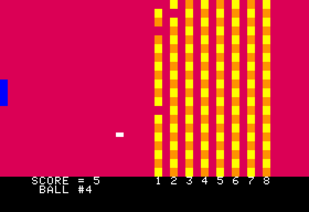
Playing a piece of computing history! (10 points to anyone who can tell us what this is in the comments)
Apple II audio was quite limited: anything more complex than a beep was quite CPU-intensive. Add-on audio boards, such as the Mockingboard, became popular and enjoyed support from a number of game developers.
The Apple II included a version of the BASIC language that only supported integer numeric data types: by eschewing floating-point numbers, Wozniak’s Integer BASIC, as it was called, processed numbers extremely fast. This made it less than ideal for certain programming tasks, but it was fantastic for video games. Integer BASIC was supplied in the system ROM image of the Apple II, while a more full-featured BASIC, Applesoft BASIC, was originally supplied on cassette tape (it would be baked into the system ROM beginning with the Apple II Plus, though).
Install an Apple II emulator
For Apple II emulation on Raspberry Pi, we are using the LinApple emulator. It’s a fork of the AppleWin emulator which was originally created by Mike O’Brien. David Baucum (maxolasersquad) and several other contributors got it running on Linux. You may also want to have a look at audetto’s fork of the AppleWin emulator. Because audetto’s fork is regularly synchronised with the original AppleWin GitHub repository, it tracks AppleWin features more closely.
LinApple can emulate Apple II sound cards such as the Mockingboard (enabled by default in the configuration file). LinApple is not available through the Raspberry Pi OS apt repository, so you’ll need to compile it yourself. Fortunately, it’s quite easy to do this. First, open a Terminal window. This is where you’ll install dependencies, download the source code, and compile, then install it.
In the Terminal window, run these commands to update your operating system packages and to install the dependencies needed to compile LinApple. You may be prompted for your password when you run the commands that use sudo.
Now you’re ready to clone the emulator repository. If you’d prefer not to check the source code out into the root of your home directory, create a directory and change into it before you clone it. For example, mkdir ~/src would create a src directory under your home directory, and cd ~/src would change into it. You can clone the repository with this command:
The first cmake command prepares the source code, and the second compiles it. The -j4 argument tells cmake to use as many as four CPU cores. Once it’s compiled successfully, install it under the /usr/local folder with:
$ sudo cmake --install build
Now you can run the emulator from any Terminal window with the command linapple. But before you do that, let’s customise some options. First, copy the default configuration file and sample disk image to your home directory. You’ll need to create a couple of directories before you copy files into them:
Next, edit your configuration file with your favourite editor, for example using nano ~/.config/linapple/linapple.conf, and make these changes:
Find the entry that reads Joystick 0 = 2 and change 2 to 4. This lets you use your mouse as a joystick, which you’ll either love or hate (give it a try in Brickout later in the article!). The configuration file describes the other options you can choose.
Locate the Screen factor = 1.0 entry and change 1.0 to 2.5. This will make the emulator window a bit bigger.
Save the config file and exit your editor. If you’re using the nano editor, press CTRL+X, answer Y for yes, then press ENTER to confirm the file name. Let’s test LinApple and make sure everything is working. In the Terminal window, run the following command:
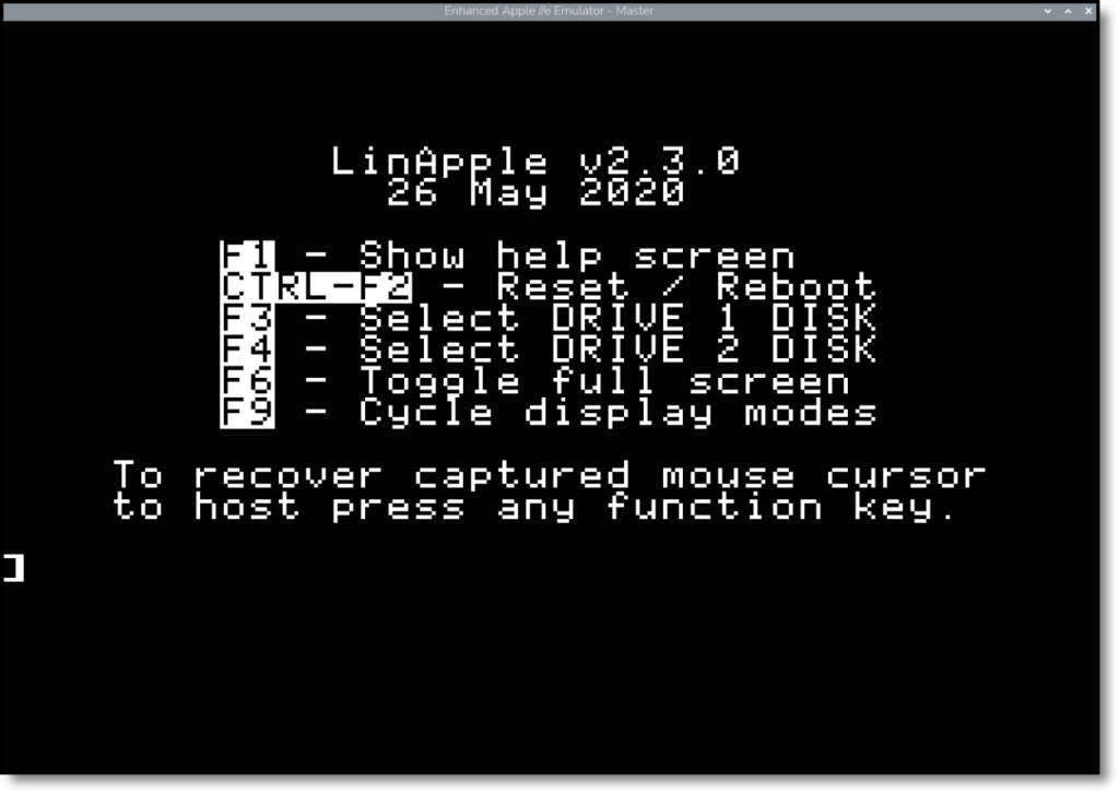
LinApple should open and display the screen shown in Figure 1. If you find that the emulator has taken over control of your mouse, press F1 to release it (this will display the help screen, but you can press F1 again to turn it off). You can toggle full-screen mode with the F6 key.
Figure 1: LinApple is up and running
Here’s a little BASIC program you can try running. You can either type it into the emulator, or you can find the program in the ch03/AppleIIBasicPrograms.dsk file in the GitHub repository. To use the disk image, launch the emulator with linapple --autoboot --d1 AppleIIBasicPrograms.dsk, type LOAD BLOCKMOVE at the ] prompt and press ENTER, then type RUN (and press ENTER).
10 HGR

20 X = 140: Y = 80: D = 3: REM INITIALISE

30 HCOLOR = 3: GOSUB 1000: REM DRAW CUBE

40 REM WAIT FOR AND READ KEYPRESS

50 K = PEEK (- 16384): IF K < 128 THEN 40

60 REM CLEAR STROBE

70 POKE - 16368, 0: K$ = CHR$ (K - 128)

80 HCOLOR = 0: GOSUB 1000: REM ERASE CUBE

90 IF K$ = "W" THEN Y = Y - D

100 IF K$ = "S" THEN Y = Y + D

110 IF K$ = "A" THEN X = X - D

120 IF K$ = "D" THEN X = X + D

130 IF X < 0 THEN X = 0

140 IF X > 272 THEN X = 272

150 IF Y < 0 THEN Y = 0

160 IF Y > 184 THEN Y = 184

170 GOTO 30 : REM BACK TO TOP OF LOOP

1000 REM DRAW CUBE IN CURRENT HCOLOR

1010 HPLOT X, Y TO X + 8, Y TO X + 8, Y + 8 TO X, Y + 8 TO X, Y

1020 RETURN
This will draw a small square on screen. Use the W, A, S, and D keys to move it around the screen. The program is quite simple. It first defines the starting X and Y position, as well as the number of pixels the square should move each time (the variable D). After that, it sets the drawing colour to 3 and calls the subroutine to draw the cube. The program then waits for a key press, and when it has a key press, it clears the keyboard strobe, which is a bit of hardware that indicates when a key press has been read.
After that, the program converts the integer key press value (K) into a string (K$) that contains the character typed. From there, it updates the X and Y position, makes sure the square hasn’t run off-screen, and returns to the top of the loop (line 30).
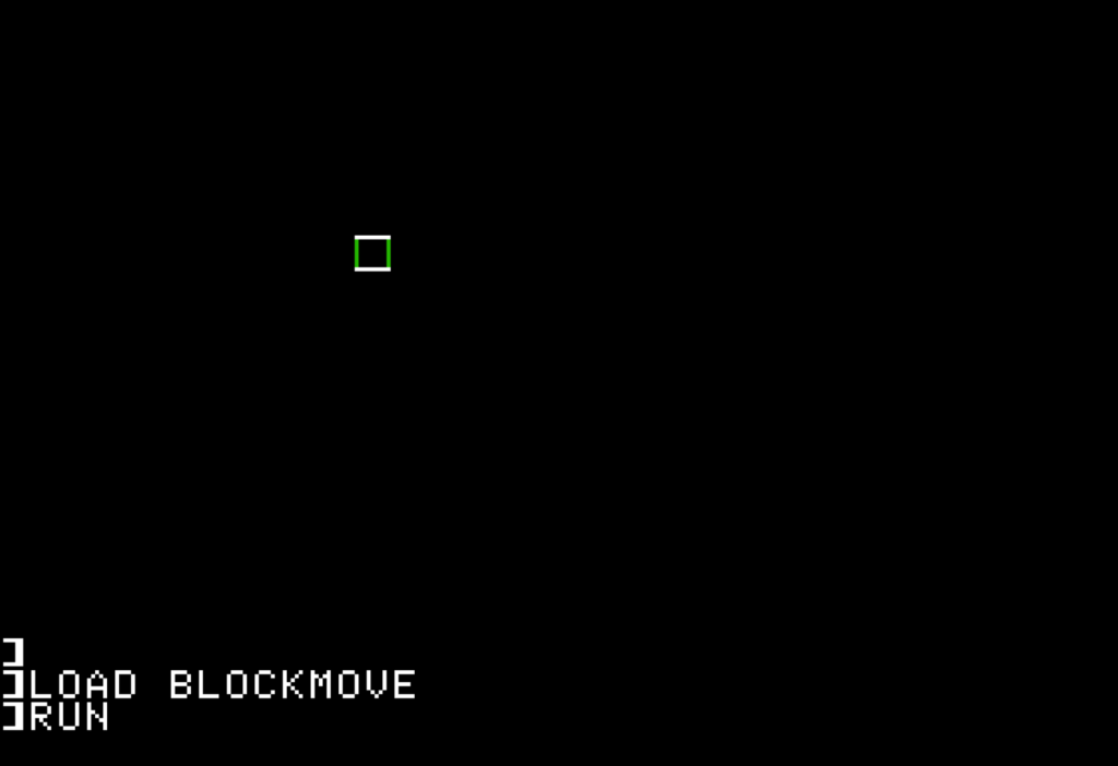
Figure 2: Moving a simple object around your screen
After you type in the program, type RUN followed by ENTER. Try moving the square with the WASD keys, and press CTRL+C when you’re done to exit the program. Figure 2 shows the program in action. Notice that the vertical and horizontal lines are different colours, and that the vertical lines change colour as you move. This is due to the way Apple II graphics work: the Apple II only generates a monochrome display signal, but it uses some signalling tricks to generate colour artefacts. Game programmers could manipulate these artefacts to create colour combinations they wanted.
After you run a graphical program, you’ll only have a small text area below the graphics mode portion of the emulator screen. You can type the TEXT command and press ENTER to return to text-only mode. You’ll also find these commands helpful:
LIST — lists all the lines of the current BASIC program.
RUN — runs the current program.
NEW — erases the current program and lets you start afresh.
CATALOG — lists all files on the disk image.
SAVE NAME — saves the current BASIC program under whatever file name you specify.
LOAD NAME — loads the program with the specified file name.
CTRL+C — use this key combination to stop a running BASIC program.
Apart from CATALOG, these commands only apply to BASIC programs. Many games are binary executable files that don’t include BASIC source.
You can find some fun type-in programs in Lee Fastenau’s collection of short programs. Lee’s programs are intentionally dense, as most are designed to be entered on one or two lines of code. So, take your time typing them in!
Read more like this in The Raspberry Pi Guide to Retro Gaming
You can buy a print edition of The Raspberry Pi Guide to Retro Gaming for an introductory price of £9.99 from Raspberry Pi Press, or wherever else books are sold. Contributors can access a free e-book version.
Discover the most common SQL syntax differences developers encounter when moving from MySQL to PostgreSQL, including identifier quoting, identifier rules, reserved keywords, limit vs. fetch first, inserting and updating data, and truncating tables.
Throughout this article – part of Aisha Bukar’s complete MySQL vs PostgreSQL comparison guide – you’ll also learn why these differences exist, and how to adapt your queries to work effectively across both databases.
Moving an application from MySQL to PostgreSQL involves more than exporting data and changing a few SQL statements. While both are relational database management systems, they interpret and extend SQL differently – and that gap has widened over the years as each system introduced its own syntax conventions, default behaviors, and features.
That’s exactly why some SQL statements look nearly identical across both systems, but others require syntax changes or a different approach altogether. Some of these easy to spot – for example, a query that executes successfully in MySQL may produce an error in PostgreSQL, because the latter enforces SQL standards more strictly. It may also return different results because of the differences in default behavior.
Identifier quoting in MySQL and PostgreSQL – the key differences explained
One of the first syntax differences developers notice when moving from MySQL to PostgreSQL is how identifiers are quoted. Identifiers include database objects such as table names, column names, and schema names.
Firstly, MySQL uses backticks (`) to quote identifiers:
SELECT `first_name`, `last_name`FROM `employees`;
PostgreSQL, on the other hand, follows the SQL standard by using double quotes (“):
SELECT "first_name", "last_name"FROM "employees";
Interestingly, MySQL can also use double quotes for identifiers, but only when the ANSI_QUOTES SQL mode is enabled. Without this mode, double quotes are interpreted as string delimiters rather than identifier quotes.
Since ANSI_QUOTES is not enabled by default in most MySQL installations, many applications and codebases continue to use backticks.
This difference often becomes apparent during migration. If MySQL queries are copied into PostgreSQL without modification, any identifiers enclosed in backticks will cause syntax errors, because PostgreSQL does not recognize backticks as identifier delimiters.
Replacing backticks with double quotes is usually straightforward, but developers should be aware that quoted identifiers in PostgreSQL become case-sensitive. An identifier created as “Employees”, for example, is different from employees, which can introduce unexpected errors if naming conventions are inconsistent.
This is why many PostgreSQL developers avoid quoting identifiers unless necessary – preferring lowercase, unquoted names that are easier to reference across applications.
While replacing backticks with double quotes is usually one of the simpler syntax changes during migration, it’s only one part of the story. Identifiers often need to be quoted because they conflict with SQL keywords or violate a database’s naming rules.
Since MySQL and PostgreSQL don’t reserve exactly the same keywords or enforce identifier rules in the same way, an acceptable object name in one database may require quoting or renaming in the other.
Understanding these differences is essential for avoiding syntax errors and ensuring that schemas and queries remain portable across both systems.
Get started with PostgreSQL – free book download
‘Introduction to PostgreSQL for the data professional’, written by Grant Fritchey and Ryan Booz, covers all the basics of how to get started with PostgreSQL.
What are the key differences in reserved keywords and identifier rules in MySQL compared to PostgreSQL?
When writing SQL, identifiers are the names assigned to database objects such as tables, columns, views, indexes, and schemas. Although developers are free to choose nearly any descriptive name, those names can’t conflict with the database’s reserved keywords.
Reserved keywords are words that have a predefined meaning in the SQL language. Statements such as SELECT, FROM, WHERE, and ORDER are reserved because they form part of SQL syntax. Attempting to use these words as identifiers without proper quoting can cause parsing errors or unexpected behavior.
MySQL and PostgreSQL maintain different sets of reserved keywords. PostgreSQL generally reserves more keywords because it more closely adheres to the SQL standard and includes additional language features. Consequently, a valid identifier in MySQL may be rejected by PostgreSQL.
For example, consider the following table definition:
CREATE TABLE user (id INT PRIMARY KEY,name VARCHAR(100));
Depending on the database configuration and version, this statement may execute successfully in MySQL, but PostgreSQL treats user as a reserved keyword because it refers to the current database role. To use it as a table name, the identifier must be quoted:
CREATE TABLE "user" (id INTEGER PRIMARY KEY,name VARCHAR(100));
Although quoting resolves the syntax error, it introduces another consideration. In PostgreSQL, quoted identifiers preserve their original letter casing and become case-sensitive. For example, a table created as “User” must always be referenced using exactly the same capitalization and quotation marks.
By contrast, unquoted identifiers are automatically folded to lowercase, making them easier to reference consistently. A common example is user. It’s not a reserved keyword in MySQL, but has special significance in PostgreSQL because it’s associated with the current database role.
Why you should rename conflicting identifiers instead of relying on quoted names
Although quoting such identifiers can resolve syntax errors, relying heavily on quoted names often makes SQL harder to read and maintain, particularly in large applications with hundreds of queries.
For this reason, many migration projects prefer to rename conflicting identifiers instead of relying on quoted names. Using descriptive, lowercase identifiers that avoid reserved keywords improves readability, reduces portability issues, and minimizes the likelihood of syntax errors when moving between database systems.
Want to advance your MySQL or PostgreSQL learning?You may be interested in:
How to avoid naming conflicts with reserved keywords in MySQL and PostgreSQL
Since the list of reserved keywords evolves as new SQL features are introduced, it’s good practice to always verify whether an identifier is reserved before creating or migrating a schema. Detecting and correcting any naming conflicts early is considerably easier than discovering syntax errors after the application has been deployed.
PostgreSQL likewise maintains an appendix listing all SQL keywords, indicating whether each word is reserved, non-reserved, or has other parser-specific classifications throughout.
Consulting these references during a migration can help identify naming conflicts before they become syntax errors.
Comparing MySQL AUTO_INCREMENT with PostgreSQL SERIAL and IDENTITY (the key differences explained)
Automatically-generated primary keys are a common feature of relational databases, but MySQL and PostgreSQL have different ways of implementing them.
This is often one of the first schema changes developers encounter during migration because the AUTO_INCREMENT attribute used in MySQL is not recognized by PostgreSQL.
In MySQL, a column is made self-incrementing by applying the AUTO_INCREMENT attribute. Whenever a new row is inserted without an explicit value for that column, MySQL automatically generates the next available integer.
This approach is simple, and tightly integrated into the table definition:
CREATE TABLE customers ( customer_id INT AUTO_INCREMENT PRIMARY KEY, name VARCHAR(100) NOT NULL);
Attempting to use the same definition in PostgreSQL results in a syntax error, because PostgreSQL does not support the AUTO_INCREMENT keyword:
..imAGE
Historically, PostgreSQL solved this problem using the SERIAL pseudo-type:
CREATE TABLE customers ( customer_id SERIAL PRIMARY KEY, name VARCHAR(100) NOT NULL);
Although SERIALlooks like a data type, it’s actually a convenient shorthand. Behind the scenes, PostgreSQL creates an integer column, creates a separate sequence object, sets the column’s default value on the sequence to nextval(), and associates the sequence with the column.
In other words, SERIAL is a shortcut for creating a sequence-backed auto-generating column rather than a true data type.
Modern PostgreSQL also supports SQL-standard identity columns using the GENERATED ... AS IDENTITY clause:
CREATE TABLE customers ( customer_id INTEGER GENERATED ALWAYS AS IDENTITY PRIMARY KEY, name VARCHAR(100) NOT NULL);
Additionally, PostgreSQL supports GENERATED BY DEFAULT AS IDENTITY, which generates values automatically but allows applications to provide explicit values when needed.
By contrast, GENERATED ALWAYS AS IDENTITY strictly enforces automatic value generation by rejecting user-supplied values unless the INSERT statement explicitly includes the OVERRIDING SYSTEM VALUE clause.
This makes GENERATED ALWAYS a better choice when you want to prevent accidental modification of identity values while still retaining the option to override them in exceptional cases.
For new PostgreSQL applications, IDENTITY is generally preferred over SERIAL because it conforms to the SQL standard, clearly expressing that the column’s values are generated automatically.
The PostgreSQL documentation does still support SERIAL – and it remains common in existing schemas – but IDENTITY is the recommended choice for new database designs.
Why you shouldn’t replace AUTO_INCREMENT with SERIAL in PostgreSQL
A common mistake during migration is attempting to replace MySQL’s AUTO_INCREMENT with PostgreSQL’s SERIAL using a simple text substitution. While this resolves the immediate syntax error, it overlooks the fact that PostgreSQL uses sequences to generate values.
As a result, operations involving sequence management, resetting counters, or retrieving generated values may need to be updated.
For example, many MySQL applications retrieve the last generated identifier using LAST_INSERT_ID(). In PostgreSQL, the preferred approach is to use the RETURNING clause as part of the INSERT statement, which returns the generated value directly – without requiring a separate query.
Another important distinction is that, although a SERIAL column is created with a NOT NULL constraint, neither SERIAL or IDENTITY create a PRIMARY KEY or UNIQUE constraint automatically. These mechanisms define how values are generated – not how uniqueness is enforced.
If the column is intended to uniquely identify each row (as is typically the case for surrogate keys), you must explicitly declare a PRIMARY KEY or UNIQUE constraint.
It’s worth noting that MySQL also provides a SERIAL alias, although – unlike PostgreSQL – it’s not a pseudo-type that creates and manages a sequence. Instead, SERIAL is simply an alias for the following column definition:
BIGINT UNSIGNED NOT NULL AUTO_INCREMENT UNIQUE
Consequently, a MySQL SERIAL column is always an unsigned 64-bit integer with the AUTO_INCREMENT attribute and an implicit UNIQUE constraint.
In PostgreSQL, SERIAL behaves very differently: it expands into an integer column backed by a sequence object, but doesn’t automatically create a PRIMARY KEY or UNIQUE constraint.
So, although both databases provide a SERIAL alias, they serve different purposes and should not be considered equivalent during migration.
Finally, while AUTO_INCREMENT, SERIAL, and IDENTITY all address the same requirement of generating numeric identifiers, they reflect different implementation philosophies.
MySQL exposes auto-incrementing behavior as a column attribute, whereas PostgreSQL historically relied on independent sequence objects before adopting the SQL-standard identity column syntax.
Understanding these implementation differences makes schema migration considerably smoother – helping to avoid issues that extend beyond simply replacing one keyword with another.
Comparing MySQL LIMIT and PostgreSQL FETCH FIRST (the key differences explained)
In most cases, applications rarely need to retrieve every row from a table. Whether displaying search results or paginating records, it’s common to limit the number of rows returned by a query.
While MySQL and PostgreSQL both support this capability, they offer different syntax options, with PostgreSQL also implementing the SQL-standard approach.
In MySQL, the LIMIT clause restricts the number of rows returned by a query:
SELECT *FROM employeesLIMIT 10;
PostgreSQL also supports the same syntax:
SELECT *FROM employeesLIMIT 10;
For developers migrating from MySQL to PostgreSQL, this is good news, because most queries using LIMIT work without modification.
When skipping rows, both databases support the OFFSET clause:
SELECT *FROM employeesLIMIT 10 OFFSET 20;
The query skips the first 20 rows and returns the next 10. It’s commonly used for implementing pagination.
MySQL also provides a shorthand form that combines the offset and row count into a single LIMIT clause:
SELECT *FROM employeesLIMIT 20, 10;
In this example, the first value specifies the number of rows to skip, while the second specifies the maximum number of rows to return. Although this syntax is widely used in MySQL applications, PostgreSQL does not support it. During migration, it should be rewritten using the explicit LIMIT ... OFFSET form.
In addition to LIMIT, PostgreSQL supports the SQL-standard FETCH FIRST clause.
SELECT *FROM employeesFETCH FIRST 10 ROWS ONLY;
To skip rows before fetching results, FETCH FIRST is typically combined with OFFSET.
SELECT *FROM employeesOFFSET 20FETCH FIRST 10 ROWS ONLY;
Unlike LIMIT, FETCH FIRST is part of the SQL standard, making it portable across several relational database systems. Although PostgreSQL supports both approaches, LIMIT remains the syntax most commonly used in PostgreSQL applications because of its brevity and long-standing familiarity.
Move fast. Govern at scale.
Redgate Flyway Enterprise embeds guardrails in the database layer, so every change is policy-checked, deterministic, and traceable.
Why these small syntax differences still need your attention
The syntax differences between MySQL and PostgreSQL are relatively small in this area, but they can still cause migration issues. Queries written using MySQL’s LIMIT offset, count syntax must be rewritten using LIMIT count OFFSET offset, or alternatively OFFSET ... FETCH FIRST ... ROWS ONLY if adopting the SQL-standard syntax.
Another important consideration is that neither LIMIT or FETCH FIRST guarantee which rows are returned unless the query includes an ORDER BY clause. Without an explicit ordering, the database is free to return rows in any order – and that order may differ between the two platforms.
This is because both MySQL and PostgreSQL use their own query planner and execution strategy. To ensure consistent and repeatable results, always combine row-limiting clauses with an appropriate ORDER BY clause –especially when implementing pagination.
Although PostgreSQL supports both LIMIT and FETCH FIRST, choosing between them largely comes down to coding standards and portability requirements.
LIMIT is concise and familiar to developers coming from MySQL, while FETCH FIRST aligns closer to the SQL standard and may be preferable in environments where cross-database compatibility is a priority.
What are the key differences in how the INSERT statement works in MySQL compared to PostgreSQL?
The basic INSERT syntax is remarkably similar in MySQL and PostgreSQL. In both databases, you can specify the target columns and provide one or more rows of values:
INSERT INTO customers (name, email)VALUES ('Aisha', 'aisha@example.com');
The same statement works in both databases. This means that simple INSERT statements are generally among the easier parts of a MySQL-to-PostgreSQL migration.
The differences become more noticeable when an application relies on database-specific behavior, particularly when inserting rows with generated values, handling duplicate records, or retrieving the values generated by the database.
One of the more significant differences appears when an application needs the value generated by the database after an INSERT.
In MySQL, an application commonly retrieves the automatically generated ID using LAST_INSERT_ID():
INSERT INTO customers (name)VALUES ('Aisha');
SELECT LAST_INSERT_ID();
PostgreSQL provides the RETURNING clause, allowing the generated value to be returned as part of the INSERT statement itself:
INSERT INTO customers (name)VALUES ('Aisha')RETURNING customer_id;
The PostgreSQL approach can also return multiple columns or the entire newly inserted row:
INSERT INTO customers (name)VALUES ('Aisha')RETURNING *;
This difference matters during application migration, as code expecting a separate call to retrieve the generated identifier may need rewriting to use PostgreSQL’s RETURNING clause instead.
INSERT IGNORE and ON DUPLICATE KEY UPDATE
Another important difference appears when an application requires a row insert only if it doesn’t already exist, or updates an existing row when a conflict occurs. MySQL uses INSERT IGNORE and ON DUPLICATE KEY UPDATE.
The INSERT IGNORE command tells the database to continue processing the statement when certain errors or warnings occur. For example:
INSERT IGNORE INTO customers (customer_id, name)VALUES (1, 'Aisha');
If the value of customer_id conflicts with an existing unique or primary key value, MySQL can ignore the conflicting row instead of terminating the statement with an error.
MySQL also uses the ON DUPLICATE KEY UPDATE. It basically tells the database to not fail if the insert violates a PRIMARY KEY or UNIQUE constraint. Instead, it should update the existing row.
INSERT INTO customers (customer_id, name)VALUES (1, 'Aisha')ON DUPLICATE KEY UPDATE name = 'Aisha';
ON CONFLICT
PostgreSQL uses the ON CONFLICT command for this:
INSERT INTO customers (customer_id, name)VALUES (1, 'Aisha')ON CONFLICT (customer_id)DO UPDATESET name = EXCLUDED.name;
PostgreSQL can also ignore the conflicting row:
INSERT INTO customers (customer_id, name)VALUES (1, 'Aisha')ON CONFLICT (customer_id)DO NOTHING;
The syntax is different but, more importantly, the two databases express the conflict-handling logic differently. MySQL’s syntax is centered around duplicate-key detection, while PostgreSQL allows the developer to specify a conflict target and then choose what happens when that conflict occurs.
There’s no direct equivalent to INSERT IGNORE in PostgreSQL. When the intention is specifically to ignore a conflict involving a unique or primary key constraint, PostgreSQL uses ON CONFLICT DO NOTHING.
What are the key differences in how TRUNCATING TABLES works in MySQL compared to PostgreSQL?
TRUNCATE is used to remove all rows from a table without removing the table itself. At first, MySQL and PostgreSQL appear to handle it in much the same way. The table remains available for future inserts, but its existing rows are removed:
TRUNCATE TABLE customers;
However, the similarities become less obvious when you look at transactions, generated identifiers, and relationships between tables.
One of the important differences is how TRUNCATE interacts with transactions. PostgreSQL treats TRUNCATE as a transactional operation. It can be included in a transaction and rolled back if the transaction is subsequently aborted:
BEGIN;
TRUNCATE TABLE customers;
ROLLBACK;
After the rollback, any rows removed by TRUNCATE are restored.
MySQL’s behavior depends on the storage engine and transaction context. With InnoDB, for example, TRUNCATE TABLE causes an implicit commit before execution and cannot be rolled back like a regular transactional DELETE.
This difference can become significant when migrating application code that performs table cleanup as part of a larger transaction.
How MySQL and PostgreSQL handle generated identifiers – the key differences explained
Another difference concerns automatically generated identifiers. Consider a PostgreSQL table using an identity column:
CREATE TABLE customers ( customer_id INTEGER GENERATED ALWAYS AS IDENTITY, name TEXT);
PostgreSQL allows the identity sequence to be reset when truncating the table:
TRUNCATE TABLE customersRESTART IDENTITY;
The next inserted row will start again from the identity sequence’s configured starting value. PostgreSQL also provides CONTINUE IDENTITY when the existing sequence values should be preserved:
TRUNCATE TABLE customersCONTINUE IDENTITY;
A MySQL TRUNCATE TABLE also resets the AUTO_INCREMENT counter for an InnoDB table, so a straightforward PostgreSQL TRUNCATE will generally have similar behavior with respect to generated identifiers.
However, PostgreSQL gives you explicit control over this behavior through RESTART IDENTITY and CONTINUE IDENTITY.
What are the key differences in how foreign key relationships work in MySQL compared to PostgreSQL?
Foreign key relationships are handled differently in MySQL and PostgreSQL. If, for example, orders reference customers through a foreign key, PostgreSQL won’t allow a table to be truncated because it would violate a foreign key relationship.
The only exception would be if the related tables are included in the operation, or if cascading is explicitly requested. For this, PostgreSQL provides the CASCADE option:
TRUNCATE TABLE customers CASCADE;
This can also truncate tables that depend on customers through foreign key relationships.
Because CASCADE can affect more tables than the one named in the statement, it should be used carefully, particularly in production environments.
PostgreSQL also supports truncating several related tables explicitly:
TRUNCATE TABLE customers, orders;
Over in MySQL, the way you truncate tables with foreign key relationships differs from PostgreSQL. In particular, TRUNCATE TABLE is treated as a DDL operation in MySQL, and foreign key restrictions can prevent the operation – even when the referencing table is empty.
You should therefore review foreign key dependencies, rather than just assuming a MySQL TRUNCATE statement can simply be copied to PostgreSQL.And remember: despite them both removing rows, TRUNCATE is not the same as DELETE, so should not be treated as such.
A statement such as:
DELETE FROM customers;
removes rows through the normal row-level deletion mechanism and can be combined with a WHERE clause. TRUNCATE, by contrast, removes all rows from the table, and does not support a WHERE clause.
Why this matters
The distinction matters during migration. Replacing one with the other can change transaction behavior, trigger behavior, identity handling, and the way foreign key relationships are handled.
The basic TRUNCATE TABLE syntax is portable between MySQL and PostgreSQL, but the behavior surrounding it is not. In particular, migration scripts should be reviewed for assumptions about transaction rollback, automatically- generated identifiers, foreign key dependencies, and cascading behavior.
If the purpose of the operation is simply to remove selected rows, DELETE is usually the appropriate choice. If the intention is to empty an entire table and the database-specific consequences are understood, however, TRUNCATE can be more efficient.
In summary
The important point during migration is not to treat the two commands as interchangeable – and never assume that a TRUNCATE statement copied from MySQL will have exactly the same effect in PostgreSQL.
These examples highlight an important pattern throughout a MySQL-to-PostgreSQL migration: the closer you look, the more the differences extend beyond syntax. A statement may look familiar while relying on database-specific behavior underneath.
The same becomes even more apparent when logic moves beyond individual SQL statements and into stored procedures, functions, and triggers.
Simple Talk is brought to you by Redgate Software
Take control of your databases with the trusted Database DevOps solutions provider. Automate with confidence, scale securely, and unlock growth through AI.
1. Why does a MySQL query with backticks fail in PostgreSQL?
MySQL uses backticks to quote identifiers like table and column names, while PostgreSQL follows the SQL standard and uses double quotes instead. Backticks aren’t recognized as identifier delimiters in PostgreSQL, so any query copied over without modification will throw a syntax error.
2. Does PostgreSQL support MySQL's AUTO_INCREMENT?
No. PostgreSQL doesn’t recognize the AUTO_INCREMENT attribute. Instead, it offers the SERIAL pseudo-type (a shorthand for a sequence-backed column) or the SQL-standard GENERATED ... AS IDENTITY syntax, which is now the recommended approach for new schemas.
3. Can I just replace AUTO_INCREMENT with SERIAL and call it done?
Not quite. While SERIAL fixes the syntax error, it doesn’t behave identically to MySQL’s version; PostgreSQL’s SERIAL relies on a separate sequence object and doesn’t automatically create a PRIMARY KEY or UNIQUE constraint, unlike MySQL’s SERIAL alias.
4. Does MySQL's LIMIT clause work the same way in PostgreSQL?
Mostly, yes. Basic LIMIT and OFFSET syntax is supported in both. However, MySQL’s shorthand LIMIT offset, count isn’t supported in PostgreSQL and must be rewritten as LIMIT count OFFSET offset, or using the SQL-standard FETCH FIRST clause.
5. What's the PostgreSQL equivalent of MySQL's ON DUPLICATE KEY UPDATE?
PostgreSQL uses ON CONFLICT instead. You specify a conflict target (like a column with a unique constraint) and choose whether to update the existing row (DO UPDATE), or skip it entirely (DO NOTHING) – which also replaces MySQL’s INSERT IGNORE.
6. Is TRUNCATE TABLE safe to use inside a transaction in PostgreSQL?
Yes. PostgreSQL treats TRUNCATE as fully transactional, so it can be rolled back. This differs from MySQL’s InnoDB engine, where TRUNCATE causes an implicit commit and can’t be undone the same way.
 Log in