In a move that heralds a definitive return to native software, Microsoft is doubling down on the WinUI 3 framework to purge bloat from Windows 11.
The PC community has reached a breaking point with “web app slop.” For the past few years, developers have increasingly abandoned native Windows applications in favor of Progressive Web Apps (PWAs) or Electron-based wrappers. While these web-first frameworks make cross-platform development significantly cheaper for massive corporations, they are resource-heavy desktop applications that devour your RAM and drain your battery, even to display a basic UI.
This frustration boiled over recently when we tested Windows 11’s hidden Low Latency Profile, a background feature that temporarily spikes CPU frequencies to make the operating system feel instantly responsive.
Keyboard critics accused Microsoft of brute-forcing performance with hardware to compensate for bloated, unoptimized code. Microsoft VP Scott Hanselman fired back, arguing that temporary CPU boosting is an industry standard across macOS and Linux, and that Microsoft is simultaneously doing the hard work of optimizing the underlying software.
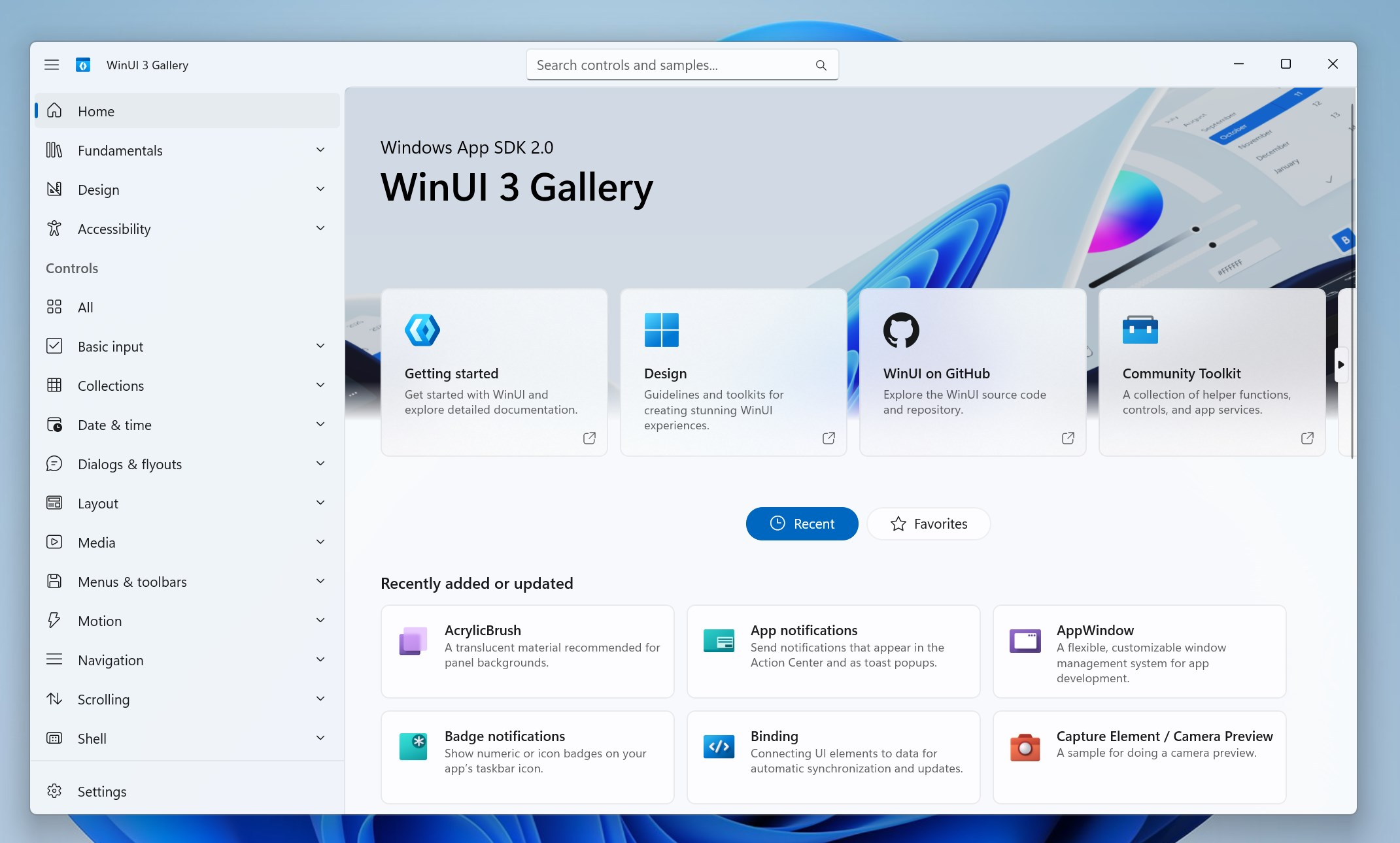
This week, we finally got the hard technical proof that Microsoft is keeping its promise. In a major move to restore both performance and developer trust, Microsoft has publicly doubled down on WinUI 3, announcing sweeping architectural changes and new developer tools that help Windows 11 shake off its negative reputation and, of course, its sluggishness.
Microsoft’s commitment to WinUI 3 will make Windows 11 faster
A new technical brief published by the Windows engineering team on GitHub shows massive performance leaps coming to the WinUI 3 framework. The software giant wants to “make WinUI 3 the best native UI platform for Windows experiences and apps.”

To prove they aren’t just blowing smoke, the development team zeroed in on launch times, using File Explorer and Notepad as their primary benchmarks. If you have used previous versions of Windows, the File Explorer in Windows 11 has consistently been sluggish for power users.
The preliminary benchmark results by the WinUI engineering branch are genuinely staggering. For the WinUI portion of a File Explorer launch, Microsoft has successfully achieved:
- 41% fewer allocations: This drastically reduces the memory overhead and the frequency of abrupt garbage collection pauses.
- 63% fewer transient allocations: Less temporary data generation means the CPU spends significantly more time executing tasks instead of cleaning up short-lived objects in the background.
- 45% fewer function calls: Simplifying the code path directly reduces execution time, so the UI renders faster on screen.
- 25% reduction in time spent in WinUI code: The user interface framework itself is getting out of the way faster, which can make the application become interactive almost instantly.
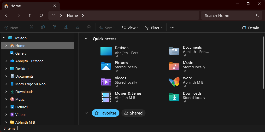
Combine these framework-level code optimizations with the “aggressive” hardware scheduling of Low Latency Profile, and you get a highly potent compound effect. This is what Hanselman meant when he said the engineering team was doing both.
Windows 11 is eradicating web wrappers from the core OS
For a long time, Windows 11 felt like it was drowning in its own web wrappers. Even essential system components were heavily reliant on WebView2, which naturally started showing microscopic but highly noticeable UI stutters when clicking through the interface.
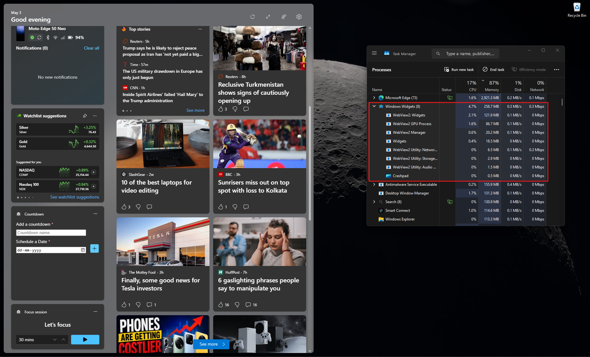
However, the tide is officially turning. We recently reported that Microsoft is actively shifting the Windows 11 Start menu away from React-based web components to pure, native WinUI 3 code.
When are WinUI 3 performance improvements coming to Windows 11?
The maintainers noted in their GitHub update that these framework improvements will soon migrate from the development branch to the main winui3/main branch, and eventually into the Windows App SDK (WinAppSDK) 2.x releases. They specifically mention that some of these changes “may be too risky or complex to deliver as servicing updates.”
Some WinUI 3 speed boosts are currently opt-in
Interestingly, Microsoft acknowledged that achieving this level of bleeding-edge performance requires some structural sacrifices. The company is introducing necessary breaking changes to default control styles.
Because these optimizations might break older applications that rely heavily on customized container elements within a control template, Microsoft is making these performance pathways “opt-in” for now. However, the ultimate goal is to switch these high-performance pathways to “opt-out” by default in WinAppSDK 3.0 or 4.0+, forcing the Windows ecosystem toward better efficiency.
Will File Explorer launch 40% faster?
It is important to understand that these reductions in memory allocations and function calls do not automatically translate to a one-to-one 40% reduction in app launch time. The benchmarked metrics specifically measure the WinUI framework’s portion of the File Explorer launch sequence, and not the end-to-end loading process.
Real-world speed gains require deep collaboration across multiple Windows development teams. However, dramatically stripping down the overhead of the UI framework itself is a mandatory first step in Microsoft’s long-term commitment to WinUI 3.
Microsoft says developers can build WinUI 3 apps using Command-Line tools and AI
Fixing first-party Windows apps is only half the battle. If Microsoft wants to eliminate web app slop, they have to convince third-party developers that building a native WinUI 3 app is just as easy as spinning up a bloated Electron project.
It makes absolute sense. As we reported, Windows 11 keeps getting web apps instead of native apps because developers lack the trust and the incentive in a platform like WinUI 3, which Microsoft didn’t even support until now. Not to mention how they continuously changed app development frameworks, without a proper strategy in place.
Traditionally, native Windows development required downloading the massive Visual Studio IDE and understanding incredibly complex XAML structures.
To completely dismantle this barrier to entry, Microsoft just announced a powerful new suite of open-source dotnet new project and item templates specifically for WinUI, proving once again their commitment to the framework.
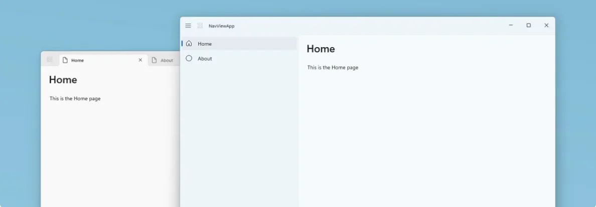
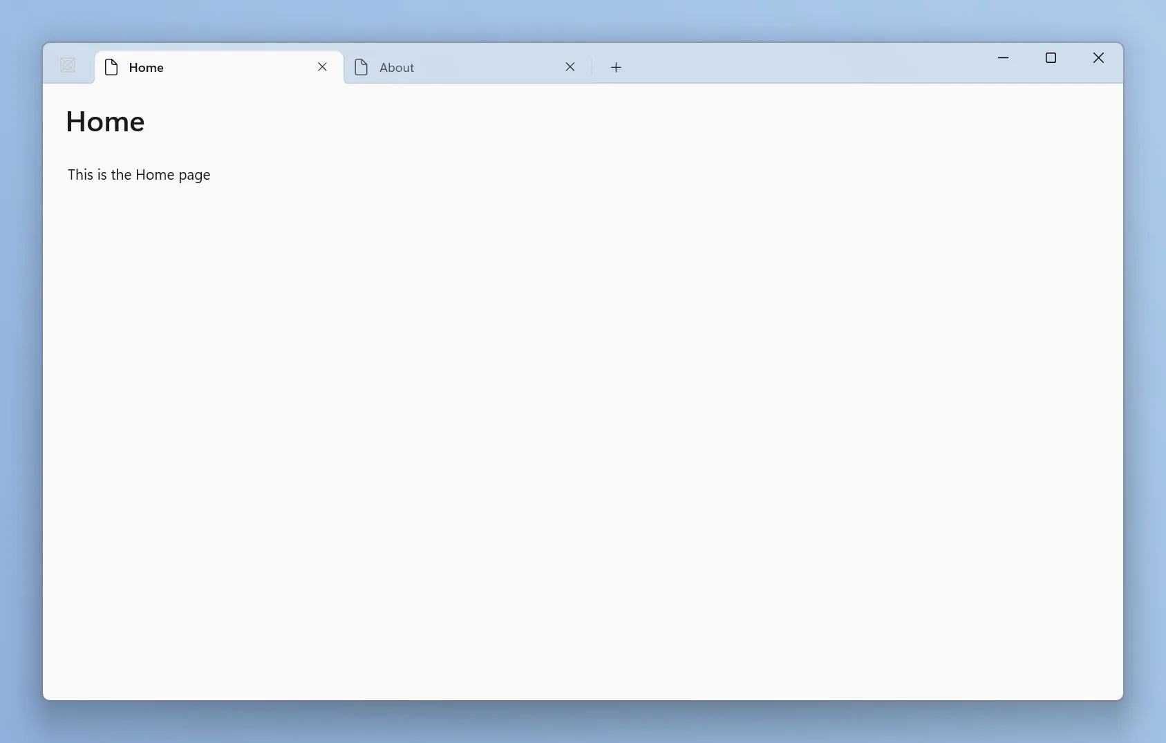
Developers can now scaffold, build, and run a fully packaged native WinUI app directly from the command line without ever touching Visual Studio. These templates are designed with modern Windows silhouettes in mind.

If you use the dotnet new winui-navview command, you instantly get a project wired up with a modern title bar, responsive navigation, and an architecture with Fluent Design patterns out of the box in both light and dark modes. Furthermore, these templates leverage the new WinApp CLI, which completely eliminates the historic nightmare of manual MSIX packaging and certificate management by handling loose-layout package registration instantly.
Microsoft also just introduced a dedicated WinUI agent plugin for AI assistants like GitHub Copilot and Claude Code. And I feel this is where native development gets incredibly exciting.
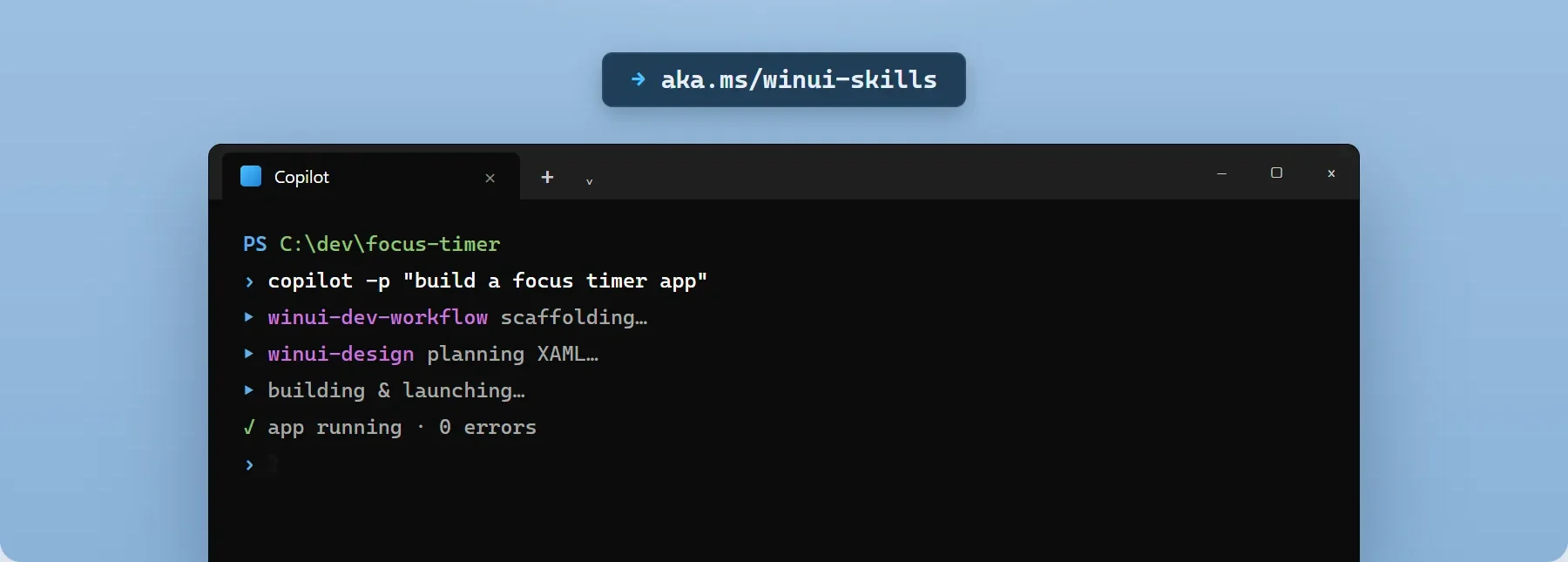
You can now open your command line and prompt Copilot with a natural language request, such as “create a WinUI 3 photo viewer with thumbnails and EXIF metadata.” the specialized winui-dev AI agent will automatically pick the right native template, write the MVVM (Model-View-ViewModel) architecture, generate the XAML layout, and automatically fix any compilation errors. It even features a deeply integrated winui-ui-testing skill that drives real UI automation from the command line to find and fix functional bugs without your intervention.
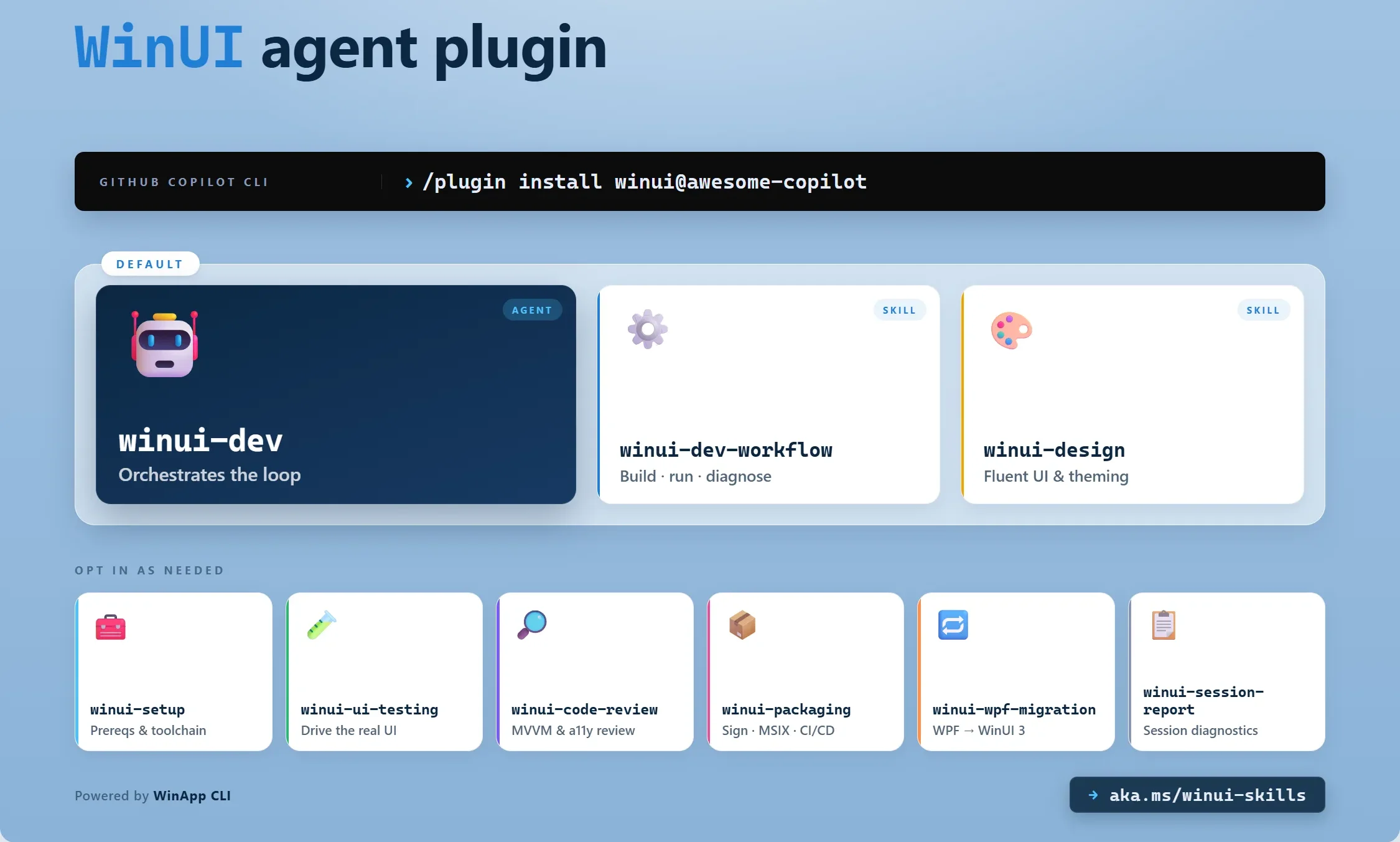
Microsoft is drastically reducing the time and cost required to build native software
By giving AI agents the deep, grounded knowledge of WinUI and the Windows App SDK, the company is completely negating the primary argument for using cross-platform web wrappers!
Microsoft is saying goodbye to Web apps
The industry pushback against memory-hogging web apps has never been louder. As global RAM prices are surging, and users are increasingly frustrated by chat applications that push beyond 1GB, software efficiency is an absolute necessity.
With the massive framework-level code optimizations, the architectural shift to native code for the Start menu, the critical quality-of-life fixes in the May 2026 Patch Tuesday update, and the brilliant new command-line developer tools, the message from Redmond is that they are finally providing the necessary infrastructure to help developers eradicate web app slop and make Windows 11 feel like a premium, highly responsive, and deeply native operating system.
The post Microsoft commits to native UI for Windows 11 as users push back against web app slop appeared first on Windows Latest
Strategic Technology Consultation Services
This episode of The Modern .NET Show is supported, in part, by RJJ Software's Strategic Technology Consultation Services. If you're an SME (Small to Medium Enterprise) leader wondering why your technology investments aren't delivering, or you're facing critical decisions about AI, modernization, or team productivity, let's talk.
Show Notes
"A lot of people go to conferences and they do conference-driven development. They come back with all these great ideas. And you know what? I'm guilty. I speak at conferences and I give lots of ideas. But they're ideas and you don't have to take every idea and apply it when you get back to the office."— Chris Woodruff
Hey everyone, and welcome back to The Modern .NET Show; the premier .NET podcast, focusing entirely on the knowledge, tools, and frameworks that all .NET developers should have in their toolbox. I'm your host Jamie Taylor, bringing you conversations with the brightest minds in the .NET ecosystem.
Today, we're joined by Chris Woodruff to talk simplicity, which is his overarching philosophy when it comes to working with code; whether that's developing, architecting, or interacting with decision makers: simplicity matters.
"Simplicity also reflects in cost. Because I've found all these studies that say that most companies that start putting solutions out on the cloud pay a lot more than they should."— Chris Woodruff
Along the way, we talked about how simplicity goes further than the code we write and into how we choose to host our applications, either in the cloud or on prem. Arguably, most of the time, an application which has a simpler architecture will be cheaper to host.
Before we jump in, a quick reminder: if The Modern .NET Show has become part of your learning journey, please consider supporting us through Patreon or Buy Me A Coffee. Every contribution helps us continue bringing you these in-depth conversations with industry experts. You'll find all the links in the show notes.
Anyway, without further ado, let's sit back, open up a terminal, type in `dotnet new podcast` and we'll dive into the core of Modern .NET.
Full Show Notes
The full show notes, including links to some of the things we discussed and a full transcription of this episode, can be found at: https://dotnetcore.show/season-8/simplicity-first-why-complexity-is-not-sophistication-with-chris-woodruff/
Useful Links:
Supporting the show:
Getting in Touch:
Remember to rate and review the show on Apple Podcasts, Podchaser, or wherever you find your podcasts, this will help the show's audience grow. Or you can just share the show with a friend.
And don't forget to reach out via our Contact page. We're very interested in your opinion of the show, so please get in touch.
You can support the show by making a monthly donation on the show's Patreon page at: https://www.patreon.com/TheDotNetCorePodcast.
Music created by Mono Memory Music, licensed to RJJ Software for use in The Modern .NET Show.
Editing and post-production services for this episode were provided by MB Podcast Services.
Download audio: https://traffic.libsyn.com/clean/secure/thedotnetcorepodcast/819-Chris-Woodruff.mp3?dest-id=767916
This week, we discuss how security gets sold to execs, where agentic coding and security collide, and Cloudflare vs. Datadog's diverging paths. Plus, Coté weighs in on sugar cookies.
Watch the YouTube Live Recording of Episode 572
Runner-up Titles
- Sugar Kingdom
- Bastard Sugar
- Choose butter
- It’s just AI now
- People don’t like paying for software
- It’s an exciting time to be writing software
- Are we going to start funding open source?
- Speaking of that, but not that, it’s totally unrelated
- We’re leaving the table
- Weird network stuff
- That box of cables on GitHub
Rundown
- Security
- AI is restructuring the software industry — winners and losers
Relevant to your Interests
- Laws, anecdotes, idioms, and other shit people say - cote.pizza
- The smart lock standard that could replace your keys is finally here
- dirtyfrag/README.md at master · V4bel/dirtyfrag · GitHub
- Red Hat Summit Newsroom
- Finally, texts between Android and iPhone users can be end-to-end encrypted
- Your Container Is Not a Sandbox
- OpenAI launches the OpenAI Deployment Company
- Corporate Card Startup Ramp Raising Funds at $40 Billion Valuation
- Cyberattack shutters Canvas learning platform for schools across the U.S.
- AWS warns of EC2 'impairment' as power loss hits notorious US-EAST-1 region
- AI and DevOps Maturity
- Anthropic raises Claude Code usage limits, credits new deal with SpaceX
- Announcing Agent Toolkit for AWS
- He's not wrong, but what can they do? How are those Microsoft foundation models going?
Sponsors
Conferences
- WeAreDevelopers Europe, July 8-10, 2026 Berlin, Coté speaking.
- DevOpsDays Graz, Sept 4-5, 2026
- DevOpsDays Rockies, Sept. 22 – 23, 2026, Discount Code: 26DODSWEDEFTALK
- WeAreDevelopers NA, Sept 23-25, 2026, Discount Code: DEVPOD26
- DevOpsDays Dallas, Sept 28-29, 2026
- DevOpsDays Vilnius, Sep 30 - Oct 1. 2006
- DevOpsDays Istanbul, October 24th, 2026 - Coté keynoting.
- VMware User Groups (VMUGs):
- Dallas (June 9-11, 2026)
- Orlando (October 20-22, 2026)
SDT News & Community
- Join our Slack community
- Email the show: questions@softwaredefinedtalk.com
- Free stickers: Email your address to stickers@softwaredefinedtalk.com
- Follow us on social media: Twitter, Threads, Mastodon, LinkedIn, BlueSky
- Watch us on: Twitch, YouTube, Instagram, TikTok
- Book offer: Use code SDT for $20 off "Digital WTF" by Coté
- Sponsor the show
- Sponsor more podcasts with Failover Media
Recommendations
Download audio: https://aphid.fireside.fm/d/1437767933/9b74150b-3553-49dc-8332-f89bbbba9f92/ff92fa89-9d76-4785-b7f2-d22cbdd139b4.mp3
Modern distributed systems fail in partial, uneven ways. A downstream API slows down, a database starts timing out, or a burst of messages arrives faster than a dependency can absorb. If every Azure Function instance retries immediately and indefinitely, the system creates its own backpressure and turns a transient fault into a wider outage.
Two patterns are especially useful for controlling that failure mode:
- Exponential backoff increases the delay between retries so a dependency has time to recover.
- Circuit breaker stops repeated calls to an unhealthy dependency and fails fast until the dependency is likely to be healthy again.
Used together, these patterns reduce retry storms, protect downstream systems, and give your Functions app a controlled way to degrade under stress.
Reference architecture
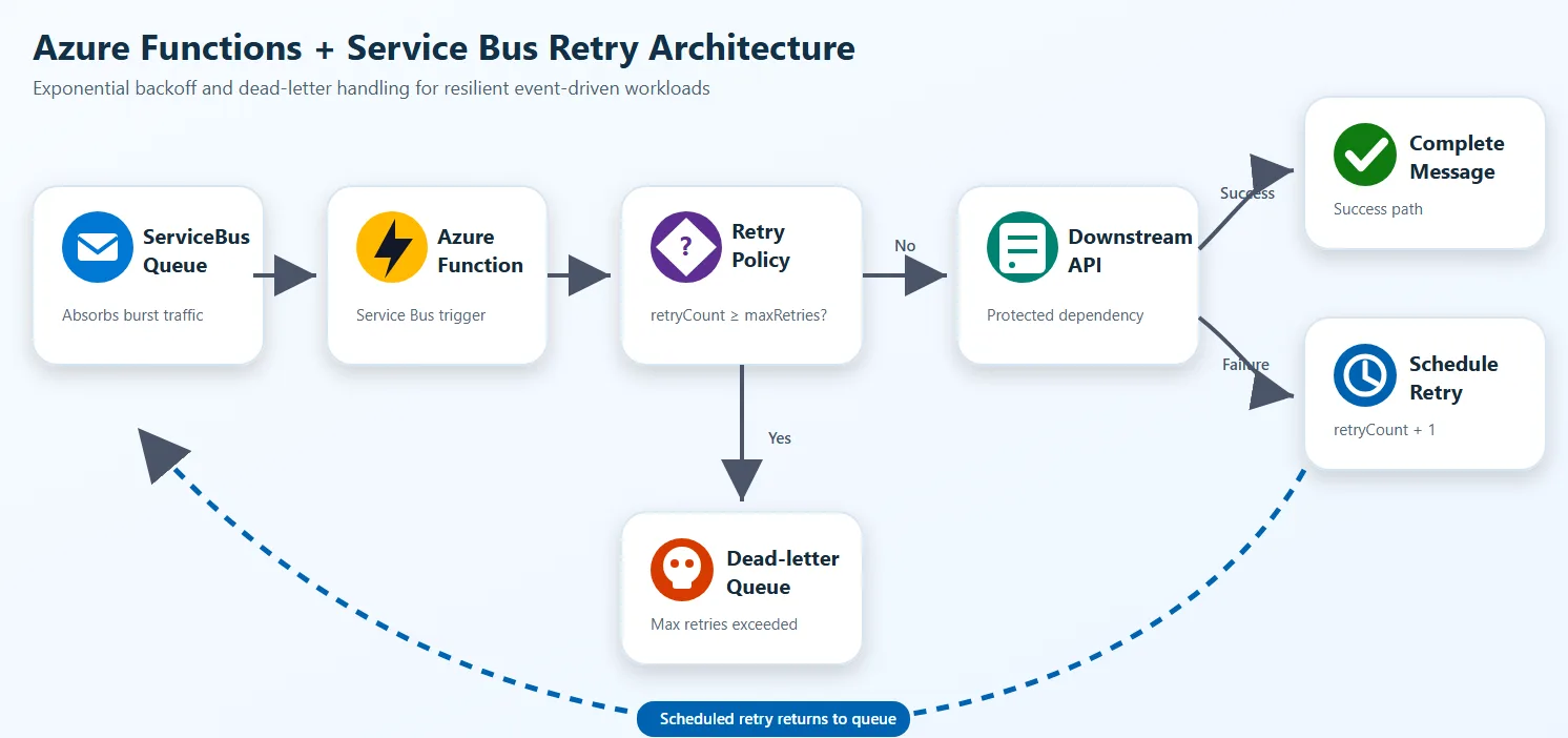
The queue absorbs burst traffic, the Functions app decides whether the dependency is safe to call, and failed work is either delayed or isolated instead of being retried immediately.
Why these patterns matter
Azure Functions can scale out quickly. That capability is useful for throughput, but it also means many concurrent executions can hit a weak dependency. Without controls:
- transient failures become synchronized retry bursts
- queue length grows while workers keep wasting compute on doomed calls
- hot partitions or limited downstream capacity create system-wide backpressure
- poison messages stay active longer than they should
The safer design is:
- detect transient failure
- delay the next attempt using exponential backoff
- stop calling a failing dependency when a threshold is reached
- resume carefully after a cool-down period
- move irrecoverable work to a dead-letter or quarantine path
Backoff and circuit breaker play different roles
Exponential backoff answers: “When should I try again?”
Circuit breaker answers: “Should I call this dependency at all right now?”
You usually want both:
- backoff handles message-level retry pacing
- circuit breaker handles dependency-level protection
Exponential backoff with Azure Functions and Service Bus
The existing sample in this repo already demonstrates application-level retry scheduling for TypeScript with Azure Service Bus.
The core idea is simple:
- read the current retry count from message metadata
- compute the next delay with exponential growth
- schedule a new Service Bus message for the future
- complete the current message
- dead-letter or quarantine after the maximum retry count
TypeScript example
This TypeScript example follows the Azure Functions v4 programming model and uses a Service Bus trigger with SDK binding enabled. Source: serviceBusTopicTrigger.ts
import {
    ServiceBusMessageContext,
    ServiceBusMessageActions,
    messageBodyAsText,
} from '@azure/functions-extensions-servicebus';
import { app, InvocationContext } from '@azure/functions';
import { ServiceBusClient } from '@azure/service-bus';
import { DefaultAzureCredential } from '@azure/identity';

const maxRetries = 3;

export async function serviceBusQueueTrigger(
    serviceBusMessageContext: ServiceBusMessageContext,
    context: InvocationContext
): Promise<void> {
    const actions = serviceBusMessageContext.actions as ServiceBusMessageActions;
    const message = serviceBusMessageContext.messages[0];
    const bodyText = messageBodyAsText(message);
    const currentRetryCount = Number(message.applicationProperties?.retryCount) || 0;

    if (currentRetryCount >= maxRetries) {
        await actions.deadletter(message);
        return;
    }

    try {
        const fullyQualifiedNamespace = process.env.ServiceBusConnection__fullyQualifiedNamespace;
        if (!fullyQualifiedNamespace) {
            throw new Error('ServiceBusConnection__fullyQualifiedNamespace is not set');
        }

        const client = new ServiceBusClient(fullyQualifiedNamespace, new DefaultAzureCredential());
        const sender = client.createSender('testqueue');
        const scheduledEnqueueTime = new Date(Date.now() + 10_000);

        await sender.scheduleMessages(
            [{
                body: bodyText,
                messageId: `scheduled-${message.messageId}`,
                contentType: message.contentType,
                correlationId: message.correlationId,
                subject: message.subject,
                applicationProperties: {
                    ...message.applicationProperties,
                    retryCount: currentRetryCount + 1,
                    originalMessageId: message.messageId,
                    scheduledAt: new Date().toISOString(),
                    originalEnqueueTime: message.enqueuedTimeUtc?.toISOString(),
                },
            }],
            scheduledEnqueueTime
        );

        await sender.close();
        await client.close();
        await actions.complete(message);
    } catch (error) {
        await actions.abandon(message);
        throw error;
    }
}

app.serviceBusQueue('serviceBusQueueTrigger1', {
    connection: 'ServiceBusConnection',
    queueName: 'testqueue',
    sdkBinding: true,
    autoCompleteMessages: false,
    cardinality: 'many',
    handler: serviceBusQueueTrigger,
});
Python example
This Python example uses the Azure Functions Python v2 programming model with the Service Bus extensions binding. Source: function_app.py
import datetime
import logging
import os

import azure.functions as func
import azurefunctions.extensions.bindings.servicebus as servicebus
from azure.identity import DefaultAzureCredential
from azure.servicebus.aio import ServiceBusClient
from azure.servicebus import ServiceBusMessage

app = func.FunctionApp()

MAX_RETRIES = 3

@app.service_bus_queue_trigger(
    arg_name="received_message",
    queue_name="QUEUE_NAME",
    connection="SERVICEBUS_CONNECTION",
    auto_complete_messages=False,
)
async def servicebus_queue_trigger(
    received_message: servicebus.ServiceBusReceivedMessage,
    message_actions: servicebus.ServiceBusMessageActions,
):
    application_properties = received_message.application_properties or {}
    current_retry_count = int(application_properties.get(b"retry_count", 0))

    if current_retry_count >= MAX_RETRIES:
        message_actions.deadletter(received_message, deadletter_reason="MaxRetryExceeded")
        return

    try:
        message_actions.complete(received_message)

        fqns = os.getenv("SERVICEBUS_CONNECTION__fullyQualifiedNamespace")
        queue_name = os.getenv("QUEUE_NAME")
        sb_client = ServiceBusClient(
            fully_qualified_namespace=fqns,
            credential=DefaultAzureCredential(),
        )

        async with sb_client, sb_client.get_queue_sender(queue_name=queue_name) as sender:
            new_retry_count = current_retry_count + 1
            schedule_time = datetime.datetime.utcnow() + datetime.timedelta(seconds=10)

            new_message = ServiceBusMessage(
                body=str(received_message),
                application_properties={
                    **application_properties,
                    "retry_count": new_retry_count,
                    "original_message_id": received_message.message_id,
                    "scheduled_at": datetime.datetime.utcnow().isoformat(),
                },
                message_id=received_message.message_id,
                session_id=received_message.session_id,
                content_type=received_message.content_type,
                correlation_id=received_message.correlation_id,
                subject=received_message.subject,
            )

            await sender.schedule_messages(new_message, schedule_time)
            logging.info("Retry %s scheduled", new_retry_count)
    except Exception:
        message_actions.abandon(received_message)
        raise
.NET example
This .NET example uses the Azure Functions isolated worker model. The trigger receives a batch of messages, checks retry count from application properties, and schedules a delayed retry or dead-letters the message.
using Azure.Identity;
using Azure.Messaging.ServiceBus;
using Microsoft.Azure.Functions.Worker;
using Microsoft.Extensions.Logging;

public class ExponentialBackoffProcessor(ILogger<ExponentialBackoffProcessor> logger)
{
    private const int MaxRetries = 3;
    private const string QueueName = "orders-queue";

    [Function(nameof(ProcessWithBackoff))]
    public async Task ProcessWithBackoff(
        [ServiceBusTrigger(QueueName, Connection = "ServiceBusConnection", AutoCompleteMessages = false)]
        ServiceBusReceivedMessage[] messages,
        ServiceBusMessageActions messageActions)
    {
        foreach (var message in messages)
        {
            var retryCount = message.ApplicationProperties.TryGetValue("retryCount", out var val)
                ? Convert.ToInt32(val)
                : 0;

            if (retryCount >= MaxRetries)
            {
                await messageActions.DeadLetterMessageAsync(message, deadLetterReason: "MaxRetryExceeded");
                logger.LogError("Dead-lettered {MessageId} after {RetryCount} retries", message.MessageId, retryCount);
                continue;
            }

            try
            {
                await CallDownstreamApi(message);
                await messageActions.CompleteMessageAsync(message);
            }
            catch (Exception ex)
            {
                logger.LogWarning(ex, "Transient failure for {MessageId}, scheduling retry {Retry}",
                    message.MessageId, retryCount + 1);

                var fqns = Environment.GetEnvironmentVariable("ServiceBusConnection__fullyQualifiedNamespace");
                await using var client = new ServiceBusClient(fqns, new DefaultAzureCredential());
                await using var sender = client.CreateSender(QueueName);

                var retryMessage = new ServiceBusMessage(message.Body)
                {
                    MessageId = $"retry-{message.MessageId}",
                    ContentType = message.ContentType,
                    CorrelationId = message.CorrelationId,
                    Subject = message.Subject,
                    ApplicationProperties =
                    {
                        ["retryCount"] = retryCount + 1,
                        ["originalMessageId"] = message.MessageId,
                        ["scheduledAt"] = DateTime.UtcNow.ToString("o")
                    }
                };

                var scheduledTime = DateTimeOffset.UtcNow.AddSeconds(10);
                await sender.ScheduleMessageAsync(retryMessage, scheduledTime);
                await messageActions.CompleteMessageAsync(message);
            }
        }
    }

    private Task CallDownstreamApi(ServiceBusReceivedMessage message) => Task.CompletedTask;
}
Why exponential backoff reduces backpressure
If the retry interval stays fixed, many failed messages get retried at nearly the same cadence. That creates synchronized pressure on the same downstream component. Exponential backoff spreads retry load over time. In practice, it gives you:
- fewer immediate rehits on a dependency that is already degraded
- lower queue churn during transient incidents
- more time for autoscale, failover, or operator intervention
- clearer separation between transient and persistent failure
Circuit breaker with Azure Functions
Backoff alone isn’t enough when a downstream service is clearly unhealthy. If every invocation still attempts the dependency first, your code wastes compute and keeps increasing latency.
A circuit breaker usually has three states:
- Closed: normal traffic flows
- Open: calls are blocked for a cool-down window
- Half-open: allow a few trial calls to check whether the dependency recovered
In Azure Functions, the important design choice is where breaker state lives.
- In-memory breaker state is acceptable for local development or single-instance demos.
- For production, use a shared state store such as Azure Managed Redis, Cosmos DB, or another low-latency store. Azure Functions can scale out across many instances, so per-process memory doesn’t give you a global breaker.
TypeScript circuit breaker example
This example uses the SDK binding’s abandon action with propertiesToModify to track retry count directly on the message. After the threshold is reached, the message is completed to stop the retry loop. Source: serviceBusTopicTrigger.ts
import '@azure/functions-extensions-servicebus';
import { app, type InvocationContext } from '@azure/functions';
import { type ServiceBusMessageContext, messageBodyAsJson } from '@azure/functions-extensions-servicebus';

const maxRetries = 3;

export async function serviceBusQueueTrigger(
    serviceBusMessageContext: ServiceBusMessageContext,
    context: InvocationContext
): Promise<void> {
    const message = serviceBusMessageContext.messages[0];
    const bodyData = messageBodyAsJson(message);
    const currentRetryCount = message.applicationProperties?.retryCnt
        ? parseInt(message.applicationProperties.retryCnt as string)
        : 0;

    if (currentRetryCount >= maxRetries) {
        await serviceBusMessageContext.actions.complete(message);
        context.log('Message completed after maximum retries');
        return;
    }

    // Abandon with updated retry metadata, broker redelivers automatically
    await serviceBusMessageContext.actions.abandon(message, {
        retryCnt: (currentRetryCount + 1).toString(),
        lastRetryTime: new Date().toISOString(),
        errorMessage: 'Processing failed',
    });
}

app.serviceBusQueue('serviceBusQueueTrigger1', {
    connection: 'ServiceBusConnection',
    queueName: 'testqueue',
    sdkBinding: true,
    autoCompleteMessages: false,
    cardinality: 'many',
    handler: serviceBusQueueTrigger,
});
The abandon call with propertiesToModify lets the broker manage redelivery while your code tracks state in application properties. Once the retry budget is exhausted, completing the message removes it from the queue. For a production circuit breaker, you would add a shared state check (for example, Redis) before attempting the downstream call.
Python circuit breaker example
import azure.functions as func
import azurefunctions.extensions.bindings.servicebus as servicebus

app = func.FunctionApp()

MAX_RETRIES = 3

@app.service_bus_queue_trigger(
    arg_name="received_message",
    queue_name="QUEUE_NAME",
    connection="SERVICEBUS_CONNECTION",
    auto_complete_messages=False,
)
async def servicebus_queue_trigger(
    received_message: servicebus.ServiceBusReceivedMessage,
    message_actions: servicebus.ServiceBusMessageActions,
):
    application_properties = received_message.application_properties or {}
    current_retry_count = int(application_properties.get(b"retry_count", 0))

    if current_retry_count >= MAX_RETRIES:
        message_actions.complete(received_message)
        return

    # Abandon with updated retry metadata, broker redelivers automatically
    message_actions.abandon(received_message, {
        "retry_count": current_retry_count + 1,
        "last_retry_time": __import__("datetime").datetime.utcnow().isoformat(),
        "error_message": "Processing failed",
    })
.NET circuit breaker example
This example uses AbandonMessageAsync with properties to modify, tracking retry count on the message itself. After the threshold is reached, the message is completed to stop the retry loop.
using Azure.Messaging.ServiceBus;
using Microsoft.Azure.Functions.Worker;
using Microsoft.Extensions.Logging;

public class CircuitBreakerProcessor(ILogger<CircuitBreakerProcessor> logger)
{
    private const int MaxRetries = 3;

    [Function(nameof(ProcessWithCircuitBreaker))]
    public async Task ProcessWithCircuitBreaker(
        [ServiceBusTrigger("orders-queue", Connection = "ServiceBusConnection", AutoCompleteMessages = false)]
        ServiceBusReceivedMessage[] messages,
        ServiceBusMessageActions messageActions)
    {
        foreach (var message in messages)
        {
            var retryCount = message.ApplicationProperties.TryGetValue("retryCnt", out var val)
                ? Convert.ToInt32(val)
                : 0;

            if (retryCount >= MaxRetries)
            {
                await messageActions.CompleteMessageAsync(message);
                logger.LogWarning("Completed {MessageId} after max retries", message.MessageId);
                continue;
            }

            // Abandon with updated retry metadata, broker redelivers automatically
            await messageActions.AbandonMessageAsync(message, new Dictionary<string, object>
            {
                ["retryCnt"] = retryCount + 1,
                ["lastRetryTime"] = DateTime.UtcNow.ToString("o"),
                ["errorMessage"] = "Processing failed"
            });
        }
    }
}
Use both patterns together
The normal production flow looks like this:
- Function receives a message.
- Circuit breaker checks whether the downstream dependency should be called.
- If closed, the function tries the dependency.
- On transient failure, the breaker records the failure and the message is rescheduled with exponential backoff.
- After repeated failures, the breaker opens and later messages avoid immediate downstream calls.
- When the recovery window passes, half-open probes test whether the dependency recovered.
- If recovery still fails, the message eventually lands in a dead-letter queue (DLQ) or a quarantine queue.
This approach reduces useless work and protects both your Functions app and the downstream service.
Operational guidance for Azure Functions
Keep the pattern simple enough to operate:
- Use retry metadata in
applicationPropertiesso every attempt is observable. - Add jitter to retry delay in production to avoid synchronized retries across instances.
- Separate transient errors from validation or business rule failures.
- Track breaker state, retry count, queue depth, dead-letter count, and downstream latency in Application Insights.
- Set a maximum retry budget. Unlimited retries only move the incident somewhere harder to diagnose.
- Prefer a shared breaker state store when your Functions app scales beyond one instance.
- Keep quarantine or DLQ processors explicit so operators can redrive messages safely.
Choose between DLQ and quarantine queues
Both are valid, but they solve slightly different problems:
- Dead-letter queue is a natural fit when the broker should own the failed-message path.
- Quarantine queue is useful when the application wants a custom inspection and replay workflow.
The TypeScript SDK binding in this repo makes explicit dead-lettering straightforward. In Python, many teams prefer a quarantine queue when they want full application-level control over the retry path.
Summary
Exponential backoff protects the system from retry storms. Circuit breaker protects the system from repeatedly calling a dependency that is already failing. Azure Functions benefits from both because serverless scale can amplify unhealthy retry behavior as easily as it amplifies throughput.
If your goal is to avoid backpressure in a modern distributed system, these patterns should be part of the default design for queue-driven workloads.
The post Exponential backoff and circuit breaker for Service Bus-triggered Azure Functions appeared first on Azure SDK Blog.