 Log in

Anthropic has officially filed for an IPO, revealing soaring revenue, mounting losses, major enterprise adoption, and an unusual governance structure designed to preserve founder control and its AI safety mission.

|
Sr. Content Developer at Microsoft, working remotely in PA, TechBash conference organizer, former Microsoft MVP, Husband, Dad and Geek.
|

Pennsylvania, USA


A few weeks ago I presented to a small group of commercial and technology leaders from Brazilian agribusiness at the AWS office in São Paulo. My talk ran through where generative AI fits across the different stages of an agribusiness operation, and the point I kept returning to is that the markets we call traditional are exactly the ones where keeping up with this technology decides who ends up ahead of the curve. Nobody there was arguing about whether AI belongs in agriculture. The questions were about delivery: who receives the output, in which language, on which device, often while driving between farms. That is why a launch I might otherwise have filed under routine leads my list this week. The Amazon Polly Generative engine upgrade added 14 new voices, two of them in Brazilian Portuguese. When your user has both hands on a steering wheel, the interface is a voice.
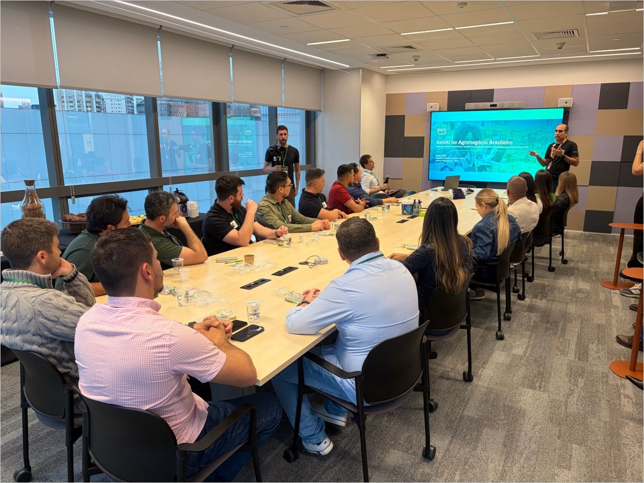
Presenting “GenAI no Agronegócio Brasileiro” at the AWS office in São Paulo.
The rest of the week had a sharper edge. The biggest launch is a security service built on the premise that the gap between a vulnerability being disclosed and a vulnerability being exploited has effectively closed, and AWS published the honeypot evidence for exactly that in the same week. Now, let’s get into this week’s AWS news…
AWS Continuum for code vulnerabilities is now generally available
AWS Continuum reframes vulnerability management as an end-to-end job rather than a scanner that hands you a list. It builds a context graph from your repositories and your AWS environment, assigns each finding an evidence level, and reproduces exploitable findings in an isolated sandbox with proof-of-concept code so you see the issue rather than a severity label. It ranks issues by how close the attack path runs to business-critical systems, then opens the fix as a pull request. The control boundary matters: every remediation currently requires human approval, so you review and merge the pull request, with autonomous classes of fix gated behind confidence thresholds for the future.
The “why now” came from AWS’s own honeypots in the same week. Amazon Threat Intelligence found a PHP2Shell exploitation attempt in MadPot telemetry dated October 17, four days before CVE-2026-109618 and CVE-2026-109619 were publicly disclosed, and on disclosure day proof-of-concept exploits were circulating around 02:00 UTC, roughly twelve hours before the embargo was due to lift at 14:00 UTC. The practical reading is direct: a patch window measured in days assumes a delay that no longer exists, and an investigation should start from the earliest known exploitation rather than from the disclosure date. AWS also published the AWS WAF mitigations for the same CVEs. Continuum is available in US East (N. Virginia) and US West (Oregon).
Introducing Amazon ECS Gateway
Amazon ECS Gateway splits the work of exposing a service between the people who own the network and the people who own the application. Platform teams define one gateway with the organization’s subnets, security groups, TLS certificates, listener settings, and AWS WAF web ACLs. Application teams opt in by adding a gateway connector to the service definition, and ECS gives them an ACM certificate, a unique DNS hostname, listener rules, a target group, and a security group that admits traffic only from the Application Load Balancer.
The numbers make the economics clear: up to 25 services share a single ALB, ECS provisions the first ALB on first connect and removes ALBs when they are no longer needed, and a gateway can associate with up to 10,000 clusters, with five gateways per cluster. You can adopt it incrementally with UpdateService while your existing load balancer stays in place. Amazon ECS Gateway is available in all commercial Regions where Amazon ECS is available, at no additional charge.
Last week’s launches
Here are some launches that caught my attention this week.
Amazon Polly delivers a major upgrade to its Generative engine – The Generative engine now runs a larger, more expressive catalog: 57 generative voices across 11 languages and 25 locales, with 14 new voices across 9 locales and Hindi and Finnish generally available for the first time. Two of the new voices are Brazilian Portuguese, Leo and Carolina. It is a drop-in upgrade, so the voice names, the same SynthesizeSpeech call, and the price all stay the same while the output gets more natural.
AWS announces TorchNeuron: native PyTorch support for AWS Trainium (public beta) – TorchNeuron is an open source PyTorch backend that lets you run your model on Trainium by switching to .to(‘neuron’), a configuration change instead of a rewrite, with eager execution and torch.compile intact. It integrates with the Neuron Kernel Interface for custom operators, and it works on Trainium2 and Trainium3 instances. If you want the bigger picture on why hardware choice should not lock in your software, the AWS Insights piece on that theme is a good companion read, and the release lands alongside AWS Neuron 2.33.
New ways to customize models with Amazon SageMaker AI, without managing GPUs – Training sessions are now generally available, giving you control of the post-training loop, including custom loss functions and reward signals, while SageMaker AI handles GPU allocation, distributed execution, fault recovery, and checkpoint storage. You pay for the tokens SageMaker AI processes, and the meter stops while your reward function scores a batch. There is a full technical walkthrough, the training session APIs, and new support for Muse Glimmer, Qwen 3.8, and Ministral 3.
Structured outputs for Claude models available on Amazon Bedrock – You can now get schema-compliant JSON back from any Anthropic Claude model on Amazon Bedrock, across both the bedrock-runtime and bedrock-mantle endpoints, without custom parsing, retry logic, or post-processing. That makes jobs like pulling every required field from a financial report, parsing clinical notes, or routing support tickets by intent far more reliable to automate.
Amazon ElastiCache Serverless for Valkey now supports online migration with zero downtime – You can migrate self-managed Valkey or Redis OSS on Amazon EC2 into ElastiCache Serverless with zero downtime, meaning zero errors returned to the client during the move, measured the way the ElastiCache SLA measures availability. You prepare the migration, start the data sync, then choose a manual or automatic cutover, with no third-party replication tools. It is available in all commercial Regions, the China Regions, and the AWS GovCloud (US) Regions.
Other AWS news
Here are some additional projects and posts that you might find interesting.
Discover tools at runtime with AWS Agent Registry – AWS Agent Registry is a managed catalog for MCP servers, agents, and agent skills, so an orchestrator can search approved capabilities at runtime instead of compiling every tool in at build time. This walkthrough shows the discover, instantiate, and execute loop in a working sample, with search results that return connection metadata but never invocation credentials.
Tokenomics for coding agents: benchmark cost and quality on your own code – Coding assistants replay a growing transcript on every turn, so their cost math is nothing like ordinary inference. This post gives you open source tooling to measure model, harness, and hosting choices on your own repositories and build a cost-and-quality frontier you own, with sample results where routing came out 44.7 percent cheaper for 4.8 percent lower mean quality.
How U.S. Bank migrated 119 TB from Oracle Exadata to Amazon RDS for Oracle – U.S. Bank moved four Oracle Exadata databases totaling about 119 TB to Amazon RDS for Oracle using a config-driven pipeline built on Oracle XTTS, AWS DataSync, and Amazon EFS. The initial baseline copy finished in about 7 days with zero data loss and cutovers averaging roughly four hours per database, over a bandwidth-capped Direct Connect link.
Upcoming AWS events
Mark your calendars for these upcoming events.
AWS re:Invent – AWS re:Invent runs November 30 to December 4 in Las Vegas, with more than 2,200 sessions. The session catalog is live and reserved seating is open, so now is the time to build your schedule.
AWS Community Days – AWS Community Day Brasil Norte takes place in Belém on October 31, closing out the 2026 Brazilian community season. Check the hub for events near you.
That’s all for this week. Check back next Monday for another Weekly Roundup!
– Daniel
This post is part of our Weekly Roundup series. Check back each week for a quick roundup of interesting news and announcements from AWS!
Pennsylvania, USA
I made good progress in the last stream. Now, I need to make sure the integration tests are working, clean up a couple of things, and then make ID generation for delegates consistent.
https://github.com/JasonBock/PartiallyApplied/issues/21
https://github.com/JasonBock/PartiallyApplied/issues/20
#dotnet #csharp

Pennsylvania, USA
Tired of jumping between five news sites every morning just to catch up on tech and industry headlines? What if a deployed AI agent just brought the briefing to you in Slack?
In this episode, Senior Developer Advocate Pooja Mistry sits down with Astropods Software Engineer Sohum Dalal to show how to deploy a daily news agent to Slack. The Industry News Agent is a public blueprint on Astropods that queries multiple news APIs in parallel, removes duplicate articles, and delivers structured AI briefings right where your team already works.
You’ll see how Slack becomes the deployment medium for a custom AI agent, so anyone on your team can get a daily newsletter style briefing with a simple @mention. Learn how lightweight, single purpose agents can streamline everyday developer workflows, how to configure API keys across news providers, and how to set up the Slack Socket Mode permissions and bot token scopes you need to deploy agents to Slack.
What You’ll Learn in This Episode:
-Why lightweight, utility driven AI agents are worth building
-Meet the Industry News Agent: parallel news fetching via NewsAPI, GNews, The Guardian, and MediaStack
-How to find and inspect public blueprints in the Astropods Explore registry
-Configuring required and optional API keys in the deployment form
-Deploying an AI agent to Slack: app level tokens (connections:write), Socket Mode, and Event Subscriptions (app_mentions:read)
Bot token permissions for channel history, posting, and direct messages
-Live demo: triggering your daily news briefing with an @mention in a Slack channel
Resources & Community:
Try Astropods and explore the Blueprint Registry: https://astropods.com
Join the community on Discord: https://astropods.com/discord
#Astropods #AIAgents #DeployAIAgents #CustomAgents #SlackBot #SlackAI #AIAutomation #DeveloperTools #NewsAPI #SoftwareEngineering #Productivity
0:00 - Introduction: Meet Sohum Dalal & The Industry News Agent
0:27 - Why Build Single-Purpose Workflow Agents?
0:57 - Finding the Industry News Blueprint on the Astro Registry
1:25 - Configuring News API Keys (NewsAPI, GNews, Guardian, MediaStack)
1:44 - Live Demo: Requesting Today's Headlines in Slack
2:35 - Step-by-Step Slack App Setup: App & Bot Tokens
3:36 - Socket Mode & Event Subscriptions (`app_mentions:read`)
4:13 - Customizing Bot Scopes & Permissions in Slack
5:34 - How to Deploy the Agent to Your Own Workspace
6:12 - Wrap-Up & Join the Astro Community

Pennsylvania, USA

Wes, Scott, and CJ run through the week’s biggest web dev news: everyone’s hacking their TVs, VoidZero open-sourced its Void framework with Cloudflare deploys, OpenCode got hacked, and Anthropic built its own git replacement. Plus DeepSeek V4.1 Flash, Cloudflare’s security audit skill, Krea 3, a local LLM speed tester, and Killswitch, an esoteric language designed to break coding agents.
Show Notes
- 00:00 Welcome to Syntax!
- 00:44 CJ Hacks a Round Thrift Store Photo Frame
- 02:18 VoidZero Open Sources the Void Framework
- 06:58 Jev Adds Image Support to Its Decision API
- 11:18 Local Security Cameras: Frigate and Custom Wyze Firmware
- 17:41 LLM Speed: Try Local Models Before You Buy Hardware
- 21:00 Everyone Is Hacking Their TVs With Clean Your TV
- 24:51 Are These the Final Days of Hardware Hacking With LLMs?
- 29:24 Reverse Engineer Everything: Skills for Agentic Hacking
- 31:42 Hacking a Tonal and Building a DIY Digital Resistance Gym
- 37:24 Brought to you by Sentry.io
- 38:34 OpenCode Console Hacked: What Happened and Who’s Affected
- 41:31 Black Market API Tokens and Distillation Attacks
- 44:13 Should Everyone Get Access to Cyber Models?
- 47:48 Managing API Keys With Varlock and 1Password
- 48:45 Anthropic Builds Its Own Git Replacement
- 55:15 What Are We Losing in the Agentic Era?
- 01:04:26 Killswitch: A Programming Language Built to Break LLMs
- 01:06:53 Cheng Lou Turns JavaScript Code Into a Neural Net
- 01:09:30 Antfu’s Furigana Font for Reading Japanese
- 01:12:32 Guitoro: Strum a Guitar in the Browser
- 01:17:39 Playing Snake on Network Switch Lights
Hit us up on Socials!
Syntax: X Instagram Tiktok LinkedIn Threads
Wes: X Instagram Tiktok LinkedIn Threads
Scott: X Instagram Tiktok LinkedIn Threads
Randy: X Instagram YouTube Threads
Download audio: https://traffic.megaphone.fm/FSI2480265141.mp3
Pennsylvania, USA

Small experiences can mean little interactions throughout the day instead of the lift of getting into a whole big app. I am taking a lot of inspiration from mobile and wearable platforms because they are almost always smaller and more focused. I believe in most software built for a purpose, less is more.
Tray Nudge is all about trying to help yourself accomplish things. I am wary when I enter my goals into commercialized apps that they’ll instantly try to sell me ads. Either that or I’ll get into a habit and the paywall will come once I’m hooked.
This little app does neither of those things because it is small, offline, and private. No syncing or accounts which means that progress will be on one Windows device. For these types of apps it is all about seeing what works, adding a simple backup or syncing through OneDrive is very feasible down the road if there is real user demand.


Happy Tray-tober!
Joe
Pennsylvania, USA
Next Page of Stories