 Log in


I spent a lifetime working at Microsoft. In the early 1990s, I began building and supporting Windows 3.x environments in a university, often cursing whatever MS was doing to make our lives more difficult (though a lot of the pain was self-inflicted by trying to integrate WFW3.11 with Novell Netware 4.0, but that’s a whole other story).
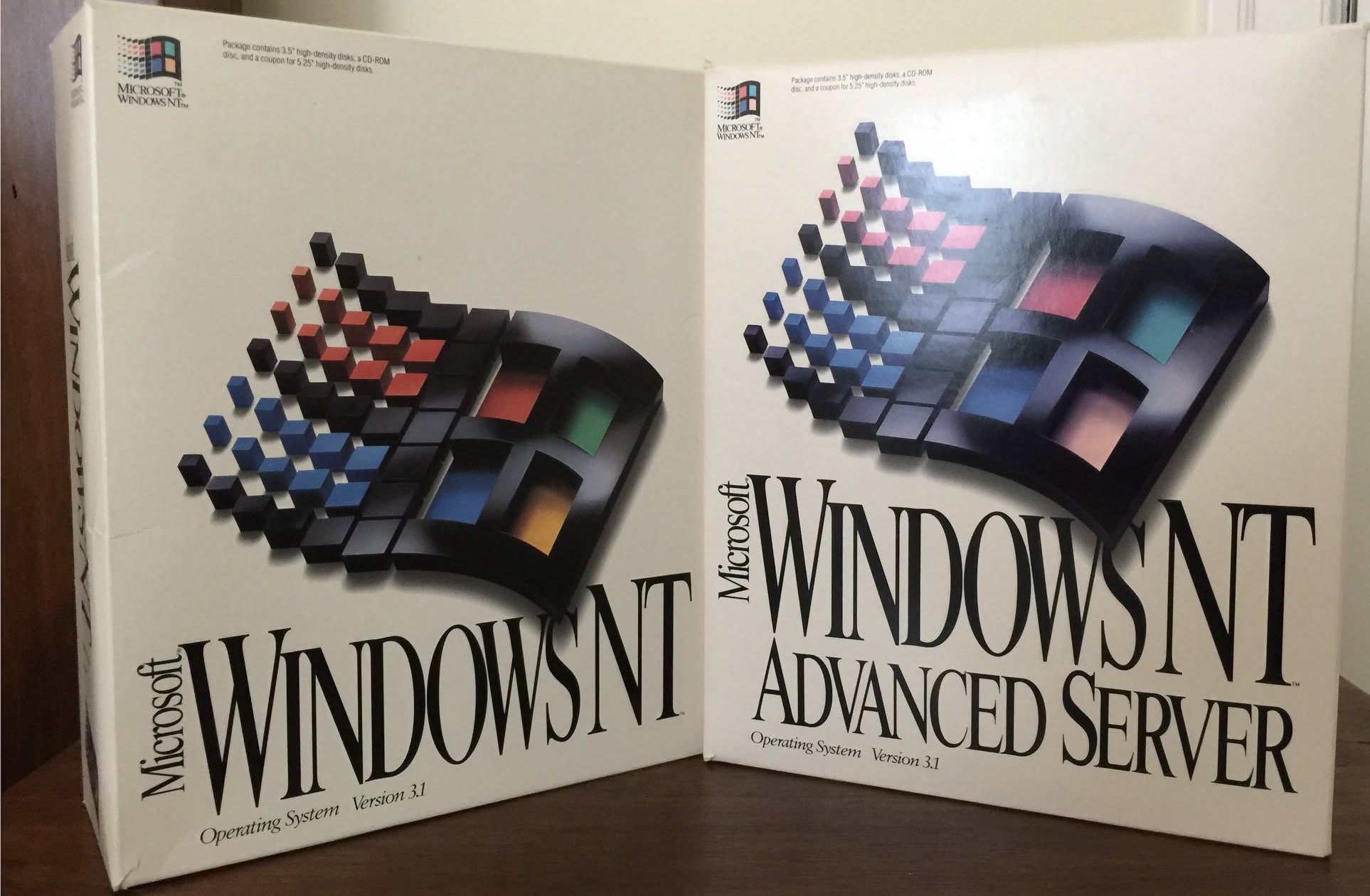
A later role in a consulting company saw me move into their own IT department at a time of great consolidation: the IT director had decided, in 1993, to bet everything on Windows NT and was rolling out NT3.1 as the company-wide standard. A brave move, perhaps some thought foolish at the time.
A couple of years later, I was replacing the global MSMail email system with this new thing called “Exchange” and that led me to jump ship and join Microsoft UK in mid-1997.
Having spent time in Redmond as part of the Exchange product group, I never worked directly on Windows (server or client) but thought myself a power user of Windows client while also keeping abreast of what Windows Server was doing, given Exchange’s dependence on it. This deepened considerably when Active Directory effectively grew out of the Exchange Directory and arrived with Windows 2000.
For years, Microsoft concentrated its efforts in growing end customer adoption of its technology in the “enterprise” – basically focussing on companies or public sector institutions who had a few hundred end users or more. They could persuade the finance team to sign up for a multi-year licensing arrangement which gave them access to the latest bits of Office, the servers that made the client apps tick (like Exchange, SharePoint, OCS/Skype/Lync) and of course the Windows Servers to run all the basic infrastructure. Logging people in, securing and updating their Windows client, providing file and print services and lots more – for many organizations, this was just the default.
Windows client and Office apps had once been the main revenue generators, though other servers and services grew to be just as significant, if not more so.
Along comes the cloud
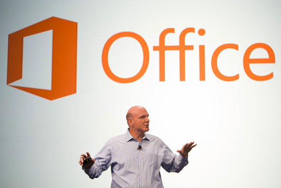
In the early 2010s, Microsoft started getting really serious about Software-as-a-Service, especially the back-end services that would go on to become Office 365 (and now, “Microsoft 365”). CEO Steve Ballmer launched O365 in mid-2011 as the preferred way to provide email and collaboration services which would otherwise be delivered by on-premises servers.
Ballmer got some heat from Microsoft partners whose business was rolling out upgrades to Office apps and servers every few years, but the die was cast – the default should be to put this stuff in the cloud and fall-back to on-prem only if necessary. Even Microsoft salespeople were wary of pitching the subscription-based Office as an alternative to the traditionally licensed variant – but SteveB was very clear that he wanted them to lead with the cloud first.
A little later came the move to pushing Azure as a place to host other workloads whether in Virtual Machines, containers or natively written to be cloud services. Microsoft 365 grew further from Office, to encompass providing the same kind of infrastructure that would previously have required on-premises Windows Servers, to the point where many organizations would choose to have as little as possible in their own datacenters.
One customer even said at the Office 365 launch, that they were planning to put a jacuzzi in their datacenter in place of the servers they replaced…
Competition
Microsoft has always been somewhat paranoid about their competitors; Bill Gates realized early on that they had to protect their areas of strength and compete with other companies who might take away their customers.
Maybe that kind of belief is behind what got them into trouble with the US DoJ in the late 1990s, from forcing OEMs to bundle Internet Explorer and not Netscape or getting upset when Real Networks wanted to put their software on new PCs in competition with Windows Media Player.
There were lots of other areas which had cut-throat competition – MS Money vs Intuit, Word vs WordPerfect etc. They tried with Zune to compete against Apple’s iPod, and the whole Windows Mobile initiative was initially against Symbian and Blackberry before tearing it all up and launching Windows Phone to try and go after Android and iPhone. Many of these failed or became irrelevant, but the #1 mission behind most of what Microsoft was doing 30 years ago was to protect Windows.
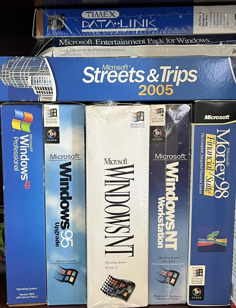
This desire to keep Windows relevant and protected led Microsoft to build all kinds of product that wasn’t really core – like Money, Encarta, AutoRoute/Streets & Trips as well as games, loads of hardware and more.
There was always a threat that something would take over Windows’ crown; IBM and Microsoft had been developing OS/2 before their relationship broke down and Windows 3.x became the most successful system with a graphical user interface. IBM carried on trying to develop OS/2 just at the time when Apple had lost its way and needed Microsoft, of all companies, to bail it out and keep it viable. The Mac something of a threat to Windows, though it was used to try and show the DoJ that Windows was not a monopoly, given alternatives like Mac and Linux. At the time, it felt like the desktop OS was a battleground which, though Microsoft had been winning for a long time, could easily be ceded. Dilbert cartoons of the mid 1990s joked about the “OS Holy Wars”, and in hindsight, the biggest threat to Windows’ dominance was to come from mobile devices rather than other desktop OSes.
In the meantime, Windows Server was an upstart trying to compete against “proper” systems like VAX, Unix and even the likes of IBM’s AS/400. Linux would ultimately hoover up a lot of work that was done on many systems, and other competitors like Novell would sink beneath the waves.
The Desktop Years
When Windows XP came out in 2001 – only 6 years after Windows 95 – it really gave a single platform for consumers and business customers and went on to be wildly successful. Part way through XP’s life, there was a huge pivot to focus on security, meaning all code had to be thoroughly reviewed and patched, and new products had to be “secure by design”. This meant the eventual release of Windows XP Service Pack 2 was really like a whole new version (it was 2 years after SP1).
The ambitious “Longhorn” project that was supposed to bring a load of newer technology to both client and server ultimately ran aground (Ballmer admits that as one his biggest regrets from his time at Microsoft) and Vista arrived 5 years after XP, to a somewhat lukewarm reception from many.
Windows 7 was pitched internally in Microsoft as “bringing back the new car smell” for Windows. It was righting some of the wrongs of Vista (though faster hardware helped) and became the true successor to Windows XP.
Later, Windows 8/8.1 got distracted by worries that iPads were taking people away from PCs and obsessing over touch screens and store apps, when most users didn’t really need or want them. (Actually; having used a touch screen laptop since the old Windows XP Tablet Edition, I find it hard not to have it since pinching to zoom or just scrolling around a document or webpage feels so much nicer with touch than often using a mouse or trackpad).
Windows 10 was effectively the modern Win7 – right the mistakes of the predecessor, take advantage of faster machines just to make it look and feel better. Windows 11, which is approaching its fifth birthday, had a not dissimilar reaction to Vista – lots of users didn’t like some of the new design and wanted to stick with Win10 or make Win11 look and behave more like its predecessor. Maybe the old advice that you should skip alternate version of Windows, like Vista, 8.x and 11, is starting to fade.
It seems Microsoft had got distracted and stopped making Windows genuinely better. The revenue it brings is a shadow of what it used to be, at least in terms of relative importance within the company. Financial reporting is generally pretty obtuse, but in 1997 it’s probable that Windows Client revenue was about 40% of the total. Nowadays it’s reckoned to be less than 10%.
When it became clear that Linux and the Mac weren’t about to completely dethrone Windows, perhaps Microsoft put more effort into chasing subscribers to Office/Microsoft365 and Azure. The focus-on-nothing-but-AI of the last few years has also meant a lot of the updates to Windows and its venerable applications have been to jam Copilot or other AI capabilities where they might not be welcome.
Windows 11 and the new car smell again
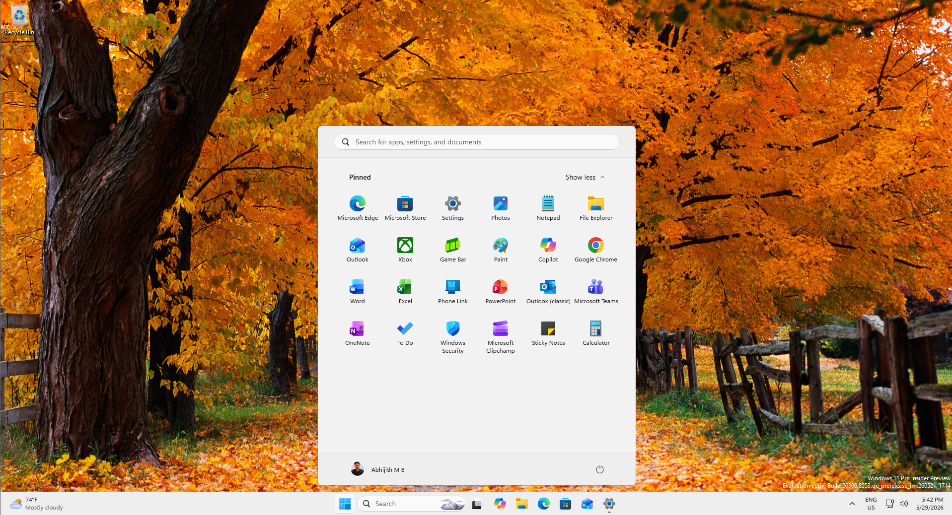
It feels like Windows client has got a new focus – updates to the Start menu, reducing the insidious “sponsored content” and widgets chock full of stupid ads, while adding in features (like where the taskbar sits on the screen) that have been missing for half a decade despite continuous requests to restore them. And backing away from shoving Copilot/AI into every. single. app.
In a world where kids might go through all their schooldays and only ever use Chromebooks or iPads, there’s a risk that in another 20 or 30 years, nobody will remember what Windows was like, just as only old nerds can recall plugging a PCMCIA card into an inch-thick laptop just to connect it to a network.
Who knows if and when Windows 12 will ever appear, or if Windows 11 will just keep evolving in different directions depending on fashion and the whims of the people in charge.
What’s somewhat reassuring is that it seems Microsoft has decided to care about it again.
The post I spent 25+ years at Microsoft, and Windows is getting the care it deserves again appeared first on Windows Latest


