 Log in
If it feels as though it has been a while since PowerToys received an update, that’s because it has been a number of weeks. But now this changes. Microsoft has launched PowerToys v0.92.0 as part of a release cycle that focuses on new features, stability, optimization improvements, and automation. Every PowerToys release causes fans of the utility suite to ask whether any new modules have been added. This time around there are no completely new utilities to play with, but there a so many modules that have gained new features and improvements that it’s hard to remain disappointed for long.… [Continue Reading]

|
Sr. Content Developer at Microsoft, working remotely in PA, TechBash conference organizer, former Microsoft MVP, Husband, Dad and Geek.
|
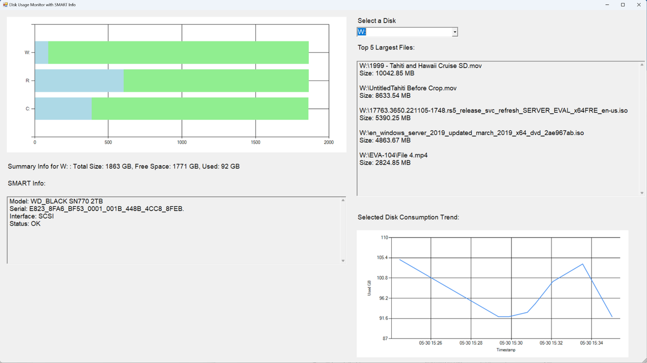
The final part of this three-part series on building a Windows storage dashboard details how to incorporate the historical data you collected for your disks in Part 2 into the PowerShell script created in Part 1.

Pennsylvania, USA

By “color contrast” we’re referring to the difference in brightness between foreground and background colors. In simpler terms, it defines how easy it is for the human eye to recognize text or images on a coloured background.
The Web Content Accessibility Guidelines (WCAG) provide specific recommendations regarding color contrast for text to make web content accessible and visible to people with impaired vision.
It recommends a minimum contrast ratio of 4.5:1 for normal text. For larger text, the minimum recommended contrast ratio is 3:1. According to the WCAG, larger text is defined as 24px or larger for normal-weight fonts and 18.66px or larger for bold text.
For example, if you have a dark background with dark-colored text, the text will not be easily readable, as seen below.


How is contrast ratio calculated?
The contrast ratio between two colors is calculated using the following formula.
1 |
contrast ratio = (L1 + 0.05) /( L2+0.05) |
L1 is the relative luminance of the lighter color, and L2 is the relative luminance of the darker color. While higher contrast is generally recommended to meet accessibility standards, moderate contrast is the best as it reduces eye strain.
Luminance, on the other hand, is the perceived brightness of a color, and it's calculated based on RGB values of that color as shown below:
1 |
R0 = R/255 |
2 |
G0 = G/255 |
3 |
B0 = B/255 |
Once we obtain these values, we linearise each component as follows:
1 |
let r = R0 <= 0.03928 ? R0 / 12.92 : Math.pow((R0 + 0.055) / 1.055, 2.4); |
2 |
let g = G0 <= 0.03928 ? G0 / 12.92 : Math.pow((G0 + 0.055) / 1.055, 2.4); |
3 |
let b = B0 <= 0.03928 ? B0 / 12.92 : Math.pow((B0 + 0.055) / 1.055, 2.4); |
Finally, we compute the relative luminance like so:
1 |
Luminance = 0.2126 * R0+0.07152* G0+0.0722*B0 |
Now that we know how to calculate the contrast ratio, let’s build our own color contrast tool!
Here’s what we’re working towards
HTML Structure
The HTML structure will have the following elements:
- Color pickers for selecting the foreground and background colors
- A display area to indicate whether the selected color combination meets the WCAG guidelines.
- A preview area that displays sample text to visually demonstrate readability.
- A paragraph displaying the contrast ratio of the selected colors.
The code for the HTML markup will look like this:
1 |
<div class="container"> |
2 |
<h1>Color Contrast Checker</h1> |
3 |
<div class="color-pickers"> |
4 |
<div class="color-picker"> |
5 |
<label for="text-color">Text Color:</label> |
6 |
<input type="color" id="text-color" value="#000000" /> |
7 |
<input type="text" id="text-color-hex" value="#000000" /> |
8 |
<p id="text-color-error" class="error-message"></p> |
9 |
</div>
|
10 |
|
11 |
<div class="color-picker"> |
12 |
<label for="bg-color">Background Color:</label> |
13 |
<input type="color" id="bg-color" value="#FFFFFF" /> |
14 |
<input type="text" id="bg-color-hex" value="#FFFFFF" /> |
15 |
<p id="bg-color-error" class="error-message"></p> |
16 |
</div>
|
17 |
</div>
|
18 |
|
19 |
<div class="output"> |
20 |
<div class="results"> |
21 |
<div class="results-item"> |
22 |
<h3>WCAG AA</h3> |
23 |
<p>Normal Text: <span id="normal_text_aa">Pass</span></p> |
24 |
<p>Large Text: <span id="large_text_aa">Pass</span></p> |
25 |
</div>
|
26 |
<div class="results-item"> |
27 |
<h3>WCAG AAA</h3> |
28 |
<p>Normal Text: <span id="normal_text_aaa">Pass</span></p> |
29 |
<p>Large Text: <span id="large_text_aaa">Pass</span></p> |
30 |
</div>
|
31 |
</div>
|
32 |
|
33 |
<div id="preview" class="preview"> |
34 |
<p>This is a preview text</p> |
35 |
</div>
|
36 |
|
37 |
<div class="ratio"> |
38 |
<h2>Contrast Ratio: <span id="contrast-ratio"></span></h2> |
39 |
</div>
|
40 |
</div>
|
41 |
|
42 |
<div class="error"> |
43 |
<p id="error-message"></p> |
44 |
</div>
|
45 |
</div>
|
Styling with CSS
We'll start by adding some basic styles to the body, the enclosing container, and the title.
1 |
body { |
2 |
background-color: #fff; |
3 |
padding: 20px; |
4 |
}
|
5 |
.container { |
6 |
display: flex; |
7 |
flex-direction: column; |
8 |
align-items: center; |
9 |
max-width: 800px; |
10 |
margin: 0 auto; |
11 |
gap: 8px; |
12 |
border-radius: 8px; |
13 |
|
14 |
}
|
15 |
h1 { |
16 |
text-align: center; |
17 |
margin-bottom: 32px; |
18 |
color: #333; |
19 |
}
|
Align the color picker elements using Flexbox to ensure child elements (i.e. the input and label) are stacked vertically.
1 |
.color-pickers { |
2 |
display: flex; |
3 |
gap: 20px; |
4 |
justify-content: center; |
5 |
margin-bottom: 20px; |
6 |
}
|
7 |
.color-picker { |
8 |
display: flex; |
9 |
flex-direction: column; |
10 |
width: 160px; |
11 |
gap: 4px; |
12 |
}
|
Style the inputs and labels as shown below:
1 |
label { |
2 |
font-weight: 600; |
3 |
color: rgb(0, 0, 0, 0.7); |
4 |
}
|
5 |
input[type="color"] { |
6 |
width: 100%; |
7 |
height: 40px; |
8 |
border: 1px solid rgb(0, 0, 0, 0.05); |
9 |
border-radius: 4px; |
10 |
cursor: pointer; |
11 |
}
|
12 |
input[type="text"] { |
13 |
padding: 8px 12px; |
14 |
border: 1px solid rgb(0, 0, 0, 0.05); |
15 |
border-radius: 4px; |
16 |
text-transform: uppercase; |
17 |
}
|
The display area will indicate whether the selected colors have passed the minimum contrast ratio requirement. If they fail, we will show a fail message, otherwise a pass message will be displayed.
Here are the styles for the display area.
1 |
.results { |
2 |
margin-bottom: 20px; |
3 |
display: flex; |
4 |
gap: 20px; |
5 |
justify-content: center; |
6 |
}
|
7 |
.results-item { |
8 |
text-align: center; |
9 |
padding: 15px; |
10 |
min-width: 130px; |
11 |
border: 1px solid rgb(0, 0, 0, 0.05); |
12 |
border-radius: 8px; |
13 |
}
|
14 |
.results-item h3 { |
15 |
margin-bottom: 10px; |
16 |
text-align: center; |
17 |
color: #333; |
18 |
}
|
19 |
.results-item p { |
20 |
margin-bottom: 5px; |
21 |
}
|
22 |
.pass { |
23 |
color: #38a169; |
24 |
font-weight: bold; |
25 |
}
|
26 |
.fail, |
27 |
.error-message { |
28 |
color: #e53e3e; |
29 |
font-weight: bold; |
30 |
}
|
Add these styles to the preview and contrast ratio elements .
1 |
.preview { |
2 |
display: flex; |
3 |
align-items: center; |
4 |
justify-content: center; |
5 |
min-height: 100px; |
6 |
margin-bottom: 20px; |
7 |
font-size: 24px; |
8 |
border: 1px solid rgb(0, 0, 0, 0.05); |
9 |
width: 100%; |
10 |
max-width: 600px; |
11 |
}
|
12 |
|
13 |
.ratio { |
14 |
text-align: center; |
15 |
font-style: italic; |
16 |
color: #333; |
17 |
}
|
We'll also have styles for error messages.
1 |
.error { |
2 |
color: #e53e3e; |
3 |
}
|
4 |
.error-message { |
5 |
display: none; |
6 |
}
|
Our simple interface now looks like this:


Color contrast functionality with JavaScript
To get accurate color contrast ratios, we'll use the WCAG contrast checker API, which provides an easy way to check the contrast between any two colors. The color contrast ratio is obtained by providing the foreground and background color values to the API, as shown below.
1 |
https://webaim.org/resources/contrastchecker/?fcolor=0000FF&bcolor=FFFFFF&api |
Here we are using black for the text and white for the background.
The output is a JSON object that looks something like this:
1 |
{
|
2 |
"ratio": "8.59", |
3 |
"AA": "pass", |
4 |
"AALarge": "pass", |
5 |
"AAA": "pass", |
6 |
"AAALarge": "pass" |
7 |
}
|
A ratio of 8.59 means the two colors pass the minimum color contrast guidelines. The pass status means the colors also pass the WCAG requirements for both normal text (AA) and large text (AA).
The pass on AAA means the contrast ratio passes the most strict compliance level.
Select all the elements we'll be working with.
1 |
const textColorInput = document.getElementById("text-color"); |
2 |
const bgColorInput = document.getElementById("bg-color"); |
3 |
|
4 |
const textColorHex = document.getElementById("text-color-hex"); |
5 |
const bgColorHex = document.getElementById("bg-color-hex"); |
6 |
const textColorError = document.getElementById("text-color-error"); |
7 |
const bgColorError = document.getElementById("bg-color-error"); |
8 |
const normal_text_aa = document.getElementById("normal_text_aa"); |
9 |
const large_text_aa = document.getElementById("large_text_aa"); |
10 |
const normal_text_aaa = document.getElementById("normal_text_aaa"); |
11 |
const large_text_aaa = document.getElementById("large_text_aaa"); |
12 |
const preview = document.getElementById("preview"); |
13 |
const contrastRatio = document.getElementById("contrast-ratio"); |
Next, we'll get the currently selected color values from each of the color picker inputs. Create a function called updateColors which looks like this:
1 |
function updateColors() { |
2 |
const textColor = textColorInput.value; |
3 |
const bgColor = bgColorInput.value; |
4 |
|
5 |
preview.style.color = textColor; |
6 |
preview.style.backgroundColor = bgColor; |
7 |
|
8 |
}
|
This function gets the current values and applies them to the preview. The selected background color is used as the preview's background while the selected foreground color is applied to the text.
Invoke the updateColors function to ensure the preview visually reflects how the text appears on the chosen background.
1 |
updateColors(); |
Color validation
Before calculating the contrast ratio of the selected colors, we'll first need to validate and sync the color values. This will ensure that when a color is selected using the color picker, the corresponding HEX input value is updated and vice versa.
To do that, we'll create two functions, one for validating the foreground and another for validating the background color.
Create a function called updateTextColorFromHex .
1 |
function updateTextColorFromHex() {} |
Get the current hex value from the text color input.
1 |
let hexValue = textColorHex.value; |
Check if the value provided starts with the # symbol, if it doesn't, append the symbol at the start of the value.
1 |
if (hexValue.charAt(0) !== "#") { |
2 |
hexValue = "#" + hexValue; |
3 |
}
|
Perform another validation to ensure the provided HEX value is a valid and existing color.
1 |
if (!isValidHex(hexValue)) { |
2 |
textColorError.textContent = "incorrect color"; |
3 |
return; |
4 |
}
|
If the hex value of the color provided is invalid, show a message and exit the function. If it's a valid color, clear the error message and sync the input value and the color picker to ensure the text input and the color input both show the same color.
1 |
textColorError.textContent = ""; |
2 |
textColorError.style.display = "block"; |
3 |
textColorInput.value = hexValue; |
4 |
textColorHex.value = hexValue; |
The helper isValidHex function uses a regular expression to test the input value and it looks like this:
1 |
function isValidHex(hex) { |
2 |
return /^#([A-Fa-f0-9]{6}|[A-Fa-f0-9]{3})$/.test(hex); |
3 |
}
|
We'll perform a similar validation for the background color.
1 |
function updateBgColorFromHex() {
|
2 |
let hexValue = bgColorHex.value; |
3 |
if (hexValue.charAt(0) !== "#") {
|
4 |
hexValue = "#" + hexValue; |
5 |
} |
6 |
|
7 |
if (!isValidHex(hexValue)) {
|
8 |
bgColorError.textContent = "incorrect color"; |
9 |
bgColorError.style.display = "block"; |
10 |
|
11 |
|
12 |
return; |
13 |
} |
14 |
bgColorError.textContent = ""; |
15 |
bgColorInput.value = hexValue; |
16 |
bgColorHex.value = hexValue; |
17 |
updateColors() |
18 |
} |
Event listeners
It is also important to ensure that when the color or text input change, the corresponding values are updated. We do this by adding input event listeners to the elements.
1 |
textColorHex.addEventListener("input", updateTextColorFromHex); |
2 |
bgColorHex.addEventListener("input", updateBgColorFromHex); |
3 |
|
4 |
textColorInput.addEventListener("input", function () { |
5 |
textColorHex.value = textColorInput.value; |
6 |
updateColors(); |
7 |
});
|
8 |
|
9 |
bgColorInput.addEventListener("input", function () { |
10 |
bgColorHex.value = bgColorInput.value; |
11 |
updateColors(); |
12 |
});
|


Contrast checker
The next step is to pass the current foreground and background hex color values to the API.
Create a function called getContrastRatio, which takes two arguments namely, foreground and background.
1 |
function getContrastRatio(foreground, background) { |
2 |
//logic goes here
|
3 |
|
4 |
}
|
Since the API takes the values without the # symbol, we'll remove the # character using the replace() method, as shown below.
1 |
const fcolor = foreground.replace("#", ""); |
2 |
const bcolor = background.replace("#", ""); |
Here, we are replacing the # symbol with an empty string. For example, if the hex value is #FFFFFF, the output will be FFFFFF.
Append the values to the API string.
1 |
const apiUrl = `https://webaim.org/resources/contrastchecker/? |
2 |
fcolor=${fcolor}&bcolor=${bcolor}&api`; |
Using fetch(), make a network request to the WebAIMi API and handle any occurring errors gracefully.
1 |
fetch(apiUrl) |
2 |
.then((response) => { |
3 |
if (!response.ok) { |
4 |
throw new Error("Network response was not ok"); |
5 |
}
|
6 |
return response.json(); |
7 |
})
|
Update the results
If the API response is successful, we'll get a JSON object containing the contrast ratio and the output of the contrast check, either a fail or a pass in this format.
1 |
{
|
2 |
"ratio": "8.59", |
3 |
"AA": "pass", |
4 |
"AALarge": "pass", |
5 |
"AAA": "pass", |
6 |
"AAALarge": "pass" |
7 |
}
|
where:
- AA - normal text
- AALarge - large text
- AAA - strict compliance for normal text
- AAALarge - strict compliance for large text
We'll then update the results to the page by appending them to the appropriate elements.
1 |
normal_text_aa.textContent = data.AA === "pass" ? "Pass" : "Fail"; |
2 |
normal_text_aa.className = data.AA === "pass" ? "pass" : "fail"; |
3 |
|
4 |
large_text_aa.textContent = data.AALarge === "pass" ? "Pass" : "Fail"; |
5 |
large_text_aa.className = data.AALarge === "pass" ? "pass" : "fail"; |
6 |
|
7 |
normal_text_aaa.textContent = data.AAA === "pass" ? "Pass" : "Fail"; |
8 |
normal_text_aaa.className = data.AAA === "pass" ? "pass" : "fail"; |
9 |
|
10 |
large_text_aaa.textContent = data.AAALarge === "pass" ? "Pass" : "Fail"; |
11 |
large_text_aaa.className = data.AAALarge === "pass" ? "pass" : "fail"; |
Here, each result is displayed as either a Pass or Fail, accompanied by styling that uses red for fail and green for pass.
The final step is to update the updateColors() function to ensure the selected colors are passed to the getContrastRatio() function.
1 |
function updateColors() { |
2 |
const textColor = textColorInput.value; |
3 |
const bgColor = bgColorInput.value; |
4 |
preview.style.color = textColor; |
5 |
preview.style.backgroundColor = bgColor; |
6 |
getContrastRatio(textColor, bgColor); |
7 |
}
|
Don’t forget to update the contrast ratio by setting the ratio value as the text content.
1 |
contrastRatio.textContent = parseFloat(data.ratio); |
The final demo
Here is the final demo!
Conclusion
That's a wrap for this tutorial! We have learned how to build a tool that checks contrast ratios to help adhere to WCAG guidelines. Hopefully, you now feel equipped to create more accessible and user-friendly designs.


Pennsylvania, USA
Let’s continue our walkthrough of Uno Chefs, our new flagship reference implementation when it comes to building cross-platform apps. This time, we’ll be covering the Login Page. This is the next page after navigating from the Welcome Page, which we covered last time.
Anatomy of the Login Page
I know an article on a login page sounds boring. But, there’s actually a lot of good stuff packed into this simple screen.
We don’t need to separate the anatomy based on our wide/narrow layouts. This is one of the few pages that we simply lock to a MaxWidth so it looks good enough for both layout breakpoints.
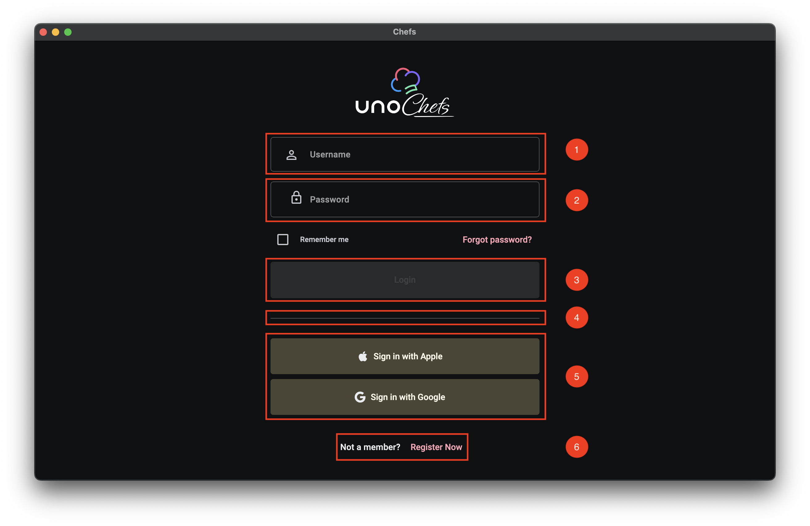
- Username TextBox
- Password PasswordBox
- Login Button
- Social Login Buttons
- Registration Text Button
The first, and most important, part of any login experience are the Username/Password fields. Not only should they be clearly indicated, it should be easy to quickly navigate between the two fields and invoke a form submission without using your mouse at all.
Custom Icons
Along with using the PlaceholderText property for the Username TextBox and the PasswordBox controls, we are using the ControlExtensions.Icon Attached Property from Uno Themes to add a nice leading icon image for each control. For more info on the ControlExtensions.Icon Attached Property you can check out the related Uno Tech Bite:
As a quick recap, the Icon Attached Property from Uno Themes’ ControlExtensions class provides the ability to define any type of IconElement and displays it in many situations as part of the custom styles coming from Uno Themes.
The ControlExtensions Attached Properties must be properly referenced inside of the control’s ControlTemplate. They do not work with the out-of-the-box Fluent styles from the core Uno library.
Keyboard Navigation
We are also using the InputExtensions set of Attached Properties from Uno Toolkit in order to facilitate keyboard navigation support for tabbing through the input controls and invoking the Login command on Enter key press. Once again, we have a couple of Uno Tech Bite videos specifically on this topic :)
The XAML
We can take a look now at the XAML for the Login Page. I extracted a snippet of the most relevant parts, but you can find the full XAML in the Uno Chefs repository.
1
2
3
4
5
6
7
8
9
10
11
12
13
14
15
16
17
18
19
20
21
22
23
24
25
26
27
28
29
30
31
32
33
34
35
36
37
38
39
40
41
42
43
44
45
46
47
48
49
50
51
52
53
54
55
56
57
58
59
60
61
62
63
64
65
66
67
68
69
70
71
72
73
74
75
76
77
78
79
80
81
82
83
84
85
86
87
88
89
90
<utu:AutoLayout Spacing="32"
                MaxWidth="500"
                PrimaryAxisAlignment="Center"
                Padding="32">
    <Image utu:AutoLayout.CounterAlignment="Center"
            Width="160"
            Height="90"
            Source="{ThemeResource ChefsLogoWithIcon}"
            Stretch="Uniform" />
    <utu:AutoLayout Spacing="16"
                    PrimaryAxisAlignment="Center">
        <TextBox PlaceholderText="Username"
                  x:Name="LoginUsername"
                  AutomationProperties.AutomationId="LoginUsername"
                  Style="{StaticResource ChefsPrimaryTextBoxStyle}"
                  utu:InputExtensions.ReturnType="Next"
                  utu:InputExtensions.AutoFocusNextElement="{Binding ElementName=LoginPassword}"
                  IsSpellCheckEnabled="False"
                  Text="{Binding UserCredentials.Username, Mode=TwoWay, UpdateSourceTrigger=PropertyChanged}">
            <ut:ControlExtensions.Icon>
                <PathIcon Data="{StaticResource Icon_Person_Outline}" />
            </ut:ControlExtensions.Icon>
        </TextBox>
        <PasswordBox x:Name="LoginPassword"
                      AutomationProperties.AutomationId="LoginPassword"
                      utu:InputExtensions.ReturnType="Done"
                      utu:CommandExtensions.Command="{Binding Login}"
                      Password="{Binding UserCredentials.Password, Mode=TwoWay, UpdateSourceTrigger=PropertyChanged}"
                      PlaceholderText="Password"
                      Style="{StaticResource OutlinedPasswordBoxStyle}"
                      BorderBrush="{ThemeResource OutlineVariantBrush}">
            <ut:ControlExtensions.Icon>
                <PathIcon Data="{StaticResource Icon_Lock}" />
            </ut:ControlExtensions.Icon>
        </PasswordBox>
        <utu:AutoLayout Spacing="24"
                        Orientation="Horizontal"
                        CounterAxisAlignment="Center"
                        Justify="SpaceBetween"
                        PrimaryAxisAlignment="Stretch">
            <CheckBox Content="Remember me"
                      utu:AutoLayout.PrimaryAlignment="Auto"
                      IsChecked="{Binding UserCredentials.SaveCredentials, Mode=TwoWay}" />
            <Button Content="Forgot password?"
                    Style="{StaticResource TextButtonStyle}" />
        </utu:AutoLayout>
        <Button Content="Login"
                x:Name="LoginButton"
                AutomationProperties.AutomationId="LoginButton"
                Style="{StaticResource ChefsPrimaryButtonStyle}"
                Command="{Binding Login}" />
    </utu:AutoLayout>

    <utu:Divider Style="{StaticResource DividerStyle}" />

    <utu:AutoLayout Spacing="8"
                    PrimaryAxisAlignment="Center">
        <Button Content="Sign in with Apple"
                Command="{Binding LoginWithApple}"
                Style="{StaticResource ChefsTonalButtonStyle}">
            <ut:ControlExtensions.Icon>
                <FontIcon Style="{StaticResource FontAwesomeBrandsFontIconStyle}"
                          Glyph="{StaticResource Icon_Apple_Brand}"
                          FontSize="18"
                          Foreground="{ThemeResource OnSurfaceBrush}" />
            </ut:ControlExtensions.Icon>
        </Button>
        <Button Content="Sign in with Google"
                Command="{Binding LoginWithGoogle}"
                Style="{StaticResource ChefsTonalButtonStyle}">
            <ut:ControlExtensions.Icon>
                <FontIcon Style="{StaticResource FontAwesomeBrandsFontIconStyle}"
                          Glyph="{StaticResource Icon_Google_Brand}"
                          FontSize="18"
                          Foreground="{ThemeResource OnSurfaceBrush}" />
            </ut:ControlExtensions.Icon>
        </Button>
    </utu:AutoLayout>
    <utu:AutoLayout PrimaryAxisAlignment="Center"
                    CounterAxisAlignment="Center"
                    Orientation="Horizontal"
                    Spacing="4">
        <TextBlock Text="Not a member?"
                    Foreground="{ThemeResource OnSurfaceBrush}"
                    Style="{StaticResource LabelLarge}" />
        <Button Content="Register Now"
                uen:Navigation.Request="-/Register"
                Style="{StaticResource TextButtonStyle}" />
    </utu:AutoLayout>
</utu:AutoLayout>
ControlExtensions
First thing we want to look at are the ControlExtensions.Icon usages. In the snippet above, check out lines 20-22 and 32-34. This is where we are setting the leading icons for the TextBox and PasswordBox controls. We are using a PathIcon to define the icon shape, which is a vector graphic that scales nicely across different screen sizes and resolutions.
1
2
3
4
5
6
7
8
9
<!-- Username Icon -->
<ut:ControlExtensions.Icon>
    <PathIcon Data="{StaticResource Icon_Person_Outline}" />
</ut:ControlExtensions.Icon>

<!-- Password Icon -->
<ut:ControlExtensions.Icon>
    <PathIcon Data="{StaticResource Icon_Lock}" />
</ut:ControlExtensions.Icon>
InputExtensions
Next, we have the InputExtensions Attached Properties. This is where we are defining the keyboard navigation behavior. There are actually two properties we are using here: ReturnType and AutoFocusNextElement.
1
2
3
4
5
6
<TextBox ...
         utu:InputExtensions.ReturnType="Next"
         utu:InputExtensions.AutoFocusNextElement="{Binding ElementName=LoginPassword}" />
<PasswordBox x:Name="LoginPassword"
             ...
             utu:InputExtensions.ReturnType="Done" />
The ReturnType property is set to Next for the TextBox. Which means that when the software keyboard is displayed while the Username TextBox is focused, the Next button will be shown in the spot for the Return key. For the PasswordBox, we set the ReturnType to Done, which should show a Done button instead.
The AutoFocusNextElement property is set to the LoginPassword element. Which means that when the Next button or the Tab key is pressed, the focus will automatically move from the TextBox to the PasswordBox.
CommandExtensions
Finally, we have the CommandExtensions.Command Attached Property on the PasswordBox. This is where we are binding the Login command to the PasswordBox. This means that when the Done button or the Enter key is pressed, it will invoke the Login command and will auto-dismiss the software keyboard.
1
2
<PasswordBox ...
             utu:CommandExtensions.Command="{Binding Login}" />
Putting it all together
Take note in the video below of the Return key changing from Next to Done as we navigate between the two input controls. As well as the Login successfully occurring when the Done button is pressed on the software keyboard.
The MVUX Model
Next, let’s take a look at the MVUX model for the Login Page. The Login Page is a bit more complex than the Welcome Page, so we have a few more properties and commands to look at.
1
2
3
4
5
6
7
8
9
10
11
12
13
14
15
16
17
18
19
20
21
22
23
24
public partial record LoginModel(IDispatcher Dispatcher, INavigator Navigator, IAuthenticationService Authentication)
{
    public IState<Credentials> UserCredentials => State<Credentials>.Value(this, () => new Credentials());

    public ICommand Login => Command.Create(b => b.Given(UserCredentials).When(CanLogin).Then(DoLogin));

    private bool CanLogin(Credentials userCredentials)
    {
        return userCredentials is not null &&
               !string.IsNullOrWhiteSpace(userCredentials.Username) &&
               !string.IsNullOrWhiteSpace(userCredentials.Password);
    }

    private async ValueTask DoLogin(Credentials userCredentials, CancellationToken ct)
    {
        await Authentication.LoginAsync(Dispatcher, new Dictionary<string, string> { { "Username", userCredentials.Username! }, { "Password", userCredentials.Password! } });
        await NavigateToMain(ct);
    }

    ...

    private async ValueTask NavigateToMain(CancellationToken ct)
        => await Navigator.NavigateViewModelAsync<MainModel>(this, qualifier: Qualifiers.ClearBackStack, cancellation: ct);
}
UserCredentials State
First thing’s first, we have the UserCredentials property. This is a simple Credentials object that holds the Username and Password values. We are using an IState<Credentials> here instead of an IFeed<Credentials> since we want to be able to update the observable property as the user types in the input fields and react to the changes accordingly.
Login Command
The Login command is defined using the Command.Create builder method from MVUX. This allows us to build an ICommand in a fluent way. We cover this in the Command Builder Chefs Recipe Book article. You’ll notice the When(CanLogin) method that will properly wire up the CanExecute logic for the ICommand. This will ensure that the Login button is only enabled when both the Username and Password fields are not empty, or whatever validation logic you want to implement.
IAuthenticationService Usage
We can see that the DoLogin method is where we are using the injected IAuthenticationService to handle the authentication logic. If you search the solution for something implementing the IAuthenticationService interface, you’ll find that it is not implemented in Chefs. Instead, it is registered by the UseAuthentication extension method as part of the IHostBuilder in the App.xaml code-behind logic. This is all made available to us through the Uno Extensions Authentication package.
Here is the relevant code snippet from the App code-behind:
1
2
3
4
5
6
7
8
9
10
11
12
13
14
15
16
17
18
19
20
21
22
23
24
25
26
27
28
29
30
31
32
33
...

.Configure(host => host
    .UseAuthentication(auth =>
        auth.AddCustom(
            custom =>
            {
                custom.Login(async (sp, dispatcher, credentials, cancellationToken) => await ProcessCredentials(credentials));
            },
            name: "CustomAuth")
    )

...

private async ValueTask<IDictionary<string, string>?> ProcessCredentials(IDictionary<string, string> credentials)
{
    // Check for username to simulate credential processing
    if (!(credentials?.TryGetValue("Username", out var username) ??
            false && !string.IsNullOrEmpty(username)))
    {
        return null;
    }

    // Simulate successful authentication by creating a dummy token dictionary
    var tokenDictionary = new Dictionary<string, string>
    {
        { TokenCacheExtensions.AccessTokenKey, "SampleToken" },
        { TokenCacheExtensions.RefreshTokenKey, "RefreshToken" },
        { "Expiry", DateTime.Now.AddMinutes(5).ToString("g") } // Set token expiry
    };

    return tokenDictionary;
}
In our case, we are simulating a successful login as long as the Username is not empty. We are achieving this by using the AddCustom method on the IAuthenticationBuilder to register the CustomAuthenticationProvider coming from Uno Extensions. The CustomAuthenticationProvider provides a basic implementation of the IAuthenticationProvider that requires callback methods to be defined for performing login, refresh, and logout actions.
This is where you would typically implement your own authentication logic, such as calling an API to validate the credentials. You can easily swap this out with something like .AddMsal or AddOidc.
Now, when we call the LoginAsync method on the IAuthenticationService inside of the LoginModel, it will automatically call into the ProcessCredentials method to handle the auth request.
Next Steps
In the next article, we’ll get into the real meat of the application and explore the Home Page. In the meantime, I encourage you to check out the Uno Chefs Recipe Book and the Uno Chefs GitHub repository and explore the code for yourself. There are a lot of interesting patterns and techniques used throughout the app that you can learn from.
Hope you learned something and I’ll catch you in the next one :wave:
Additional Resources
- Uno Chefs GitHub Repository
- InputExtensions Focus Recipe Book
- InputExtensions Return Type Recipe Book
- CommandExtensions Recipe Book

Pennsylvania, USA
Author and activist Cory Doctorow joins us to discuss The Internet Con, his call to reclaim internet control from Big Tech. From locked-down platforms to the illusion of choice online, Cory lays out how interoperability can break corporate monopolies—and why reshaping the digital landscape starts with empowering users to leave, remix, and reimagine the internet on their own terms.
Grab your copy of The Internet Con: https://www.versobooks.com/products/3035-the-internet-con
This conversation was recorded on 10/31/2023. Watch the full video recording at: https://archive.org/details/the-internet-con
Check out all of the Future Knowledge episodes at https://archive.org/details/future-knowledge
Download audio: https://media.transistor.fm/41a7c016/c6b61054.mp3
Pennsylvania, USA
Typesetters did not like the laser printer. Wedding photographers still hate the iphone. And some musicians are outraged that AI is now making mediocre pop music.
One group of esteemed authors is demanding that book publishers refuse to use AI in designing book covers, recording audiobooks or a range of other tasks.
As always, this isn’t going to work very well.
Plato was sure that the invention of handwriting would destroy memory, and I’m confident there were scribes who thought that the Gutenberg press was the end of civilization. Yet, all around us, there are writers who use spell check, guitarists who use electronic pitch tuners and photographers who use digital cameras.
Productivity wins out.
Productivity is outcome focused. When we create more value in less time, the consumer comes out ahead (that’s why it’s called “value.”)
And so people don’t mind driving on streets that were paved by machine instead of by hand, or driving instead of walking. They eat in fancy restaurants that have freezers and write on paper with a pen, not a quill.
As AI expands, the real opportunity is to find a way to use human effort to create more value.
When we bring humanity to the work in a way that others demand, labor is honored and valued.
The irony here is rich: the industrial age indoctrinated us and pushed us to be less human, to be cogs in the machine. School brainwashed into asking if it will be on the test–the test itself is an artifact of quality control, and human resources was invented to make factories more efficient.
So it comes around. Now that we’ve got a tireless computer ready to do the jobs we trained to be pretty good at, it’s human work that matters.
In the 150 years since the dawn of photography, the jobs of most painters disappeared. If you need a way to remember someone’s face, take a photo. But at the same time, the profession of original, trendsetting painter has grown remarkably. It turns out that there’s a market for paintings that are powerful, memorable and inefficient.
Systems are powerful and persistent. Often, they evolve to serve those that seek value from those systems.
It’s easy to imagine that we have a say in whether or not AI will take over the basic elements of our work as radiologists, writers or musicians. We don’t.
What we do have is agency over is how we’ll thrive in a world where human work is being redefined.
Either you work for an AI or AI works for you.
Pennsylvania, USA
Next Page of Stories