OpenAI has added a new tool to detect if an image was made with its DALL-E AI image generator, as well asnew watermarking methods to more clearly flag content it generates.
In a blog post, OpenAI announced that it has begun developing new provenance methods to track content and prove whether it was AI-generated. These include a new image detection classifier that uses AI to determine whether the photo was AI-generated, as well as a tamper-resistant watermark that can tag content like audio with invisible signals.
The classifier predicts the likelihood that a picture was created by DALL-E 3. OpenAI claims the classifier works even if the image is cropped or compressed or the saturation is changed. While the tool can detect if images...
As of May 1st, 2024, we have officially bid adieu to Xamarin, marking the end of an era in cross-platform mobile development. Microsoft’s decision to discontinue support for Xamarin undoubtedly brings a mix of emotions for developers who have relied on it to create native mobile apps.
Xamarin emerged as a game-changer in the world of mobile app development, offering the promise of writing code once and deploying it everywhere. To me, that was a premise that instantly clicked. The quirky monkey-obsessed aesthetics around it certainly helped. However, the ability to use C# and the .NET framework, leveraging knowledge I already had, made me fall in love quickly. I can’t even begin to compare the early days to where we stand now that we’re at the end; so much improvements were made along the way.
Monkeys! And still a kick-ass looking Xamaward.
Over the years, Xamarin evolved and matured, becoming an integral part of Microsoft’s development ecosystem. Its integration with Visual Studio provided developers with a seamless workflow, and the advent of Xamarin.Forms set the whole thing on a new path of sharing UI code. For someone like me, with a knack for all things visual, that was a godsend. Or well… most of the time. I may have lost endless hours tinkering with something platform-specific looked off by a pixel 😅 Obviously, along the way we have also lost quite a few things already. Here’s a list of things I remember, in no particular order, who knows what memories it might trigger…
Xamarin Component Store
Xamarin Insights
MonoDevelop
MTouch.Dialog
Data Pages
Xamarin.Forms Labs
Shared Projects (the actual .shproj ones)
Xamarin University
AppCenter
UI Test Recorder
Xamarin.Auth
Xamarin Forums
Xamarin Test Cloud
A warehouse, somewhere in Denmark…
To me though, the most valuable aspect of Xamarin wasn’t just the technology; it was the vibrant community and the people behind it that truly made it special. Whether it was attending local meetups, engaging in online forums, or social media, the sense of belonging and support within the Xamarin community was palpable. I would like to think I’ve made friendships along the way that endure till this day.
But as with all good things, the time has come to say goodbye. Microsoft’s decision to sunset Xamarin is not without reason, given their continued investment in its successor .NET MAUI. While Xamarin may no longer offically be a part of our toolkit, the spirit of it and the community around it lives on through .NET MAUI. So, here’s to Xamarin – thank you for the memories, the challenges, and the opportunities 🍻
Eric Lippert is a designer of fine programming languages; at Microsoft he worked on Visual Basic, VBScript, JScript and C#. At Facebook he worked on Hack (a gradually-typed PHP) and Bean Machine (a probabilistic extension of Python for data scientists). He is at present enjoying taking a break from corporate life.
“Fast Feedback - Rather than having to commit/push every time you want to test out the changes you are making to your .github/workflows/ files (or for any changes to embedded GitHub actions), you can use act to run the actions locally. The environment variables and filesystem are all configured to match what GitHub provides.”
“Local Task Runner - I love make. However, I also hate repeating myself. With act, you can use the GitHub Actions defined in your .github/workflows/ to replace your Makefile!”
For years now, the Power Platform has been a low code tool that unlocks value across your business by accelerating application & automation development to meet business demand faster. Whether you’re a professional developer, an IT admin, business analyst, or a non-technical employee, low code empowers you to create solutions in a fast, secure, and compliant fashion. Now with the rise of AI, organizations are moving quickly to embrace AI in order to usher in a new wave of growth and value creation.
Introducing the Podcast Copilot with Azure OpenAI Service, .NET, and Power Platform Workshop
With that, I am excited to announce an exciting workshop that explores the integration of the Power Platform with advanced AI models to create a dynamic application inspired by Kevin Scott’s Microsoft Build 2023 demo. This application makes it easy to generate a social media post promoting a new episode of your podcast.
Starting from the podcast URL, you get the transcription with the Whisper model
Given that transcript, you use GPT to extract the name of the guest
With the guest name, you retrieve their bio with Bing Search
With the transcription and the guest bio, you generate a social media blurb with GPT
With the social media blurb, you generate a relevant DALL-E prompt with GPT
Finally, you use DALL-E to generate an image for the social media post with the prompt
Then you’ll learn how to surface this process in a Power App or through a copilot using Microsoft Copilot Studio all powered by Azure OpenAI Service, .NET and the Power Platform!
What can you expect from this workshop?
This workshop walks you through the entire process from start to finish with the following labs:
👩🏾💻 Lab 0 - Setup your environment
This lab is all about setting up your environment. This is what you need to get started. Make sure to do this before starting the workshop.
🤖 Lab 1 - Laying the Foundation: Azure OpenAI Service
In this lab, we're going to dive into the world of Azure OpenAI Service. We introduce the service, describe the models, and guide you through creating deployments. Setting the stage for seamless AI integration.
🔧 Lab 2 - Bridging the Gap: .NET APIs and Custom Connectors
In this lab, we take a step further from Lab 1 by creating a .NET API using the .NET Azure OpenAI SDK and creating a Custom Connector from Visual Studio.
📱 Lab 3 – The Final Touch: Power Apps and Microsoft Copilot Studio Integration
In this lab, we bring it all together. We will build the Power App UI, connect to the Custom Connector, and create the AI generated social media post. As a bonus, we will also see how to implement this workflow with Microsoft Copilot Studio as well.
Video Walkthroughs
There are also video walkthroughs of each lab for those who prefer visual learning. They are embedded into the start of each lab and are currently hosted on the Microsoft Developer YouTube channel as part of our Low Code Revolution Series.
You can watch all video walkthroughs here:
Setting up the Azure OpenAI Service
.NET APIs and Custom Connectors
Power Apps and Microsoft Copilot Studio Integration
How can you get started?
You can find the workshop by visiting: https://aka.ms/PowerPodcastCopilot. If you have any questions, feel free to submit a GitHub Issue and we’ll follow up with you in the repository.
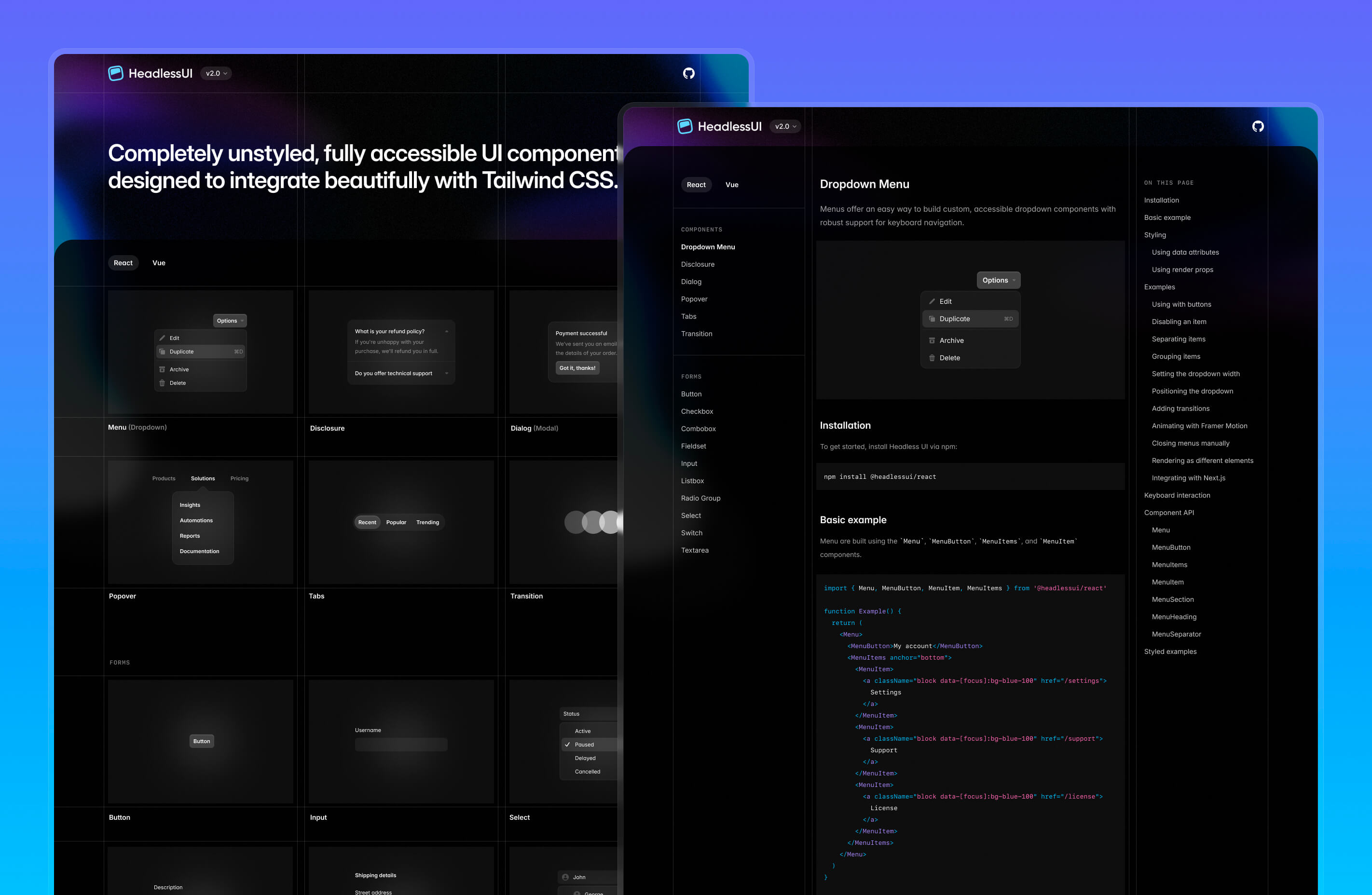
It’s been just over three years since we released the first version of Headless UI, our unstyled UI library that makes it really easy to build fully accessible, custom designed UI components like dropdowns and dialogs using Tailwind CSS.
Nothing beats actually building something real with your own tools when it comes to finding ways to make things better.
As we’ve been working on Catalyst these last several months, we’ve been making dozens of improvements to Headless UI that let you write even less code, and make the developer experience even better.
We just released Headless UI v2.0 for React, which is the culmination of all this work.
We’ve integrated Floating UI directly into Headless UI, so you never have to worry about dropdowns going out of view or being obscured by other elements on the screen.
Use the new anchor prop on the Menu, Popover, Combobox, and Listbox components to specify the anchor positioning, then fine-tune the placement with CSS variables like --anchor-gap and --anchor-padding:
Scroll up and down to see the dropdown position change
What makes this API really nice is that you can tweak the styles at different breakpoints by changing the CSS variables using utility classes like sm:[--anchor-gap:4px].
We’ve added a new headless Checkbox component to complement our existing RadioGroup component, making it easy to build totally custom checkbox controls:
This will give you early access to any awesome new features we're developing.
import{Field,Label,Checkbox}from'@headlessui/react'import{CheckmarkIcon}from'./icons/checkmark'importclsxfrom'clsx'functionExample(){return(<Field><CheckboxdefaultCheckedclassName={clsx('size-4 rounded border bg-white dark:bg-white/5','data-[checked]:border-transparent data-[checked]:bg-blue-500','focus:outline-none data-[focus]:outline-2 data-[focus]:outline-offset-2 data-[focus]:outline-blue-500',)}><CheckmarkIconclassName="stroke-white opacity-0 group-data-[checked]:opacity-100"/></Checkbox><div><Label>Enable beta features</Label><Description>This will give you early access to any awesome newfeatures we're developing.</Description></div></Field>)}
Checkboxes can be controlled or uncontrolled, and can automatically sync their state with a hidden input to play nicely with HTML forms.
We’ve added a whole new set of components that just wrap native form controls, but do all of the tedious work of wiring up IDs and aria-* attributes for you automatically.
Here’s what it looked like to build a simple <input> field with a properly associated <label> and description before:
<div><labelid="name-label"for="name-input">Name</label><inputid="name-input"aria-labelledby="name-label"aria-describedby="name-description"/><pid="name-description">Use your real name so people will recognize you.</p></div>
And here’s what it looks like with these new components in Headless UI v2.0:
import{Description,Field,Input,Label}from'@headlessui/react'functionExample(){return(<Field><Label>Name</Label><Inputname="your_name"/><Description>Use your real name so people will recognize you.</Description></Field>)}
The new Field and Fieldset components also cascade disabled states like the native <fieldset> element, so you can easily disable an entire group of controls at once:
Select a country to see the region field become enabled
Shipping details
We currently only ship to North America.
import{Button,Description,Field,Fieldset,Input,Label,Legend,Select}from'@headlessui/react'import{ regions }from'./countries'exportfunctionExample(){const[country, setCountry]=useState(null)return(<formaction="/shipping"><Fieldset><Legend>Shipping details</Legend><Field><Label>Street address</Label><Inputname="address"/></Field><Field><Label>Country</Label><Description>We currently only ship to NorthAmerica.</Description><Selectname="country"value={country}onChange={(event)=>setCountry(event.target.value)}><option></option><option>Canada</option><option>Mexico</option><option>UnitedStates</option></Select></Field><Fielddisabled={!country}><LabelclassName="data-[disabled]:opacity-40">State/province</Label><Selectname="region"className="data-[disabled]:opacity-50"><option></option>{country && regions[country].map((region)=><option>{region}</option>)}</Select></Field><Button>Submit</Button></Fieldset></form>)}
We expose the disabled state using a data-disabled attribute in the rendered HTML. This lets us expose it even on elements that don’t support the native disabled attribute like the associated <label> element, making it really easy to fine-tune the disabled styles for each element.
All in all we’ve added 8 new components here — Fieldset, Legend, Field, Label, Description, Input, Select, and Textarea.
For more details, start with the Fieldset documentation and work your way through the rest.
Using hooks from the awesome React Aria library under the hood, Headless UI now adds smarter data-* state attributes to your controls that behave more consistently across different devices than the native CSS pseudo-classes:
data-active — like :active, but is removed when dragging off of the element.
data-hover — like :hover, but is ignored on touch devices to avoid sticky hover states.
data-focus — like :focus-visible, without false positives from imperative focusing.
Click, hover, focus, and drag the button to see the data attributes applied
To learn more about why applying these styles using JavaScript is important, I highly recommend reading through Devon Govett’s excellent blog series on this topic:
We’ve integrated TanStack Virtual into Headless UI to support list virtualization when you need to put a hundred thousand items in your combobox because, hey, that’s what the boss told you to do.
Use the new virtual prop to pass in all of your items, and use the ComboboxOptions render prop to provide the template for an individual option:
Open the combobox and scroll through the 1,000 options
import{Combobox,ComboboxButton,ComboboxInput,ComboboxOption,ComboboxOptions}from'@headlessui/react'import{ChevronDownIcon}from'@heroicons/react/20/solid'import{ useState }from'react'const people =[{id:1,name:'Rossie Abernathy'},{id:2,name:'Juana Abshire'},{id:3,name:'Leonel Abshire'},{id:4,name:'Llewellyn Abshire'},{id:5,name:'Ramon Abshire'},// ...up to 1000 people]functionExample(){const[query, setQuery]=useState('')const[selected, setSelected]=useState(people[0])const filteredPeople = query ===''? people: people.filter((person)=>{return person.name.toLowerCase().includes(query.toLowerCase())})return(<Comboboxvalue={selected}virtual={{options: filteredPeople }}onChange={(value)=>setSelected(value)}onClose={()=>setQuery('')}><div><ComboboxInputdisplayValue={(person)=> person?.name}onChange={(event)=>setQuery(event.target.value)}/><ComboboxButton><ChevronDownIcon/></ComboboxButton></div><ComboboxOptions>{({option: person })=>(<ComboboxOptionkey={person.id}value={person}>{person.name}</ComboboxOption>)}</ComboboxOptions></Combobox>)}
 Log in


 Monkeys! And still a kick-ass looking Xamaward.
 A warehouse, somewhere in Denmark…

 A curated list of GitHub badges for your next project
